compareのTwitterイラスト検索結果。 481ページ目


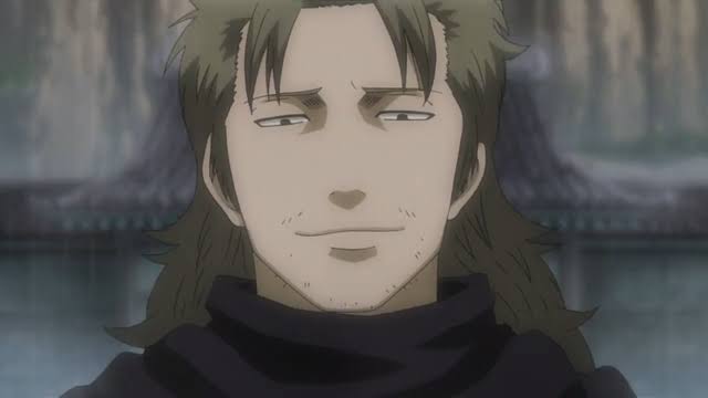

WE NEED TO TALK MORE ABOUT ABUTO
He's an absolute daddy material. He's loyal and has soft spot for children. A bit of a tsundere but will do drastic things to help you. And more importantly he said it himself : "Compared to us Yato, all earthlings have tiny dicks."


i started streaming back in may, next month is 6 month anni?
at the start i knew no one and have trouble connecting with people plus my personality isn't the best, so i've improved a bit when compared to naki back than!
i hope at 1st anni i can look back with improvement too?

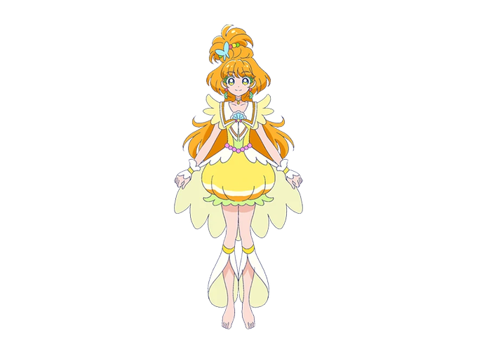


@curehibiki01 Definityl Manatsu, Minori and Asuka, im still supriced how god looking those forms are compared to, not bad, but still not that great forms in healin good and very uninteresting super forms in Star Twinkle... don't make me even start with HuGtto


Obrigada a todos que compareceram hoje foi um prazer streamar pra vcs <3
Sketch Request #11 Tema: Cottage Core
Personagens:
#Juuzou - #TokyoGhoul [Aquecimento]
#Lilith - #Borderlands2
#POWER - #chainsawman
#Puck - #Berserk


Showing my favorite ones i drew today.
all ocs, do not compare. is2g


"I am an apex predator, a wolf beyond compare... But they will never know what it cost me, what a monster I am"
Inktober Day 3: Predator | Flower
Using a custom list curated by my beloved discord friends!!


the love that i have for this character doesn’t compare to any other. i love emma and will always be her biggest fan no matter what https://t.co/CY5dyKyzO3


@RubberNinja Hey!! I cannot stress enough dude that I CAN NOT ANIMATE and am NOTHING compared to yall, but can draw!

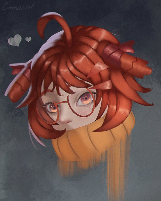
PFP icon of Beagle from Arknights. She's pretty plain compared to the rest of the characters, but she's my favorite by far
#digitalart #illustration #arknights #beagle


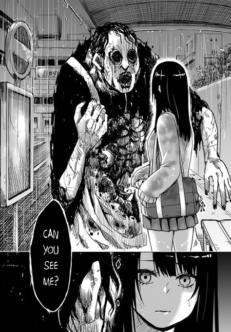
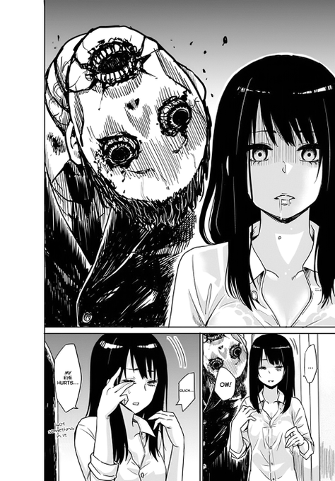
I'm not even complaining about the way the ghosts look. I don't think it's even possible to truly convey how uncanny they look compared to the rest of the artstyle in anime.


#genshintober2021
Day 3: First Main — Albedo!
Okay technically my first mains was Chongyun, but it was fairly brief compared to Albedo.
#genshinimpact #原神 #albedo #genshintober


twitter refuses for me to upload the bg ver
(will delete if shitty quality)
this was a redraw of an older piece i did awhile back will probably compare them in the replies


☀️“I do not possess words to compare with your sonnets, so let me show you rather than tell you, my love.”🌹
I drew art of ScarfyTheShipster's #ferdirenz fic cause I'm a huge sap for it. This was technically for #wewam2021 but dw about it lol. Link to the fic in the replies!


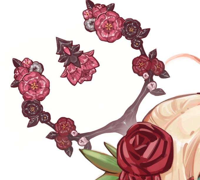
pls look at this ridiculous cane i put so much time in compared to the jarring rose LMAO


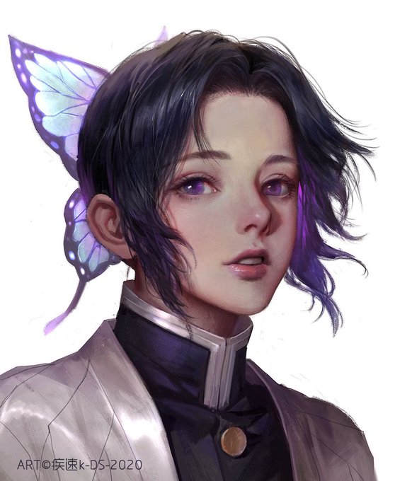


Proof that they did traced.I’ve compared already and recheck if it’s similar ^^


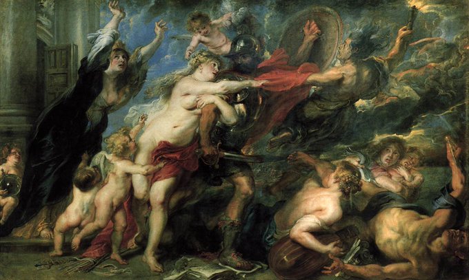
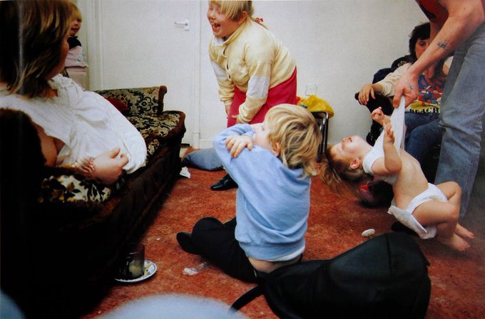

Apart from describing an unintrusive insight into the working class' unselfconscious pleasure of living, I love how John Berger compares Nick Waplington's "Living Room" images with baroque paintings of Rubens and how it makes perfect sense.


Imagine if @zakalwe_x started a pfp collection? I mean please don't because it couldn't possibly compare to the love and life your singular creations emote. These are just a handful of masterpieces from his PUNX collection. My profile pic included. Love you Zak! #punx #nftart