BlurredのTwitterイラスト検索結果。 1,686 件中 50ページ目
being very rough with backgrounds when i know they're gonna be blurred
Blurred vision https://t.co/NEJJlHKYte #ARTstreet #MediBang #March2021_Creature #MySecretSocietyContest
@seasideparrot I think this image stands out the most. The foreground have some nice tones and how the background seems to be less vibrant. And blurred out makes the foreground stands out. Personally I think that creates great harmony
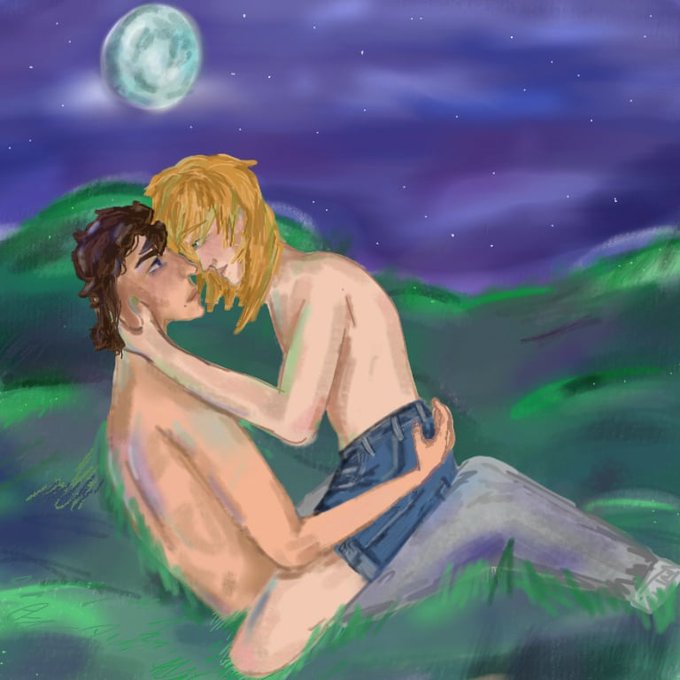
The hint of purple in the night sky is a nice touch
@QuestForMataNui Nuvhok's #BionicleArtwork also uses Tahnok in the background, but is the only one with a non-blurred background. Image 3 showcases it in its full glory.
@otomebunny here i blurred ur icon so u can see the duck, and then outlined the duck
A bit higher quality of that one panel of Emily and Aiden conversation that got blurred out bc of low resolution
got around to revamping my inu hariko sticker ✨
Join my patreon sticker club by the end of today to grab this month’s silver variant of this sticker! link in bio
Image: art of an inu hariko on a dark blurred background. Inu hariko are traditional Japanese symbols of protection
Cool Tones Blurred Lights Digital Texture Overlay Set!
https://t.co/JwkFImXcoh
#photo #photoart #photography #downloads #texture #etsy #etsystore #etsysellers #DigitalArtist #digitalart #MyArtwork #Mydesign #design #photoeffect #graphicsdesign #craft #photographer #Digital
@orquidiaarte Hi I'm Mikey I'm trans and autistic I post a lot of fnaf stuff. I go to an art and theatre school and my insta is @/mikeysdecentcosplays where I post art #art #FNAF #TransDayOfVisibility
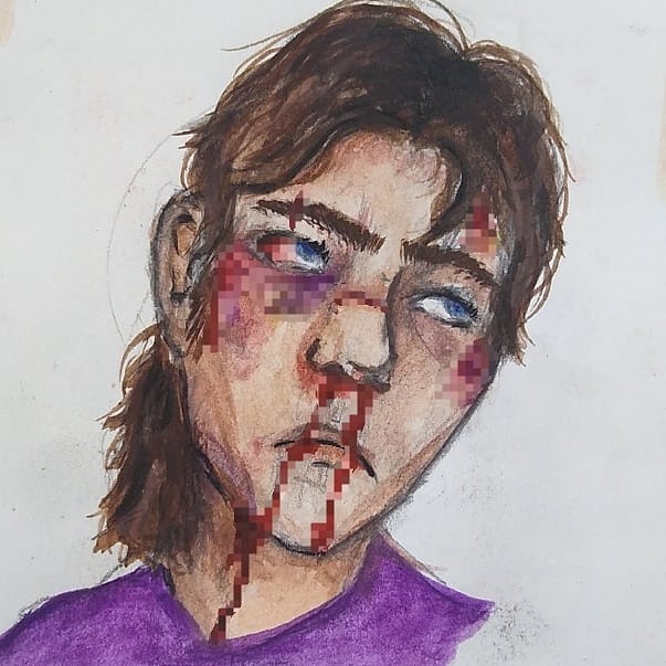
Tw blurred gore , blood
Also here's an unblurred version, just Ranboo and Tubbo (both of which I slightly redesigned), and just Michael!
might as well kick off the art stuff with this one bc its been sitting around for a WHILE- we got two versions! blurred and unblurred
lucky was not so lucky this time around while trying to thieve some wares for his shop- he got GOT
#sfwgt #gianttiny #sizetwitter
i did NOT work hard on that hair for it to be washed out by the quality . anyways . unblurred + no filter versions
Drawing made as payment for setting up my computer, for my bf brother friend. It was fun tbh xD
Also the background is not mine, just blurred photo of some park.
I didn't know what to do for a background so I found a stock photo, blurred it, then drew over it. I think it works well enough!
You can see where the blurred image is and where I drew over it 😄


