ueartのTwitterイラスト検索結果。 12,681 件中 493ページ目


Los tonos fríos no son precisamente los que más uso, pero algo hay. #BlueArt


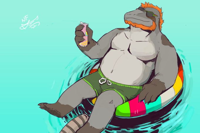
#blueart
Too many to choose from, so limited it to some concepts. Even that was a chore!
______
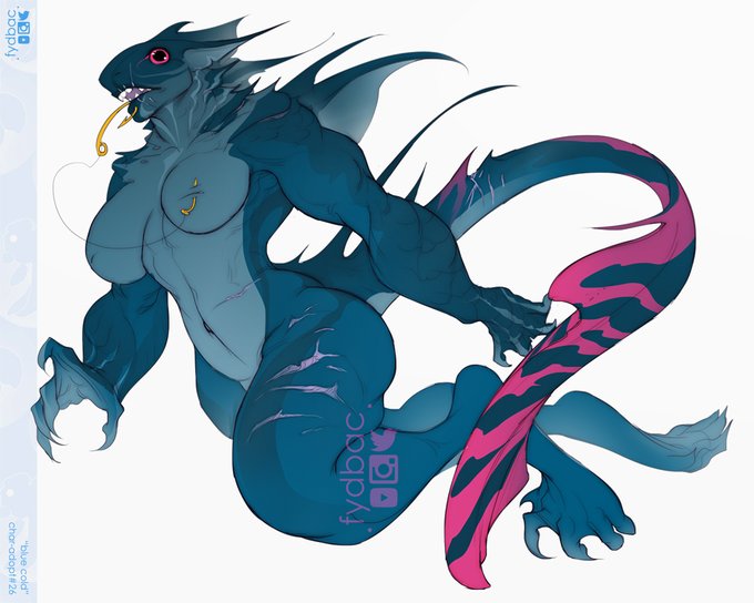
Only one of these is available to adopt!
https://t.co/grmaP8aevy

#BlueArt
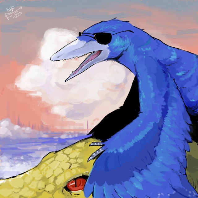
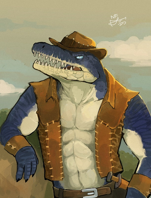
Blue is a pretty nice colour. Compared to red and green or pink and yellow, blue and orange aren't as antagonistic to each other. https://t.co/NiuhJ5E22a


I tried to look for pieces that's weren't all just hollow knight but it turns out I used to use purple in place of blue a lot and only started using a lot of blue after I got into HK
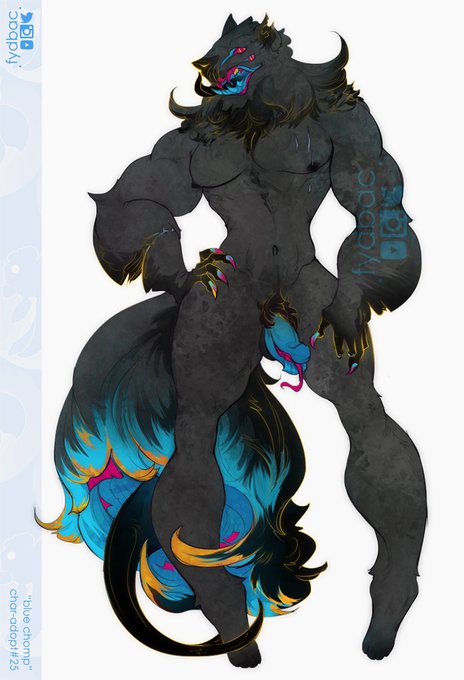
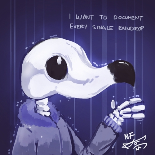
#BlueArt


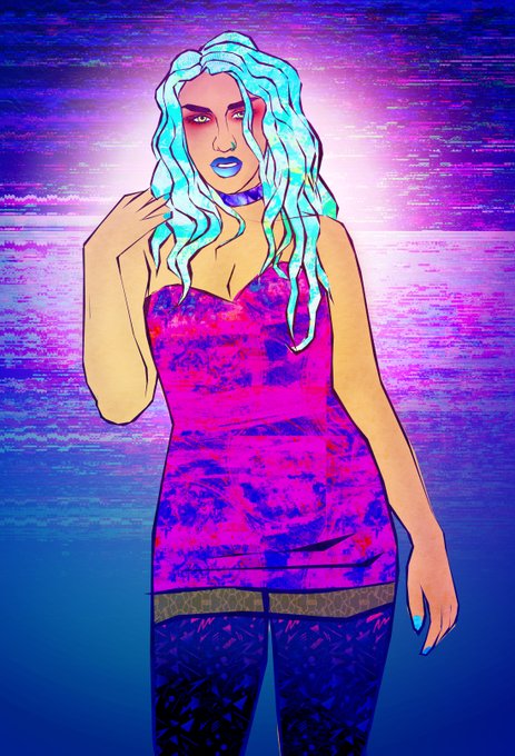

More #BlueArt - drag fanart edition! #dragfanart #rupaulsdragrace #dragracefanart #brookelynnhytes #adoredelano #aja


...and the other half of my work is blue 😁 with fancy frames! #BlueArt