PortionのTwitterイラスト検索結果。 13,277 件中 494ページ目


Digital retouch. I will probably make stickers out of this, and donate a portion of every sold to charity. If anyone is interested, I'll also be willing to auction off the original painting for charity as well.

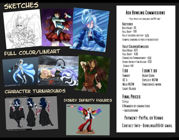
Commissions are still open! 3-4 spots are available!
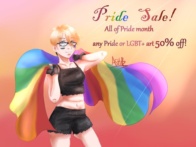
And another special sale for the month of June, as well as a portion made from commissions from the sale will be donated to organizations like "The Trevor Project"~🌈🌈
DM or email if interested!


My "style" kinda sits at a happy medium between toony and realistic proportions. But I'm able to shift it in either direction, really.
Regular cell shaded Seph vs Toony soft shaded Seph


I still wasnt very good at drawing people 3 years ago, but this meme of a boy certainly went and blew himself out of proportion.
And im ok with that 👁✨
#OC #originalcharacter #dnd #bloodborneoc #cleric


Old work day 2! Some OC’s from a comic about a fisherman and a kid he inherited at a festival. I rembember working so har don it and now I cringe at all the perspective and proportion mistakes. #originalcharacter #anime #manga #digitalart


Sooo I wanted to try something else since I'm bad at proportions and anatomy, so why not draw some cute demons!


Hi yes hello I finished my diviner oc's art! She’s honestly been so much fun to draw ✨✨
Now I just gotta,,,
Stares @ her written portion


@CaptAnaugi For my first sketch, I’ve recently started to use a big brush and just sketch the pose by what feels right. Then I’ll do a second sketch with some proportions and stuff fixed

Here's a doodle i made yesterday of @YadiZarii's girl Oreng
also i'd like to say i have never heard of proportions


#Sandman Watercolor.
Another of my paintings of @neilhimself's #Sandman watercolor painting in last hrs of auction here:
https://t.co/sElXbytSQO
& others from same seller here: https://t.co/CTZwoYyAwH
offering a portion of the sales to aid frontline & comic shops.


Thank you to everyone who swung by today, especially @HelloHeyHeather and @VPN_Bytes! You two rock!! I got a good portion of prep for Saturday's stream done! Look forward to the announcement later today!
We raided @Syertse who's doing art right now!
https://t.co/ira9pr1flJ


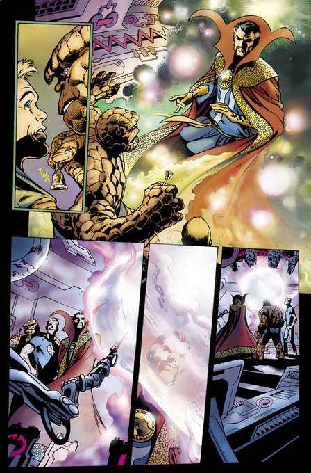

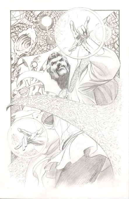
@tegan_oneil5000 Alan Davis is an absolutely quintessential comicbook art God.
.
Is it any wonder that I would give vital portions of my anatomy to get him to draw a Doctor Strange series?
.


The video portion of Woosa #DrawYourSummonersWar #6thSWdraw


Don't mind me, just practicing proportions n all that jazz and to drawing Allister for the billionth time. Boy want abs to be cool. 💪
#Allister #オニオン #pokemon #pokemonswordshield #ポケモン #ポケモン剣盾 #anime #digitalart #fanart #Procreate


Spent a good portion of this morning putting color to this doodle, takin a trip down memory lane and listening to the same song on repeat...
"Wanna tangle up in you. Dont be tempted to escape. Wishin' it was just us two..."
#myart #ArtistOnTwitter #FF14 #originalcharacter


🖤 WIP tiiiime! ✨
🖤 Decided that the amount of Witcher fanart I did is not proportional to my obsession for this franchise so yeah guess I'm starting a little Witcher centered project now 😆
#fanart #wip #thewitcher #digitalart