contrasのTwitterイラスト検索結果。 10,781 件中 500ページ目


finished up that Lei-Lei sketch, tried to go for a high contrast shadow thing, might do that with the rest but heres a #CutieSaturday #Darkstalkers

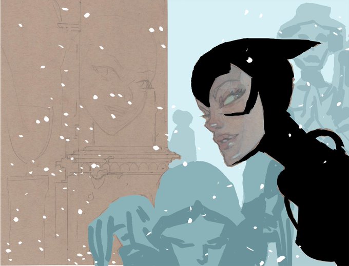
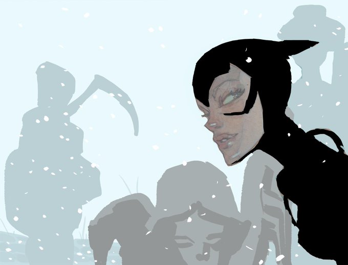
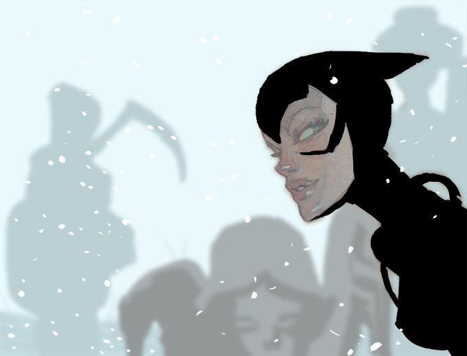
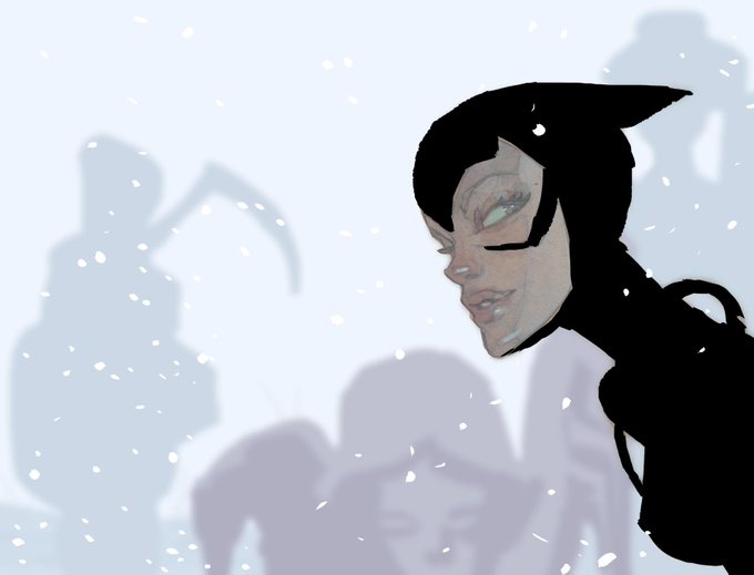
color testing, first with a green-blue bkg that i wrongly thought would be recessive, then a lighter, lower-contrast color, then that color blurred, and finally the winner -- a redder (pinker?) version that has the right balance of cold and distance. now for actual watercolors...


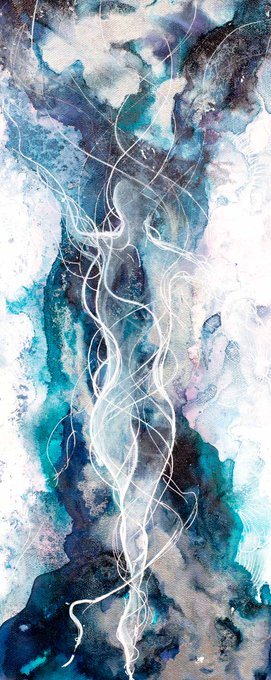
"Abstraction 271" Bold contrasts, luminous chromatic palette are my favorites https://t.co/SIsYCc013D #impressionism #homedecoration #abstractart #artgallery @SaatchiArt #artistic Archival Pigment Print on Baryta Fine Art Paper #artcollector #contemporaryart #abstractlandscape


WORK IN PROGRESS!!!
Got some progress with working on dark edges and contrasts.....
#WonderWoman #GalGadot #digitalart #illustration #dccomics #character


Reupload in better quality. Found out my mobile can edit photos too and add contrast etc.


Messing around with contrast and tonal variants on here for fun. Mainly to announce that ‘SPIRAL CIRCUS’ is now an official indie game company. Will be releasing ‘Silt’ as it’s first title hopefully one day soon....! To check details and join mailing li… https://t.co/3KdCckW3CC


so @MathiassJB and i have contrasting art styles so we figured we would do a thing...


In my drawing methods class we were tasked to make a landscape picture that utilized atmospheric pressure.
The basic jist of it is things farther away in the distance were more dull, and blended together, while things in the foreground had higher contrast and more vibrant colors


#DamesZineArtists
@leorenahy is a Design student and Illustrator, she likes to draw knights, tarot cards and to use higly saturated colors and contrasts.
She is a Guest Artist!
You can also follow her on:
https://t.co/yd85SnZoww
And support her on her:
https://t.co/jevWUfNioN


Dibujar en tradicional con un lápiz más chiquito que mi meñique en un auto vs dibujar en digital con mi tableta en mi casa.
JAJAJAJ dios, el contraste
@ApoyaAlArtista @ConocerArtistas @ApoyoArtista

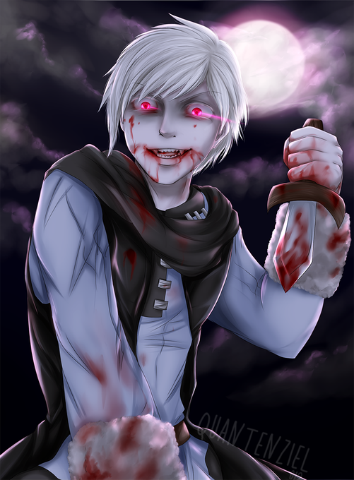
Bloody albino vampire! *w*
I just really liked the contrast of the white colours and the red blood. <3 It fits super well for this Halloween, coming up in a few days!


Saw-Whet Owl
Day 19 of #birdtober
Crappity crap i missed one yesterday
Oh well now im actually on time this time
This one was kinda rushed, the contrast and colors are ehhhhhhh too lackluster
55 mins, 3.14" x 5.11", Sakura Koi watercolors
#bird


Big Alice 77 ( Waatu & Myself) " Contrast" Feat : @pWRECKSshit
https://t.co/WEuvVBI0oX

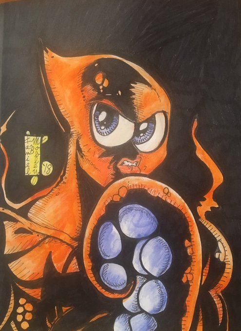
OKTOPUS in sketchbook. Sharpie, micron, watercolor pencil, and water, of course. #inktober2018 #oktopus #multiarmedanddangerous #maadoktopus #octopus #junebugpress #sketchbook #highcontrast #sealife #oceancity #nuparadise #karmafish


The latest Laura Beck Art works add elemental fire and water inflections to her celebrated Prima Ballerina figuratives. These originals can be obtained singly or as a spectacularly contrasting diptych.
https://t.co/e0fegptuS1


OWL - BÚHO
Día 17 de #inktober! Me encanta el contraste de la tinta naranja de @Winsor_NewtonES
#inktober2018 #pokemon #noctowl


Acrylics on paper
For sale
#expressive #blue #portrait #man #sad #contrast #mask #art #artist #artistsofinstagram #artistsoninstagram #visual #visualart #dark #darkart #depression #depressed #face #contemporaryart #modernart #kunst #myart #myday #colourful #artforsale