emphasisのTwitterイラスト検索結果。 1,812 件


Raven Saga Volume 2 cover reveal!
Apparently Amazon and Barnes & Noble are putting emphasis on preorders nowadays, so make sure to preorder Raven Saga volume 1, which is available to preorder now!
I’ll put the links in the thread↓


Urana-sensei’s style and creativity, as well as her emphasis on making sure to “have fun” with the drawing process in GACHIAKUTA became a mantra for me in my own drawing process! I also love that she collabs with Mr Andou for graffiti elements!!
#Kodansha_Gachiakuta


I don't even know her cuz I haven't player #StellarBlade yet (emphasis on "yet"), but had to pull for her in Nikke cuz she looks way too awesome and hot

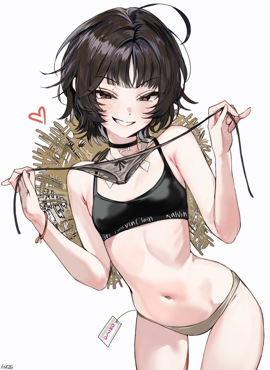
@sertraqueen You have a solid point there!! Not only her clothes are difficult, but also her skin is so good not to be shown (and I totally put emphasis on that when I drew her)


@TheIshikawaRin I dunno what to tell you- like the last bridget's eyes are half lidded, I drew the eyelashes long to emphasis that, sometimes I don't draw eyelashes, but like I can add them? Do you want me to add the fingernails too, cause i can do that- sometimes i draw them sometimes i dont.


pop art style seems to have less emphasis on the nose + prefers stylized eyes. With the preference for flatter lighter color+shade+bloom filter, it doesn't help to make the impression of flatter "softer" art style
70s-80s anime had flat colors, but they still had detailed nose


Hello #PortfolioDay
I like drawing anime 🎉
with an emphasis on merch design/illustration


▶️art strem
https://t.co/MHdK3Zxx64
trying to lock in... emphasis on "trying"


I love talking about my design choices! Sit down and buckle up!!
▸ Moth headphones: This was initially a big ribbon but along the way I wanted it to show more of a moth motif! Went with these antennae-like headpiece!
▸ XΛ pins: simple but large for emphasis! "XelafinΛ" https://t.co/pdVS7xUGU4


Okay but Gege's art is sketchy af
Adding a few more hatching doesn't make you a better artist neither does it take so much time it's just a choice (some prefer to go for simpler design and only use it for emphasis)
I wish my art was as clean as Ikemoto's ^^ https://t.co/AqQ9SGT3Fk

I'm ready to get cooked lol
But I see why Ikemoto did the emphasis on Sumire's face right here
She doesn't seem to be happy about it..


@z_killabyte @nonoka_furry And in the subsequent auction section, she strengthened the shadow of her entire body like part of her neck. If it really is just hair blocking as you said, then I don't know what the eerie emphasis here means

As I looked at her, she showed me her big fluffy with emphasis︎🤍🐱💜


For those who still want to do lineart, one good tip is to adjust your energy priorities in drawing!
if you want to put more emphasis on your lineart, try doing messier, less "finished-looking" sketches first! inking isnt just about tracing, its also definition and separation. https://t.co/x3Hi2Gonpd


I love seeing Ollie in a uniform🥰
So I asked @_TissueBOX to designed a police outfit for Ollie, and it's perfect!!!🤩
It really suits Ollie so well, the gold elements are so good, & I love the emphasis on the green in Ollie's eye 💚
#GraveyART

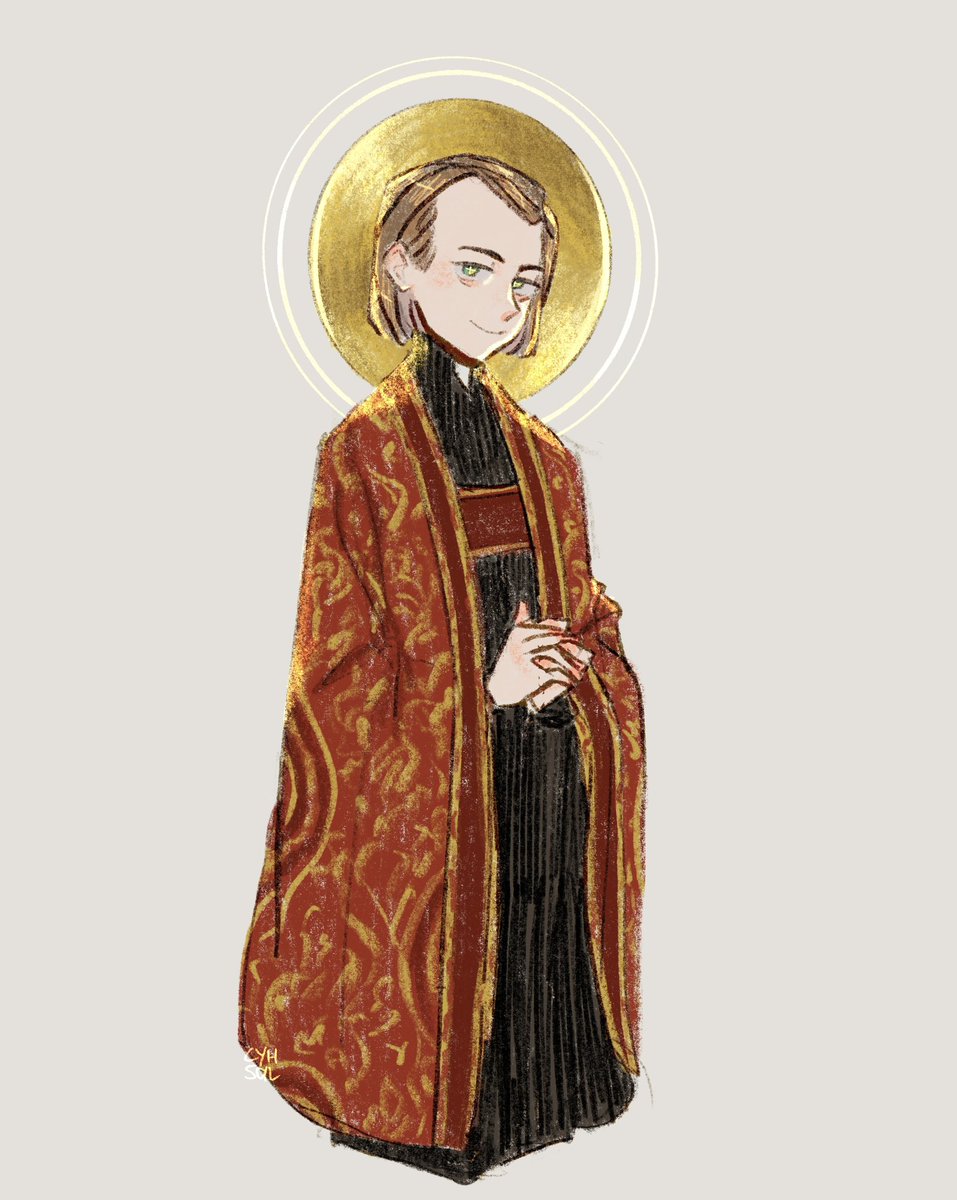
I cannot emphasise how much I LOVE his vestments, they are so beautiful… ♥️⚜️
#augustuspugin #illustration #sketch #rkgk #artistontwitter #イラスト


No longer a bot account due to CBDQ's closure, this account will instead dedicate itself to archive Kanamafu moments; images, clips and whatnot.
Not spoiler free as I'll try my best to update it if there's recent content of these two. (emphasis on try)