legibilityのTwitterイラスト検索結果。 35 件


Logo revamp for @Eelowyn 💕✨
Includes original general concept, more legibility, separate ‘text only’ logo and print/ stamp/ merch friendly versions and lineart!


Third time's a charm, still messing with resolution stuff for legibility https://t.co/ynce9bq5yH


Hmmm I feel like I definitely improved on having less tangents and more legibility,
What do you think? https://t.co/TGXE0w1D4Q


@Inner_Sanctum__ @ClaireSilver12 @drcc_art Loves it.
Have you experimented with the black text/white bg boxes we typically see in comics? It would help improve legibility.


STATIONERY QUESTION
Apart from the current design / legibility / motive, which kind of week planner would you prefer?
Just playing around with ideas…


I've gone ahead and drawn up a squirrel barking emote because we NEED one. Size legibility tests in the next couple of comments. #namiganami


These FG palettes are an important abstraction; that shared orange serves both a pragmatic (memory conservation) and gameplay (legibility) purpose, but doesn't represent an NPC's actual design. We see that in battle, where the orange splits into ~47 different skin tones. (6/24)

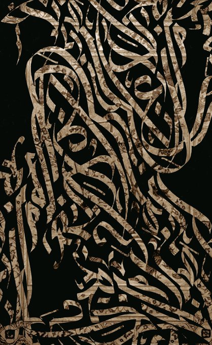
Besides using paints, I create digital pieces too. And their legibility is much further distorted.


Well, you see Ms M, comics were traditionally printed on poor quality paper, and the ink tended to bleed, and block caps retain better legibility when printed under such conditions, and now we all sort of follow the tradition of the fine letterers who came before us…


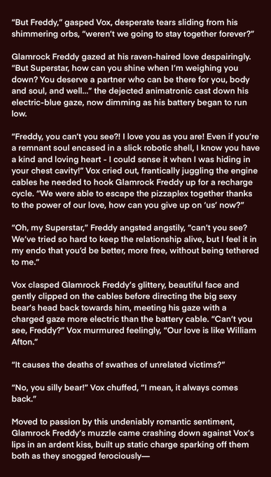
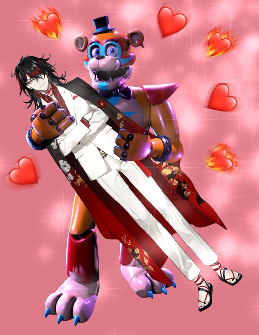
Milord asked for fanfic but he didn’t ask for GOOD fic 🦍
Vox x Glamrock Freddy, post Security Breach true ending, PG rating
1st image is meme + writing, 2nd is same writing on solid background for better legibility, 3rd is meme without writing, come get y’alls juice
#kinfiction


#MorseMage
for people who prefer minimalist over flavor: the
*~SIMPLE-HUD~*
(pink means full hp)
I also slightly reworked the default HUD for better contrast on the flowers for ease of legibility and +2 to CUTENESS


...emotional isolation from the team, she's natural prey for the manipulative Spiral.
I've included it at the of the thread for legibility purposes, but spread throughout the issue, her seduction by Spiral almost happens in slow motion as we watch helplessly as the X-Men take...


@Carin_McLeoud Oh, I found some of the images. It's not so much legibility in these as it is just more cohesive.


@perisceris Doing colored thumbnail sketches can honestly help a lot with the legibility of one's art. If it can't read as a thumbnail, it probably won't read as well as a finished piece either.


Kev Walker is such an underrated comic artist. He's consistent and innovative, while maintaining a ton of legibility and style.
His stuff siiiiings when it's colored by Frank Martin Jr., too.
(Avengers Arena, Marvel Zombies, and Thunderbolts)

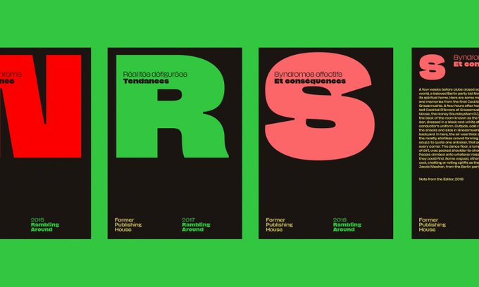


I Shot the Serif: NaN's remarkable new release NaN Jaune challenges the legibility and personality of commercial typefaces https://t.co/qgXBJceP3B

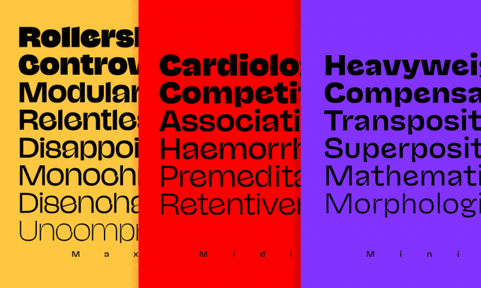
I Shot the Serif: NaN's remarkable new release NaN Jaune challenges the legibility and personality of commercial typefaces https://t.co/qgXBJceP3B (cc @nan_xyz_)


Made another one; this time writing a little Tutorial along with it!
Once some people get back to me on the legibility of said tutorial (I was very tired when writing it, and learning GIMP was a minor roadblock), I'll review it, then post a .zip for you all!


I'm particularly proud of the newest addition to the family: the Mini style. Mini’s open counters, deep ink-traps and simplified structure enhance legibility and eases Jaune swagger in longer text.