softerのTwitterイラスト検索結果。 3,229 件


Day 6 Practice
Today I'm trying to learn how to do a softer and less cluttered colouring style. what do you think ? 👀
I'm also learning lighting again. I'll post the preview in the comments :D
I know I'm supposed to rest, but it's so boring having to do nothing :s https://t.co/pbm3PvycOz


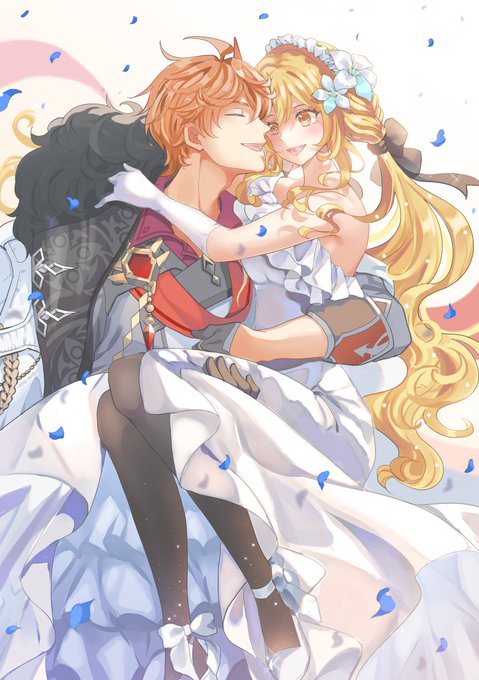
I tried this method too. Wow, My Chilumi wedding looks softer with no effort. 🥹✨
Before ➡️ After https://t.co/HzV3beZh89


Mantis has a way of bringing out Loki's softer side #lotis
(uncropped ver on SYTOchan)


aether gedik seeing ruby outside of his usual leather jacket getup like onyooo he looks softer now!


✨Merch Update✨
I adjust Harumasa & Miyabi shape and soften the gradient for acrylic. But, turned out softer than I expected.
Should I reprint them and set them as B-grade for OTS & Mail Order or you guys prefer it soft like this? Please let me know your thoughts!🤔🤔🤔 https://t.co/79FMgFHOEs


I might add multiple characters but not too much 0)-( (also I have softer spots for Karasuno sooOOOO)
From this series!


*orv // feminization , punisher , spoiler , canon event (sudah izin dengan illust)
Guys, don’t you think Femhyuk would shine better embracing a softer, more yielding side if look like this? Truly thanks for BB-Nim for making him this BEAUTIFUL 🥰 (Gak mungkin (cont)


pop art style seems to have less emphasis on the nose + prefers stylized eyes. With the preference for flatter lighter color+shade+bloom filter, it doesn't help to make the impression of flatter "softer" art style
70s-80s anime had flat colors, but they still had detailed nose

always thought modern anime looked more shinier+flatter coz they use softer shading + palette.
old anime tends to have more darker shading (esp. in 90s OVA), and color choice tends to be more bolder
doesn't help modern anime loves to spam bloom+blur so much https://t.co/1j1hSkUApa


The size gap make it so much softer and cuter 🥹
#Izukumidoriya #Izuocha #dekuocha #deku #urarakaochako #MHA #MyHeroAcademia


New Update on Ko-Fi for PH x Doctor BkDk!!
It is getting softer after this :3


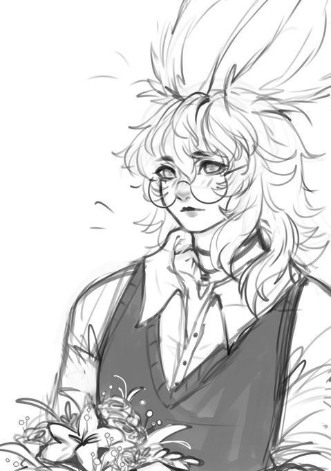
mai warmup!! im thinking of slightly altering her colors to be softer like this 🤔 #mariesona


I look up the chapter, Oda really made them softer more and more. Their watermelon love start from challenging to fighting to sharing to understanding (like, the highest level is just Sanji gave Zoro a spoon when the man come to him with a Watermelon) we can write a love story…

