Weird sketch. I've been thinking I need to go back and learn more fundamentals.
Here she is without horns (brother said they looked too corny and out of place, and he's right) and with tears on the pants (brother said they'd match the clothing tears, and he's right, good idea).
Another character concept. Not as sure where I'm going with this one, but she's supposed to be inspired by Yuri from KOF.
I tried to simplify the character and reduce the amount of details on the armor. Still, if she were an animated character, I'd have to find a way to use lots of copy-paste. https://t.co/paSwcItqAQ
@hell_fl Haha. She's supposed to be the Hermit meets Wolfgang Krauser from KOF and Alvan from Galaxy fight.
Here's another character in the same style I might use for a game. I didn't have time to do an animation, and the outfit is probably has too much nonsense, which I'll need to cut if I want her to be an animated character.
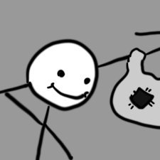
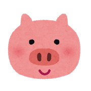
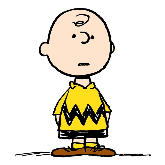
@ComicsThorsby @UnwinderH Absolutely true. I often think it's better to err on the side of having the eyes very close to the nose. Tends to look cuter and more cartoonish. Heck, Peanuts always got away with the eyes and nose at the exact same height. (Last 2 imgs are my art)


