
Evan Collins | BLM 🏳️🌈🇵🇸さんのイラストまとめ
@EvanCollins90Follow @EvanCollins90さんをフォローする
フォロー数:99 フォロワー数:8820


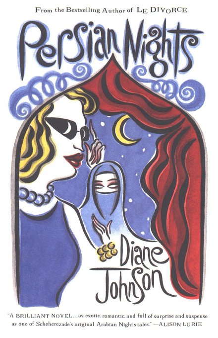

The 'Le Divorce' name came from one in a series of books by Diane Johnson that all have similar swirly, whimsical, vaguely-sophisticated Parisian(?) vibes, and a soft watercolor look.


Such a distinctly early 1990s melange of styles; love these wall mural promo shots. I'm sorta warming up to this hippie-ish playful style, as opposed to the globalization-'tribal look'-culturally appropriate side of GVC.


My favorite 1980's retail design, Goldi Shoes in Chicago. A store split down the middle, combining two of the most popular architectural trends at the time: wild & colorful Memphis with PoMo Faux Ruins/Neoclassical.
Thanks to Kubala-Washatko Architects for sending these over!


"Customers can experiment with the internet, online services, CD-ROMs, and PC games. They can create a website or video greeting card. There are also “virtual reality pods” and “simulation stations”. In the 'On-Line Cafe', shoppers can order food from computer stations.


@node00000001 Pulsations! One of my favorite disco/club designs!
Here's some information and images I scanned from 'Restaurant Design' by Susan Colgan (1987)


The book also touches on the short-lived trend of 'private home discos', this one below designed by Charles Burke.
A massive spaceship-like control room overlooks the 20x25' dancing space, featuring a pulsating disco light sculpture & clouds of dry ice mist


Some Pastel SW finds from 'Decor Magazine'; basically a monthly publication of advertisements for commercial artists. I'm pretty sure that mag is where most doctor's offices got their artworks from, as it covers most 80s mainstream styles.


I was able to scan a bunch of other years of the 80s, 90s, and early 2000s; if y'all are interested lemme know!
I'm realizing a problem with some is that I only scanned GVC examples, back when I had a hyper-focus on one thing at a time 🤦


Last one for tonight -- We don't really have a name for this aesthetic (I've been calling it Eco-Beige), a stripped-down eco-naturalistic style associated with third-wave environmentalism. Twigs, recycled textured paper, earth tones, beige, tans, leaves, dirt, etc.


Like our corporate tech weird big-arm people today, the 90s had their own oddly-proportioned figures, mainly used for editorial illustrations from what I've seen-- seems like it just became the default 'artsy & sophisticated' style for while. (edited for missing image)