
GrandGuerrillaさんのイラストまとめ
@GrandGuerrillaFollow @GrandGuerrillaさんをフォローする
フォロー数:1698 フォロワー数:54952

Boob free but now game style 😈
They didn't really bother changing it's proportions to make it more feminine like in the show but it's understandable since that'd probably mess up it's rigging and animations

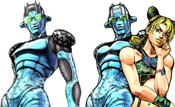
I don't like how every Jojo media after anime uses it's color palettes since it's boring seeing them for the 100th time especially with series like Jojo. Also it's funny seeing them remove details from original models just so they match simpler designs of the show lol

Both Jojo and Baki will have fights grounded in some very obscure trivia with a lot of twists and unnecesary exposition dumps. I'd say Baki is even more over the top than Jojo in those aspects. It will have dudes using granades like smoke bombs or teeth like bullets


@FuckityPuckity @lucas_mp3 Each part has its own character designer + Characters that don't have a shine are same way in the manga, it's not a production issue


@RadiantAeonstar Josuke, Giorno and Jolyne all have a heart on chest motif going on that connect's them. I wish there was more emphasis on stripes in Josuke's design to connect him better to Johnny but also make it more quirky
Also could be a motif in Part 9's Jojo but I doubt it lol


@Johnnyj74034410 I don't like early Vagabond style with how akward and flat Musashi's face is drawn, very thumb like. More detailed shading style is cool but I prefer when it's more balanced later on. Usually Farming arc is described to not be onpar with usual quality but it's my favourite


@NinjasaurioV Wit Studio used the blurry soft shading mostly for close ups to add more depth to the faces. They didn't apply it to every single frame, to every single outline of the drawing. Made the show look a lot cleaner than Mappa's approach to their shows