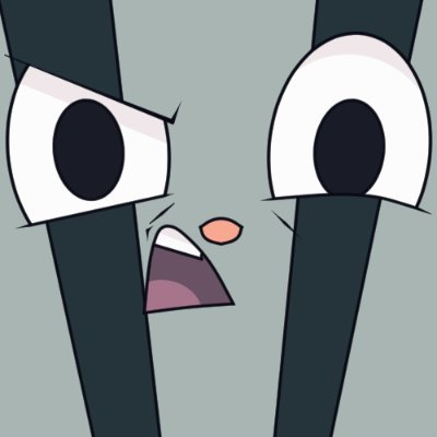
@Mournblade2 @unvarnishedvoid Vivziepop's show, same person that created Helluva Boss.
This poster is the old designs, not the current ones (I prefer the original design of Nifty to this new one)
@NotPeashyBee @weebishdweeb @AntisWTF And that's it! With coloring, I don't have too much to say... just that you don't need to add lighting to clothing, as it's generally not going to be shiny. Think of the material and how light interacts with that material. Hair shines because of oils, but clothes don't have that.
@NotPeashyBee @weebishdweeb @AntisWTF Your first working of the hair is generally going to be rougher, a guideline to get the final form. But if your sketch is quick stokes, do quick strokes in the final. It, ironically, doesn't look better when you go careful on these kind of lines. Then, just clean it up.
@NotPeashyBee @weebishdweeb @AntisWTF Even with the flats, you go for quick strokes towards the center of growth for the hair, and I like the bottom kinda flowing outwards a bit, but that's a stylistic preference lol and then the hat... I'm not great with those, I'm not a great artist, ask someone else for that xD
@NotPeashyBee @weebishdweeb @AntisWTF Clothes, of course, should follow the form of the body, which is why it's a good idea to get a rough image of the body before continuing, though many artists go even rougher than this before adding clothes and such. Hair is another thing to work on. The key is: quick strokes.
@NotPeashyBee @weebishdweeb @AntisWTF And this is where you look over the lines and fix anything that seems off, such as the inner thighs, the arms, and the head, in my case. Anime has more exaggerated features and heads larger in proportion to the body, so I grew the head a bit!


