


my csp lagged hard when I click the wrong layers, that's why I had to merge a lot of stuff together.
It sucks


page test for halfway and beyond (it'll probably change a bit on final product orz)
doesn't include spreadpages, that's why the pacing looks off
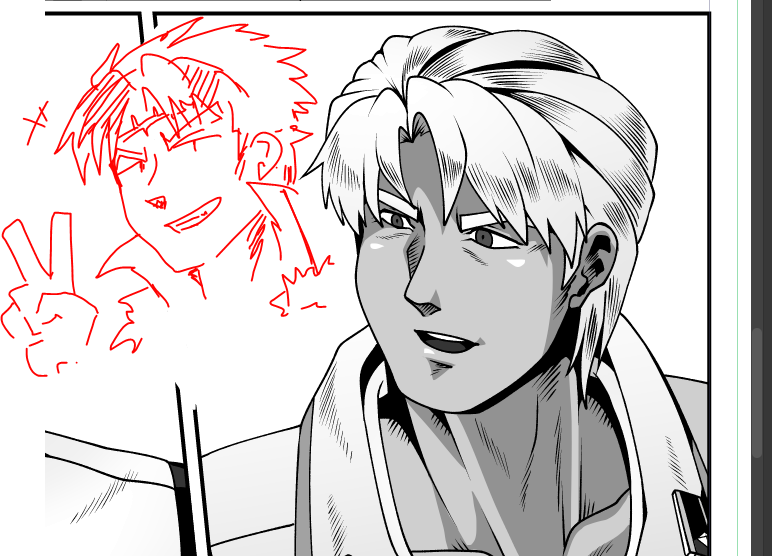
his hair is a pain to draw but at least I had some experience drawing 90s animu vent hair thanks to one of my OC 😇

@ceredolce I guess that's coz I put a bit of 70s dramatic manga style to it but idk
like yokoyama's art style is cartoony but it still looks dramatic.


by adding these rough lines indicating a bump/facet instead of a smooth line/tone
it adds more information and makes it looks detailed and playful instead of flat looking/sterile
... or sumthinlikethat


like for example thunderb0lt or rebellion 083, they have minimal tones shading but their lineworks always pops out
maybe I need to be less sterile with lineart like making it more doodly.
My gripes on my own linework is, they look too digital-clean :(


sometimes I worry a lot that my drawings doesn't look too .... idk , JP manga-style?
weird things to worry but yeah. I always wanted the grittyseinenmanga look but maybe I sorta fail in the department :/


soloing everything orzzzzzzzzzzzzzzzzzz including the tones bg everything arghhhhhhhhhhh