King LJNさんのイラストまとめ
@KingLJN_97Follow @KingLJN_97さんをフォローする
Also: kingljn9x.bsky.social
フォロー数:1401 フォロワー数:130


Fun fact, I attempted to emulate this style in a mockup poster for "The Bowling Alley Cat" and "Happy-Go-Nutty", at least until I found that the poster for the latter actually exists. https://t.co/jJVDllteb4


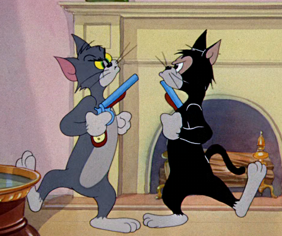
@spacefunkyarp Not the first time the MGM people poked fun at this disease.


The February '48 re-release of "The Bowling Alley Cat" and the September '48 original release of "Old Rockin' Chair Tom" both had the title card with the slightly revised "Tom and Jerry" text. (The shoddy looking image is from a deleted eBay listing way back)


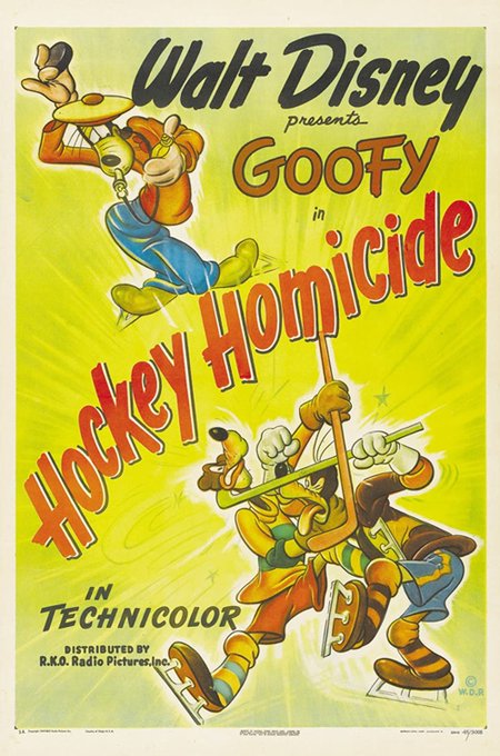

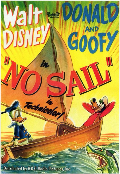

More examples for Disney cartoon posters from after the threshold. The linework got replaced by very heavy shading, the coloring went nuts (Green face galore!) and the layout and character sizes never stayed consistent.


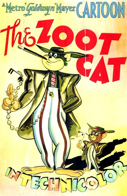
More examples from posters for shorts released before that threshold. Sometimes the color choices are questionable but the linework is still stylized and clean, and overall the coloring never gets too "crowded."