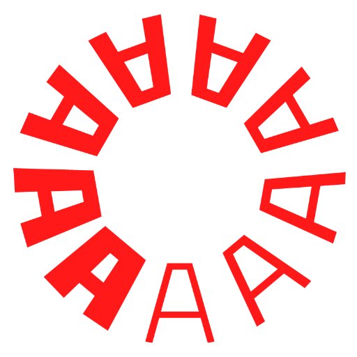
As seen in The Archive Occasional, @typethoughts’s interpretation of David Klein’s lettering is now on @futurefonts as a beta typeface. You can support its development by buying this early version. https://t.co/7Zcw4BvRVt
On Kickstarter, tomorrow's the last day you can pick up a vibrant actual-size facsimile of a print from Jack Stauffacher’s “ma5” series or a bold all-silk pocket square with artwork by Stauffacher — not to mention our beautiful Stauffacher book. https://t.co/WCZ6HF8eTL
Thanks to you, our Kickstarter is now 100+ percent funded! Read about Chuck Byrne's design for Only on Saturday, the wood type prints created for the deluxe edition, and Jack Stauffacher's exploration of the make-ready sheet as graphic form: https://t.co/8TfB3Ir2PW
Roger Excoffon, Choc typeface specimen, Fonderie Olive, 1955. See the entire specimen on the Online Archive. Join for beta access: https://t.co/a126kCJcU2
Jack Stauffacher’s “ma5” prints from the late 1960s broke new ground by exploring inking, layering, rotation, and shaping negative space with letters. Join the campaign to help us publish and preserve Stauffacher’s boundary-pushing letterpress prints: https://t.co/ppvChNrcKk
@michaeldoret, Title exploration and title treatment sketches for Wreck-It Ralph, 2011 and official poster for Wreck-It Ralph. Read more about Doret’s work for Disney and Pixar: https://t.co/L1JFsSE8BN
Tomorrow night: Join Sabiha Basrai for a presentation on Oct. 15 @sfpubliclibrary about the campaign graphics from worker-owned co-op & union shop Design Action Collective. More info: https://t.co/VuZKf6RiZG
Susan Skarsgard, 26 of 26: An Edition of Twenty-Six Alphabets, 2009. Explore more calligraphy in the Online Archive. https://t.co/RlRAsmMSoJ
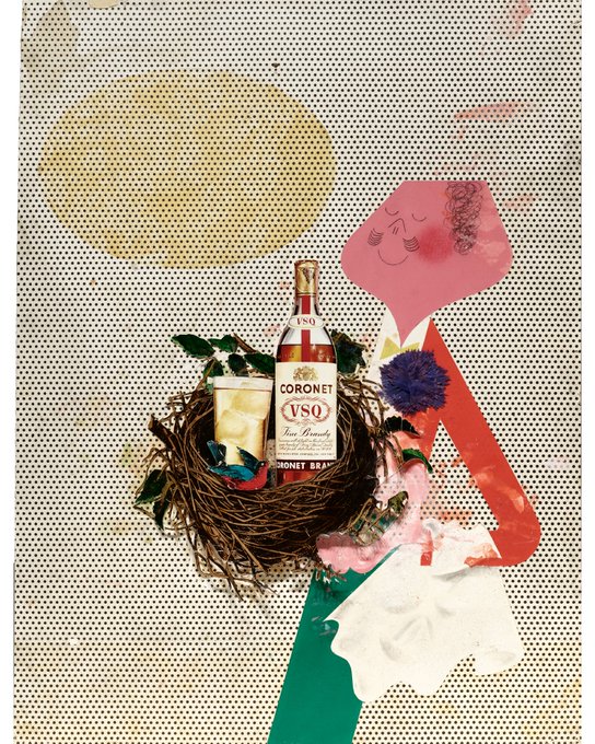
Paul Rand, two ads (pasteup and final) for Season's Best: Coronet VSQ brandy, 1945. Read about our collection from Rand’s archive at https://t.co/MaN57yYTFY
Het Overzicht No. 13, Belgium, 1922. Read more about Het Overzicht : https://t.co/b9dhp2xkgr


