Mutuals, comment with ❗️ and I’ll give you a theme (later...also maybe I'm tired)
The theme given to me was favorite horror media made before 2000
Society (do not look this up just watch it blind trust me)
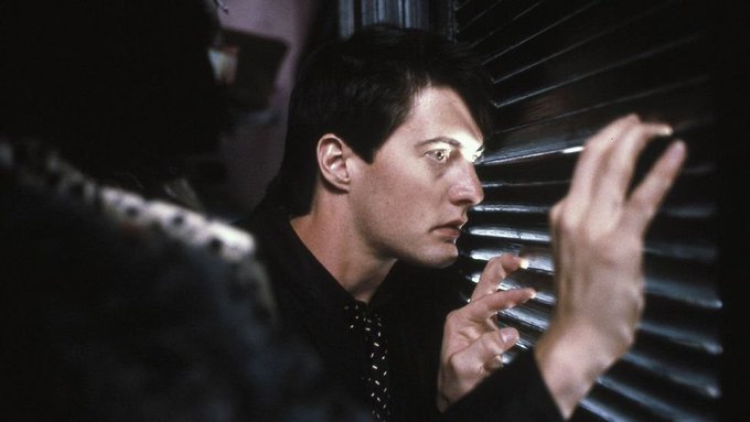
Blue Velvet
Silent Hill 1
The Silver Case (originally came out in 1999) https://t.co/gEvrBsGqZy
DID THIS DUDE COMMISSION CUTE LITTLE JANITORIAL UNIFORMS W A CUTE LITTLE ICON OF HIMSELF AS A FOX FOR HIS FAKE CLEANING SERVICE
It could not be clearer to me that they didn't care if something looked vague or unclear. They stuck to Masahiro Ito's designs even if they looked like this and as a result the 3D models are absolutely iconic. Don't sacrifice the core of your vision in translation.
Original art by Ito, the ingame model and a reimagining by oddjorge on artstation.
Now I'm not saying that reimagining is bad, it's very well done- but personally, I think making the design that explicit and clear also makes it lose something. In contrast, here's some Bacon
I have some work to do before I really delve into this thread but I will start with one point that really eats at me...
I feel like when a lot of people attempt an SH2-like they don't push the enemy designs enough in terms of abstraction. Abstract Daddy is a perfect example.
We also talked about Drakengard
When you're having a great time in the sequel and everything's fine : )
@beakfriends Have you played Mystery Room? Because I was surprised how much I liked that one. Really loved the contrast too, of Alfendi Layton (slovenly, possibly lying about his upbringing, weird personality issues) and Layton (gentlemanly, kind of emotionally checked out)
What if
You really wanted Ogata keychain
but Mamegyorai shipping prices said-
@HECKSCAPER me about to end this man's whole career and steal his girl


