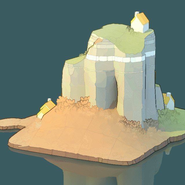
An early look at grass billboards. I really like how they add a completely new kind of shape and detail frequency.
I always write my own lighting solutions. I've had some really naive ad hoc color bleeding in my (very fake) GI before, but this is my first decent attempt to actually have the light *bounce*
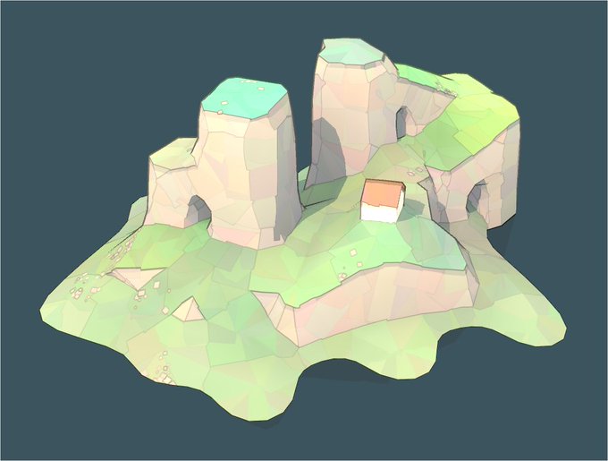
Obviously, it's all tile-based. I went through a major rewrite to combine an irregular grid (like in Townscaper) with multi-cell tiles (like in Bad North). Note how one of the house tiles even cover both a square tile AND a triangular tile
Hmm. I think, as usual, my subtlety is holding me back a bit. Looks even better with higher contrast between the grass colors.
Rain runoff simulator. Should help with figuring out what vegetation goes where. (The debug lines are based on where the water hits the sea)
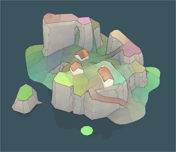
It can also be used to paint streaks (shown with random colors in 3rd picture). Perhaps iron-y rock sediments could leave rusty trails?
The beginnings of hedgerows. Nice to get some smaller scale detail in there. Also obviously a very contextual way of making the tiles more readable.
I really need some better beaches though. It looks weird when they just trail off like that.
I've spent like half of today trying to fix a precision error that was actually a NaN error. The other half I've spent hitting "regenerate" over and over
This kid of soft colors and crisp lines art style is incredibly convenient for game design. It's readable and It's very easy to adjust how much visual focus something should crave by simply tweaking the frequency and opacity of lines.


