Scooter 👽さんのイラストまとめ
@burrito_babbleFollow @burrito_babbleさんをフォローする
💖@wraithcanid 's little creature💖
フォロー数:475 フォロワー数:365

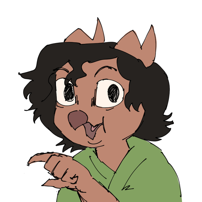
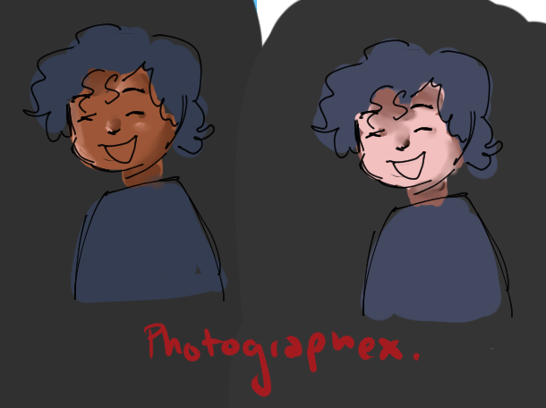
@ArcaneSunku @inaire7771 i see, what op is referring to is when artist do things like this. its all color picked and the same exact hues and values. however they are not placed correctly on the model. going back to the photograph we've been referencing, do they look like this?
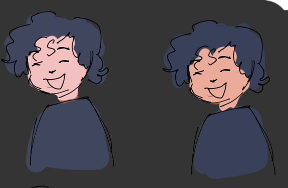
@GerantBiosteans @lupusdaemonis heres how it looks if i color pick from each photo's high value

@GerantBiosteans @lupusdaemonis nope the original color circle actually just picked from a high value in the photograph, if we select from each pictures midtones he actually looks like this which is pretty accurate since he is slightly unsaturated and a tad overexposed
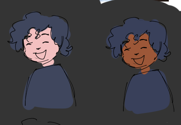
@GerantBiosteans @lupusdaemonis let's take it a step further. the same value and hue of navy is actually in both pictures in the photographs we've been observing. i color picked the original two color circles and put them against the nearly identical navy blue. is this really what the photos look like to you?
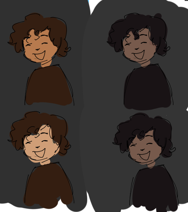
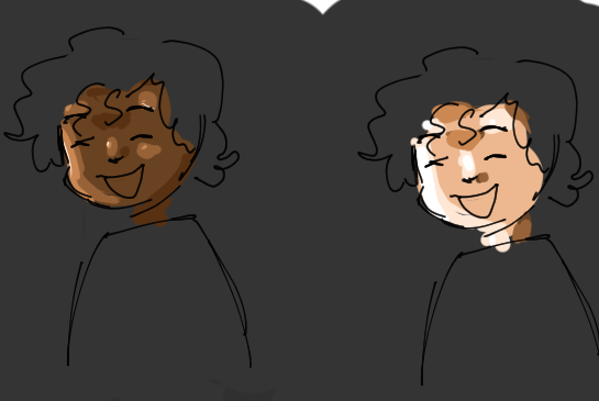
@GerantBiosteans @lupusdaemonis well duh. your eyes rely on context lets say i wanted to draw a character in shade and then in sunlight, which of these illustrations still read as the character being tan in the sun and in the shade

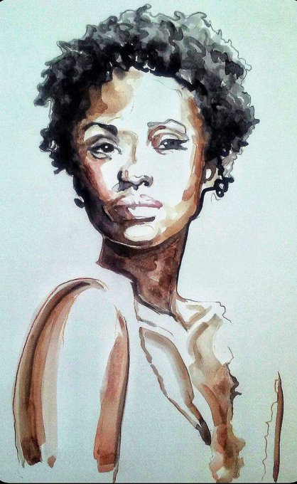
@SanjiDandelion Read my thread on values again for the color style argument. I would also recommend you read up on chroma in art. Water color can also be just as vivid and can be used with proper technique so that's never an excuse.