
Nacho Carretero Moleroさんのイラストまとめ
@carreteromoleroFollow @carreteromoleroさんをフォローする
フォロー数:3286 フォロワー数:7642


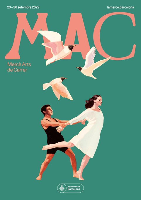

Los carteles adicionales de #LaMercè2022 no se quedan atrás en belleza, preciosa la combinación de color, imagen y tipografía. Indica @nchpdll que el diseño gráfico es de Arauna 131, con tipografía original y arte de David de las Heras. Estoy in love.


Loving how Australian photographer @lolahubner_ uses colour and composition to create striking shots. Spectacular stuff.
—
https://t.co/DE1X9nq4CI


Digging the work of British illustrator Peter Greenwood 👌🏼
—
https://t.co/kCvuihwmrw

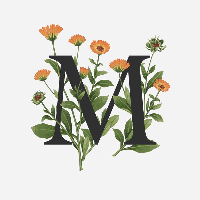


I just fell in love with this illustrated alphabet by British artist @CharlottePaints, each one depicting an edible flower. 🌺🌼🌸
—
https://t.co/gC7rAqNcmX

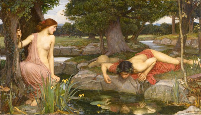
Harry Styles fotografiado por Tim Walker (2022) / Echo and Narcissus de John William Waterhouse (1903).


Few photographers observe the male body with quite as much elegance and grace as Michael Oliver Love.
—
https://t.co/gphIuiOTVr


Si os gustan los clásicos de cine os encantará el curro de la artista francesa Flore Maquin 🎥✨
—
https://t.co/pwj2RiTRhl


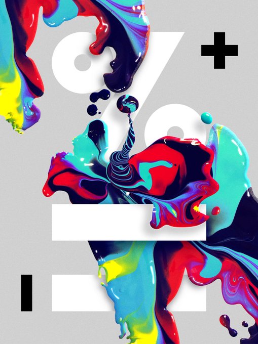
Qué maravilloso exceso esta tipografía del diseñador Adam G. Incomprensible pero bellísima.
—
https://t.co/2NbC4zvO9G
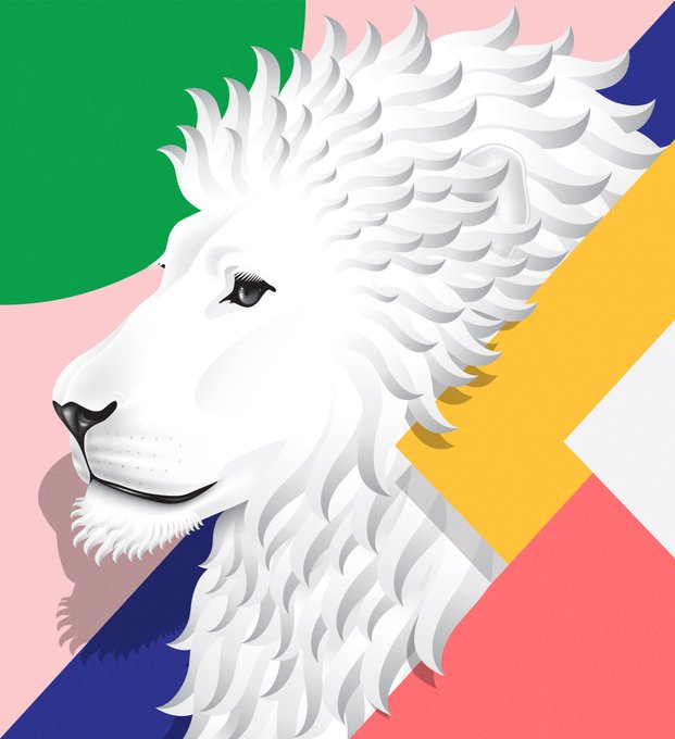
Spanish graphic designer and art director Vicente Morillo 🔥
—
https://t.co/qsBXmAjcmH