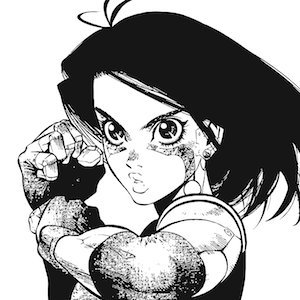
The sisters don't even match at all. It feels like putting Third Strike sprites next to Alpha 3. The new stuff feels very "standard anime art" whereas Alex Ahad's supervision always brought something outstanding to every pose and animation. You can't replace that raw talent.
@MetroidFREAK21 I’m partial to the Orange from ZM and the silver from Smash.
As for Dread, the slimmer, blue one is what I prefer. Not as big on the bulky suit designs or giant shoulderpads.
Out of the “Normal” suits, I kind of like the lean, flat shoulderpads look of a good Power Suit.
@GoldenTokenZone @kaiiteaa If Sonic was real and one of your friends was dating a Sonic character, would you support their relationship?
@CryoJakobFrost @IDWSonicNews @Ls1389 It’s pretty clear how the sprite looks when you actually look closely. Comics getting it wrong is just another mistake on the board for them. They used to get Robo Sonic’s eye wrong all the time and draw him with two irises.
@star_keaton @MegaManMain They’re pretty tall tho. I think the 8 art edges out slightly. Either one would be a missmatch for the way megaman himself looks, tho.
Figured I needed to practice Kol’s anatomy because she’s got a funny monster shape. (I try to keep it pretty tame TBH. Not really interested in drawing anything on her ‘nekkid’ that I wouldn’t draw with her clothes on, anyways.)
@Biostar123 @fronkus123 By moving the establishing shot to be what the characters are visibly running towards, you can use the path of the reader's eye across the page to lead them to that panel and then carry the momentum of the first panel into the third to add a kinetic energy to the page read. (2/2)
@Biostar123 @fronkus123 it's not about just words, layout problems can effect speechless action, too.
These three panels here read kind of dull and feel more like storyboards on a comic page. I've provided a simple edit that I will go over in the next post. (1/2)


