I'll be at Lightbox Expo this morning sharing Lessons I've Learned from Splash Art.
If you can make it, I hope I get to see you there!
✨
One more #snowmoon #fanart, this time it's Karma with an eerie feel to go with all the dark, ritualistic themes.
❄️🌙💀
#leagueoflegends
#SnowMoon is such a beautiful thematic. This is a lil #Elise the spider queen #conceptart I doodled, with a coat made of frosted spider webs.
❄️🌙🕷️💎
#leagueoflegends #fanart
Lil #Repost since it was deleted with the hack -
My Ranboo fanart from earlier this year, when the minecraft / content creator fever was all consuming
'Infinite Cake'
#ranboofanart
The way value contrast is arranged in an image also supports the depth and readability of the space. Higher contrast will tend to come forward to the viewer, lower contrast will recede away from the viewer.
Along with values - the whole range of tints and tones - contrast is very important. This is about how the values are arranged in the image - areas of high contrast (very dark + very light) draw the eye, areas of low contrast (similar values) are restful
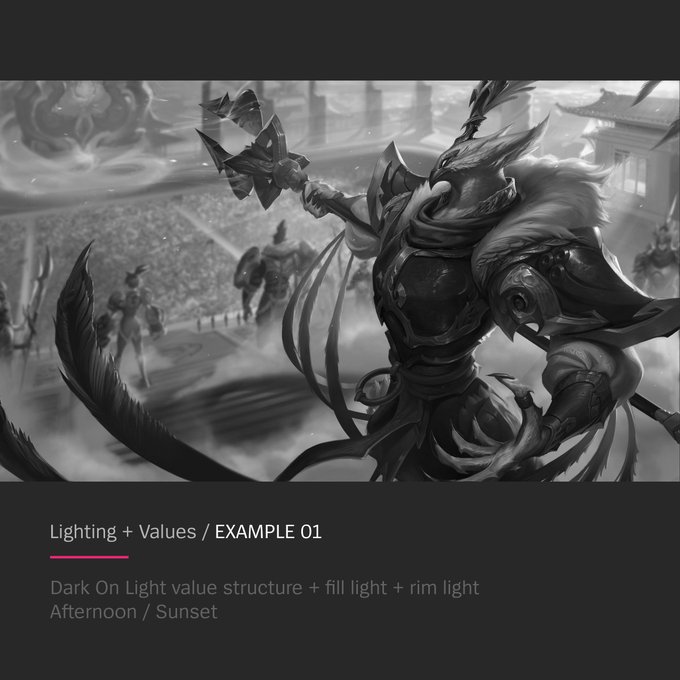
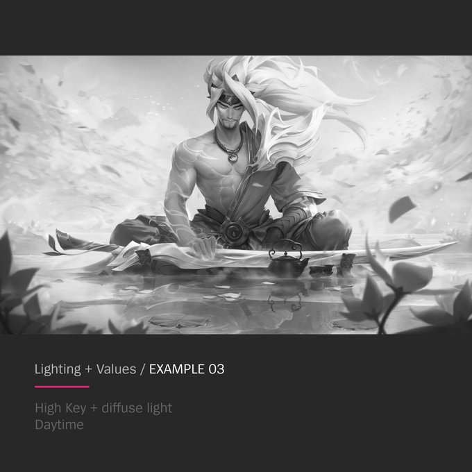
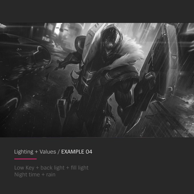
And some examples of how value structure + lighting combinations + time of day are combined into one splash image.


