Here are a handful of helpful value structures - these are common frameworks to enhance clarity, theme, mood, tone and focus the viewer's eye.
Dark on Light
Light on Dark
Contrast on Midtone
Low Key
High Key
2. Save time to resolve the Detail Frequency. I STILL go too far when I paint, so in my polish / post fx time, I make sure to step back and look at the whole image. I use tools like the smudge brush and blur filters to push and pull the balance.
Some helpful suggestions for mastering Detail Frequency:
1. Paint small - to literally stop myself from getting too noodly too soon, this is the same splash at actual size, left is ~2000px wide. Right is render time, scaled up to ~7000 px wide.
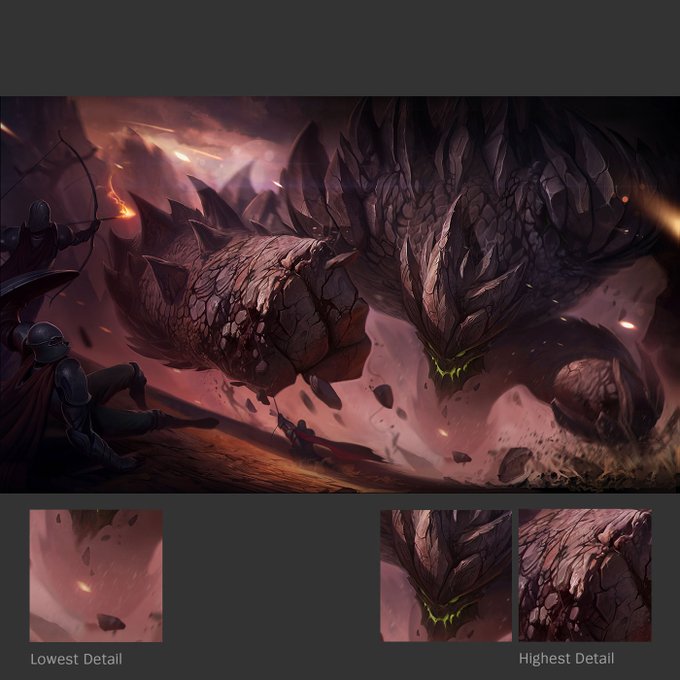
With that basic structure in mind, I think it's easy to observe in splash art style how much detail frequency and material contrast is invested into the focal areas - usually around the champion's head and source of power - in this example, Graves's portrait and his gun.
Splash art aims for 'cinematic believability', and controlling detail frequency is one way to get there - consider the illustration a camera lens, use ideas like depth of field to keep some areas blurred and others in focus.
More about camera lenses: https://t.co/qEO9bsn8ls
One more, cause I really like fanart...
Original - Fanart
#StevenUniverse #stevenuniversefanart


