
Karim Douïebさんのイラストまとめ
@karim_douiebFollow @karim_douiebさんをフォローする
フォロー数:859 フォロワー数:12523


This charred shape represents the spread of a specific wildfire that happened last year in New Mexico. The height of the volume corresponds to the time dimension: the lowest point is where the fire started.


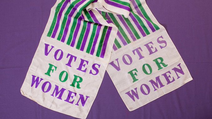
Side note on the colour choice: The purple/green combo was used by the Suffragette campaign "Votes for Women". This couldn't be more appropriate given the subject of the article. Thanks @lisacrost for the recommendation, more on colours for gender data: https://t.co/rFEcsaWwg1

The artist Matt Furie, creator of pepe the frog https://t.co/uaaWVHBMYj


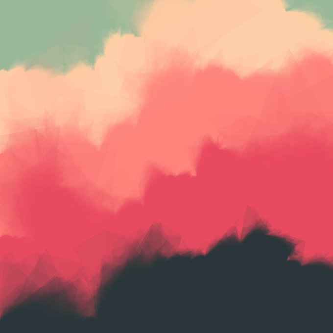


I've stumbled upon the talk "How to Hack a Painting" by @tylerxhobbs He is describing a simple & clever way to emulate water colour painting. I had some fun creating a few pieces using his technique🎨
@observablehq notebook: https://t.co/JEMMDhuriL
Talk: https://t.co/cfwo7T2gGo


👩⚕️🧑⚕️🏥 La fatigue des MACCS. Quatre enquêtes dévoilent la pénible formation des médecins assistant·es
J'ai eu la chance d'analyser et d'illustrer ces témoignages pour @Medor_mag en collaboration avec @JoieCatherine, @q_noirfalisse et @jetpackAI
➡️ https://t.co/DRe4bl9VWL


@GroupeLaPoste organised its 5th internal seminar on Data & AI. I had the opportunity to showcase how @jetpackAI uses #dataviz to bring awareness about societal issues: "Dataviz, it is also about love ❤️".
I've also got my caricature done for the first time, courtesy of @rayclid


Discovered the #Collatz conjecture in an episode of @numberphile https://t.co/UemlbiwRhh
Gave it a go by highlighting the prime numbers in the usual tree rep. No pattern. Switched descendent nodes when prime. No pattern. Giving up. Mystery unsolved.
🔖 https://t.co/tJnQzaNvL4


I wrote a data visualisation essay about Brussels and its diversity. https://t.co/TMwK5peDAo #Brussels #Europe #immigration #diversity #dataviz