Lonelyさんのイラストまとめ
@lonely_hehehFollow @lonely_hehehさんをフォローする
フォロー数:392 フォロワー数:43585


Here are his other "early teams" from OS [Kanto and Johto], AG and BW.
Kairyu/Dragonite is one of my all-time favorite Pokémon, I'm happy that Satoshi has one


@HyperGogitto I also prefer the hair with less details, it has a nice, smooth texture. Each "chunk" of hair used to have a mixture of curves and angles which gave them that wavy look. Nowadays it feels like a bunch or horns or spiky bananas


@starflash24 Yeah... Toriyama started to draw his male characters with huge Superman chins after a while. He also drew the nose and the mouth a lot higher too
@nobody661 The Boo saga in general feels too detailed for my tastes. Android and Cell saga Yamamuro was really balanced, he only added more shading during close-ups. But during the Boo saga, it felt like he always needed to add a lot at all times, it didn't feel special or impactful anymore


@Nightwing69Isse He did, but I didn't really want to count it, since it's his kid version


@color_db Sus correcciones suelen ser bastante radicales, en especial en los Saiyajin, así que las considero como redraws, usualmente terminan viéndose más como un dibujo suyo


@MarsFlamin15 @Papa_Nitz Sure, here you go. These are the covers for the anime comics, they were drawn by Katsuyoshi Nakatsuru


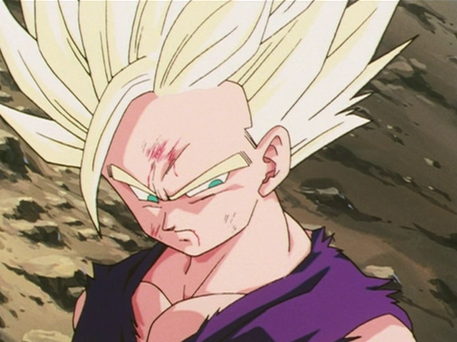
His eyes got too square and they stopped raising his eyebrows near the end of Z. That really limited his ability to emote, he just looked angry most of the time.
Super's approach looks even more straight and dull. The movie made it better, but it still wasn't super expressive