Here’re some hook ups to the apartment and a nice spread for the awkward family dinner
This set was tough to do after having such a string of bold, colorful cityscapes, toning it down on purpose was counterintuitive to me.
As an Art Director, you find that you work with artists more than artwork.
Your crew is everything.
Then you find out you gotta hire more than just designers or painters.
You need:
- Specialists
- Shapeshifters
- Mechanics
- Architects
- Wizards
🤔 HUH???
Lemme explain:
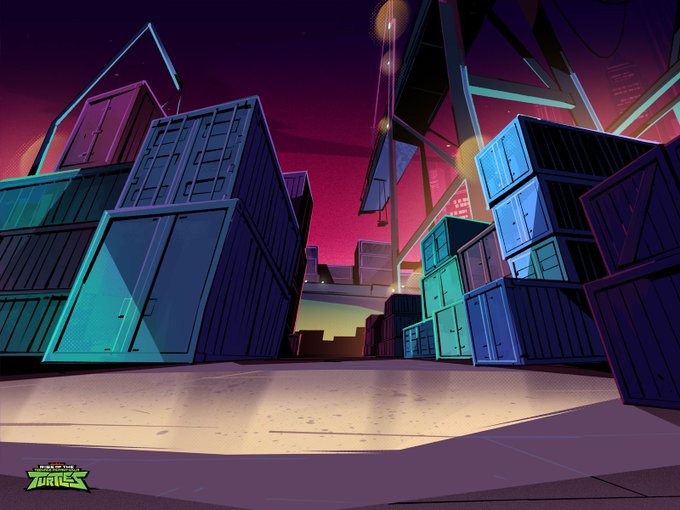
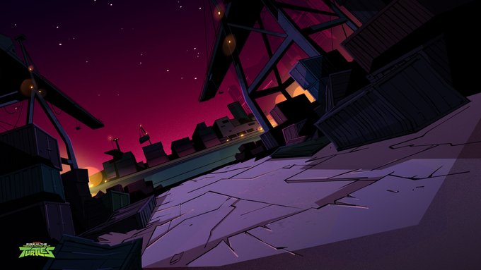
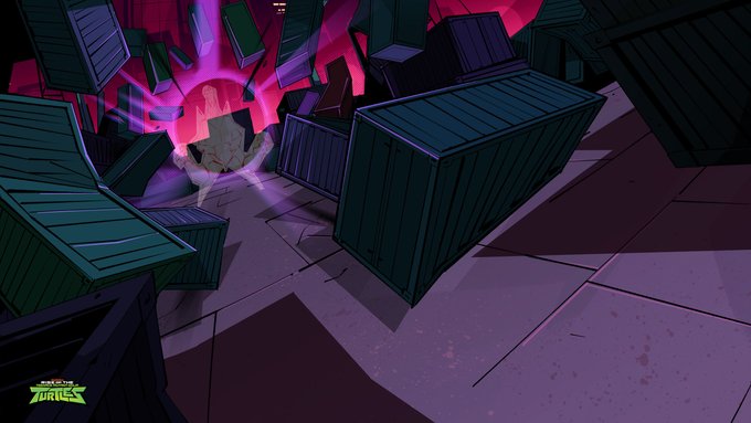
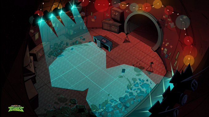
With this episode we wanted them to feel like they were in constant danger with Shredder around, so we kept the sky color red magenta throughout the ep.
The Ship Yard becomes the epic battleground and the turtz throw everything they got at the Shredder. Even a ship:
That was one of my fav bottle episodes. It was fun, and a bit "lighter work" in between some crazy tentpoles. (BGs from those comin up!)
Excellent Credits: Excellent BG Designs by Angelo Vilar & Ben Lee
Next up there’s a showdown in the kitchen where the Leo and Donnie balance everything in the fridge on their chins 🤣
This one I wanted to keep simple enough considering all the little bits going on around the kitchen that could catch your eye.
So 2ish colors, brick and cyan.
@avemeoutofit Yup it was my first artist gig!
Stoked that it introduced you to the awesomeness that is TMNT 🥹
I was able to help with concept paintings like these:
Here are the rough sketches I started out with.
First up was Squirtle and that one set the tone for the rest of them.
Here's another throwback to some prints/buttons I made years ago of the OG Pokemon starters + everyone's fav electric rodent.
(Pokemon Blue Cartridge ftw)
Some behind the scenes below 👇
Animation is a collaborative medium, so process is key.
If you have a clear, proven process, that means you have a way to the finishing line no matter what.
And that clarity creates flow for the next part of the pipeline.
That's what I felt I needed to work on.
