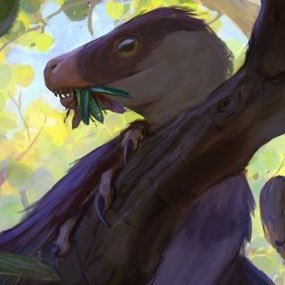
Here’s a gnarly monster I got to design for the short film “Milk Teeth”. Huge thanks to Felipe Vargas for bringing me into the project; horror art is something I wanna try to dip into more often, and the chance to do it professionally was a dream!
Same thing for the tables. Ghosts were added in on a normal layer, then duplicated, and the bottom layer had Gaussian blur applied to get that glow. After that, light influence from the ghosts was added to the environment. Final touch was some noise and color adjustment!
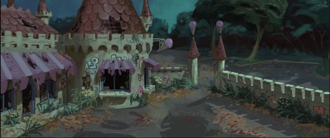
Some process! This was as tight as I went with my line drawing, as I resolved to figure out a lot of things in paint. This meant constantly checking with a 2 pt perspective grid. After the architecture was painted in clean, I got to have fun and grunge things up!
My good friend @tyagoodwin just launched his book project, “Pale Raiders”! It’s filled with some clever and original ghosts being fashionably spooky. I made this painting to celebrate- the designs are all him, I’m just the nerd who painted the scene! #spooktober #paleraiders
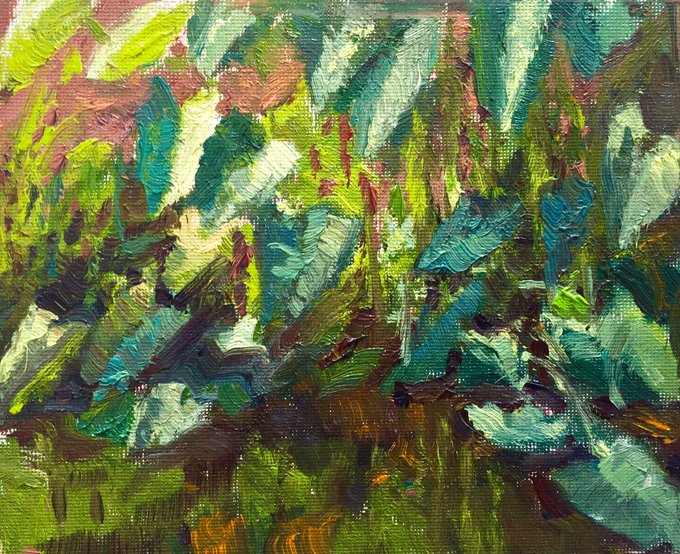
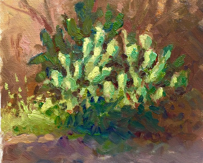
And some close ups! It helped as well to only use one big flat brush- there’s a wide variety of marks you can make when you have to get inventive with limits! #oilpainting #outdoorpainting
In the spirit of the month, I’m going to aim to do some spooky paintings as practice to try new workflows and approaches! Here’s one inspired by a happy accident with a bright red underpainting 🦇 #environmentdesign #visualdevelopment #spooktober
@animationjobs Thank you so much for your generosity in running this thread! I’m currently available for freelance work or in-studio work in LA; I specialize in environment and lighting design, model packeting, and storybeat painting. Also, my sites https://t.co/EG3rxPS7mR!
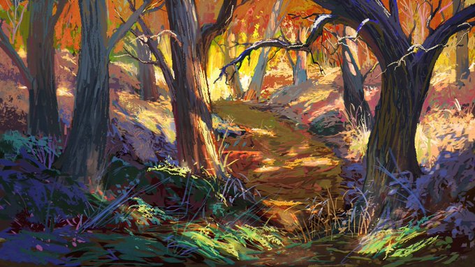
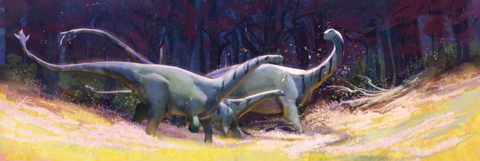
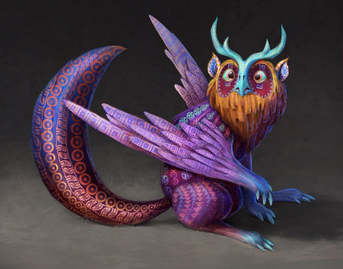
I felt I was more of a range from stylized and graphic to painterly and more realistic. Looking at all these together though, it’s really “did I have a game plan or did I slap layer modes together in a panic until the image looked decent?” Either way it’s #4styles
@Brynn_Metheney Eyyyyy~ not sure if my works exactly what you’re looking for, but stylized environments are my jam!
