Apparently there's a #batober concept running on social media. I suppose any excuse is good for drawing more Batman 🙂 So here we have a classy 1940s Batman, using his traditional English boxing against Bane🦇🥊 #Batober2021
I never got to share this on Twitter so… Happy (belated) #BatmanDay #BatmanDay2021 🤷🏻♂️🦇🦇🦇
For some reason, this week a lot of illustrators have been sharing their ‘sketch vs final’ process, so here’s one in three steps 🙂
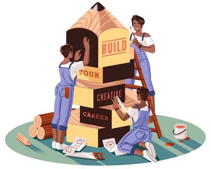
This super optimistic illustration is part of an example project for my #skillshare class ‘Typography & Illustration’. It introduces typography in a practical way, giving some tips on how to integrate it into your regular work as an illustrator. To be published this week ✏️
@ChrisRukan Hi, Chris! I love people, characters interacting in a light-hearted way, especially if they do it around a cultural, literary or humanistic theme. Thanks! https://t.co/AmoBOA3hrv
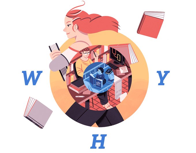
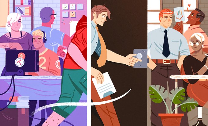
Number 4: an illustration I made for @tannerc on working at @Gem_Software. Used on a beautifully written Medium article. 9898 views (in 2,5 months).
I've tried to combine both approaches, with a first selection of images followed by some thumbnails directing to full cases. Many of these first images are in fact part of those cases. The problem is that access to them is somewhat invisible and late.
I am especially happy with some of the minor characters in the story, perhaps because there was less (self)pressure to represent them in an interesting way.
I really became very concerned if all this generated an excessively pop aspect that could conflict with the narrative style itself. Finally, we thought it was adequately complementary.


