448 years ago today, 20 May 1570, Abraham Ortelius from #Antwerp published "Theatrum Orbis Terrarum". This first modern atlas had 53 maps. Historically important enough for google to feature the event (which is also my birthday) on its home page. Source: https://t.co/65jHm9hq4I
#Map shows how Scottish Gaelic #language declined in Alba (Scotland) over 110 years. Source: https://t.co/wVseHz40hy
Roman geographer Pomponius Mela created this world map (very Rome-centric of course) in about 40 AD. 2000 years later Reddit user CountZapolai overlays modern country borders on the old map. Clever and good fun to look at. Belgium is sooo big! Source: https://t.co/QlEyOzxLMU
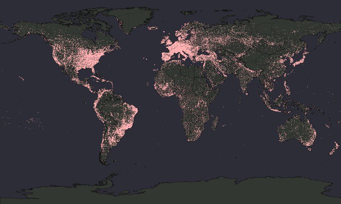
#Map shows all known FM radio transmitters in the world. A proxy for population distribution that overemphasizes regional and remote outposts I’d say. I somehow really like this map. Source: https://t.co/lh7ZY9Livy
#Infographic show the sleeping habits of various animals. #Dolphins put one half of their brain to sleep at a time. #Giraffes almost don't sleep at all. #SeaOtters hold hands while sleeping. Source: https://t.co/6wKV6Z0AOM
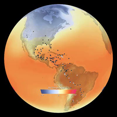
#Map shows #bird migration patterns in the western hemisphere. Beautiful to watch. The article points to https://t.co/6lvEYDyzs8 which is a super cool citizen-science project collecting bird data. Source: https://t.co/n8W9w7MPgL
Awesome #dataviz shows all 23 languages with over 50m native speakers and the countries where these languages are spoken. I think it's funny that #Austria is missing in the German section. Great piece of work though! Source: https://t.co/Yi17uPSGCg
This natural experiment started in 1992 when three shipping containers lost about 30,000 rubber ducks in the middle of the ocean. Over the years the ducks were sighted across the globe allowing scientists to better understand ocean currents. Source: https://t.co/0auK09zVxT
I’m genuinely interested if anyone knows a country where the population density #map is more descriptive of the local #geography than in #Egypt. Source: https://t.co/7J1lWDEPNv
#Map compares climate in #Europe and #Asia with the #USA. Good fun. Source: https://t.co/74WW85WsYu


