FontSundayのTwitterイラスト検索結果。 152 件中 6ページ目


.@DesignMuseum’s #fontsunday is fonts from 90s pop 🎶 — @MTV logos from the 1990s

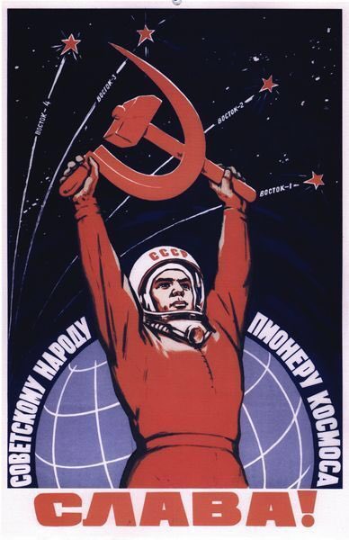
Soviet space program poster. @DesignMuseum #FontSunday #WorldSpaceWeek #design #psoter #soviet #cosmonaut

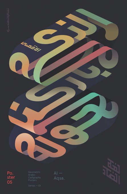

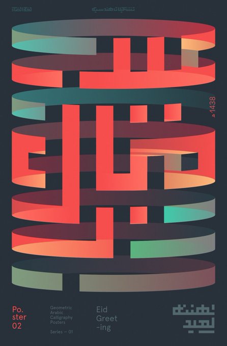
Arabic typographic posters by Mohamed Samir @DesignMuseum @wayneford #FontSunday #NonLatin


Thanks to all who have posted and followed this hand-painted fonts themed #FontSunday and to guest host @better_letters. The signwriting theme continues in London this week with #LondonLetterheads at @OXOTowerWharf
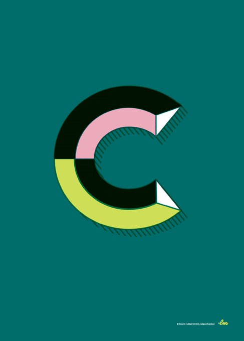
Pictured: C by Harry Fieber (@utilestudio)


#FontSunday @DesignMuseum Personal recreation of three letters from signs in Barcelona and three from Manchester designed by @laurameseguer
Absolutely adore her work #typography


#FontSunday Some great examples of exclamation marks on vintage matchbox labels. #punctuation @DesignMuseum @nikki_vz


#FontSunday 'The Case For Retiring Our Most Overworked Four Letter Word' which featured in the first issue of Avant Garde Magazine – January 1968. Design by Herb Lubalin. @DesignMuseum @nikki_vz
#Design #Punctuation #Type #Typography

Map love for @DesignMuseum #FontSunday - a vintage Japanese matchbox label


The Character of a Coffee House... Maps of London & Beyond #AdamDant #FontSunday @DesignMuseum @thegentleauthor

Tomorrow's #FontSunday is dedicated to all things #WorldCup- send in your favourite examples from noon!


Michael Gilette’s amazing Bond girl silhouettes, for @PenguinUKBooks 2008 re-issues #FontSunday @DesignMuseum

Poster for Getxophoto Photography festival created by @ISCreativStudio #alaia2018 #FontSunday @DesignMuseum @GETXOPHOTO


Yes logo - first Crosby, Fletcher, Forbes 1969 and second @_rogerdean 1972 @DesignMuseum @Creative_Entrs #FontSunday


Here's great set of numeral-shaped pens by Philadelphia's John Story for @DesignMuseum's #FontSunday celebration of numbers.


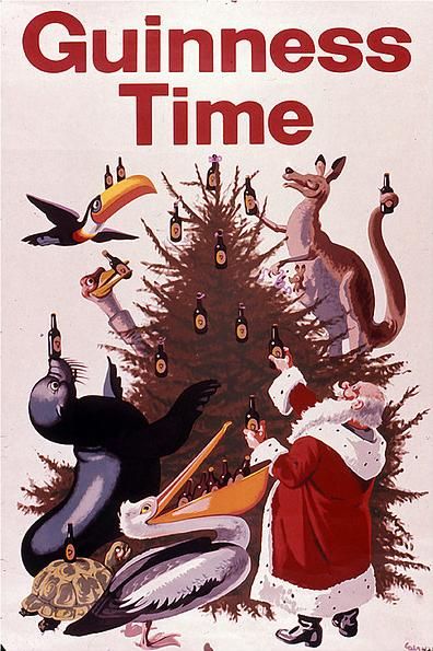
#FontSunday Lovely Festive Paper Illustrations by Paper Artist & Illustrator Yulia Brodskaya #design #art #illustration #Christmas @DesignMuseum

Thanks for all those who took part in today's #FontSunday | Explore the origin of the '80s aesthetic in this great video from @voxdotcom featuring #beazleydesignsoftheyear guest curator, Glenn Adamson https://t.co/LGZ1jK28Cj

