FontsundayのTwitterイラスト検索結果。 208 件中 7ページ目
Typeface for Nike, made of curled up wooden strips designed by Txaber
.
.
#FontSunday #WoodCarved #MakingMemory #physicaltypeface @DesignMuseum
Hand-carved wood Display font - Great Forest.
Tourism British Columbia’s brand identity by Gabriel Lefebvre & Rachel Lecompte / Canada
.
.
#FontSunday #WoodCarved #MakingMemory @DesignMuseum
ooo! @DesignMuseum has #fontsunday 💕🧀 this is one of my favourite cheese designs... a fairly simple font but tricky to mimic in a sketch #CheeseLoversDay 💕🧀 i did the sketch for my #100daysofgroceryart for #the100dayproject last year, i do love exploring grocery stores
C.F.A. Voysey's design for a wrought-iron hanging sign for Percy Heffer / Messrs. Heffer & Co's wallpaper showroom, 64 Berners Street, London. c.1902 #fontsunday @DesignMuseum @VoyseySociety Via @V_and_A collection
.@DesignMuseum’s fonts on calendars #fontsunday — Typodarium 2019, found via @slanted_blog
The Bix Beiderbecke Story - Volumes 1, 2 & 3 (1950 - 1952) @DesignMuseum @Dazarbeygui #FontSunday #Vinyl
Type-cycle from motion designer Marcel Piekarski @MarcelPiekarski #mechanical #FontSunday @DesignMuseum
"I always used one word to make an image, a kind of image-based typography." – Wim Crouwel
'Soft Alphabet' Concept Grid & Poster designed by Wim Crouwel for the Claes Oldenburg Exhibition, @Stedelijk Museum 1970.
#FontSunday #Design #HomeFutures #modularfonts @DesignMuseum
.@DesignMuseum’s #fontsunday is fonts from 90s pop 🎶 — @MTV logos from the 1990s
The Qandus Multiscript Typeface Family (Arabic).
@DesignMuseum #FontSunday #NonLatin
Arabic typographic posters by Mohamed Samir @DesignMuseum @wayneford #FontSunday #NonLatin
Thanks to all who have posted and followed this hand-painted fonts themed #FontSunday and to guest host @better_letters. The signwriting theme continues in London this week with #LondonLetterheads at @OXOTowerWharf
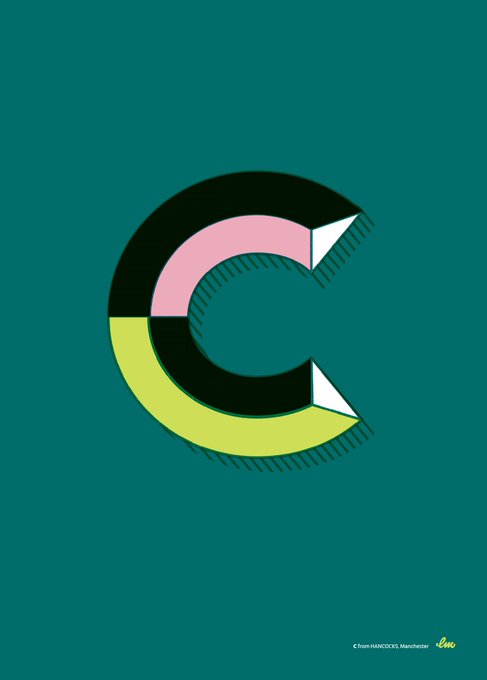
Pictured: C by Harry Fieber (@utilestudio)
#FontSunday @DesignMuseum Personal recreation of three letters from signs in Barcelona and three from Manchester designed by @laurameseguer
Absolutely adore her work #typography
#FontSunday Some great examples of exclamation marks on vintage matchbox labels. #punctuation @DesignMuseum @nikki_vz
#FontSunday 'The Case For Retiring Our Most Overworked Four Letter Word' which featured in the first issue of Avant Garde Magazine – January 1968. Design by Herb Lubalin. @DesignMuseum @nikki_vz
#Design #Punctuation #Type #Typography
Map of Ansonia, Connecticut, published by the Sanborn Map & Publishing Co.
Source: https://t.co/oVL5NidGWK
#FontSunday @DesignMuseum
Map love for @DesignMuseum #FontSunday - a vintage Japanese matchbox label
The Character of a Coffee House... Maps of London & Beyond #AdamDant #FontSunday @DesignMuseum @thegentleauthor
Tomorrow's #FontSunday is dedicated to all things #WorldCup- send in your favourite examples from noon!


