implicityのTwitterイラスト検索結果。 2,177 件中 73ページ目
9th colour scheme #icon set! <3
Characters: Aurilija, Dax, Raphael the Robin, Aster
I love the simplicity and contrast on Raphael. One of my new favs for sure!
Dommen Norov, a name I came up with on the fly, as with all names in this series. Very happy with this one despite its simplicity, because it's still pretty faithful to the sprite, while also using the blank space to just do whatever.
#Spritedraw
People that inspire me: @breadzki
Jernej, a Slovenian #illustrator and #entrepreneur I met approx 5 years ago. His life philosophy is based on #trust & #generosity, his is calm & paused. He enjoys beauty and simplicity. All qualities I'd love to develop
https://t.co/NLfvaTXSqa
Daily of August 16th
Tired and exhausted today and anxiety is being an annoying bug bear. So sorry for simplicity, just some toying around with filters and colours.
@kristaferanka Its one of my faves. That & some of the other animated design type things you did have been really inspiring, w/ the way they balance simplicity for animation, but also distinction & "flavor", for lack of a better term, haha. Can't wait to see what you've done for Spider-Verse 2!
Alright, a #dtiyschallenge issued by @babbidraws. My entry for her #babbi1000 is this. As an artist who is for simplicity, the dress scared me. But I persevered and managed to create this beautiful piece. I hope ya'll love this. Also, have the sketch to see the transformation.
Googled my name. To see which of my illustrations appeared first in the search. Randomly, but very pleasingly this cracker of Danny Welbeck. Always liked this picture, particularly the simplicity of the shape to denote his hair.
😍💕
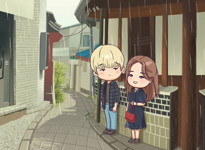
2020812 Repost, FanArt By
@ carmenmirelasava :
“~ 1st date ~ 🖤
#flowerofevil #everybodyloves #chibiart #jg #2020jg❤️ #justgolove❤️ #mcw #loveislove #kdrama #foe #psycho #simplicity #악의꽃 #이준기 #still #drama”
https://t.co/FYNQG47u1X
New art incoming!!! I'm super super proud of how this one turned out despite the simplicity on shading and such- one of my friends suggested to change up my lineart so, I did and I'm extremely happy with the results!!! Hope you guys like it too ^^ #wilford #darkiplier #trapped
gladegar in flat color.
honestly i'm not a fan of pulling headcanons out my ass but i tried my best to used evidence for his pre-morde appearance.
-for the sake of simplicity it's pre-morde, but not affected by glade magic. i'm guessing that's why lulu is purple/green idk lol.
💫 Hipster Namine 💫
It took me a while to finish but is finally done and I love the simplicity of it!! I will be making this piece into a print but still deciding on the print size lol
#kingdomhearts #namine #キングダムハーツ
simplicity is the glory of expression #4bttd #portrait #popart #fanart #Pieceofart #digitalillustration #minyoongi #suga #bts #btsfanart #army #agustd #minsuga
Simple is fine, but CONSTANT simplicity is draining/depressing.
#tuesdaymood #tuesdayvibes #TuesdayThoughts #artist #artists #poetry #lyrics #music #arts
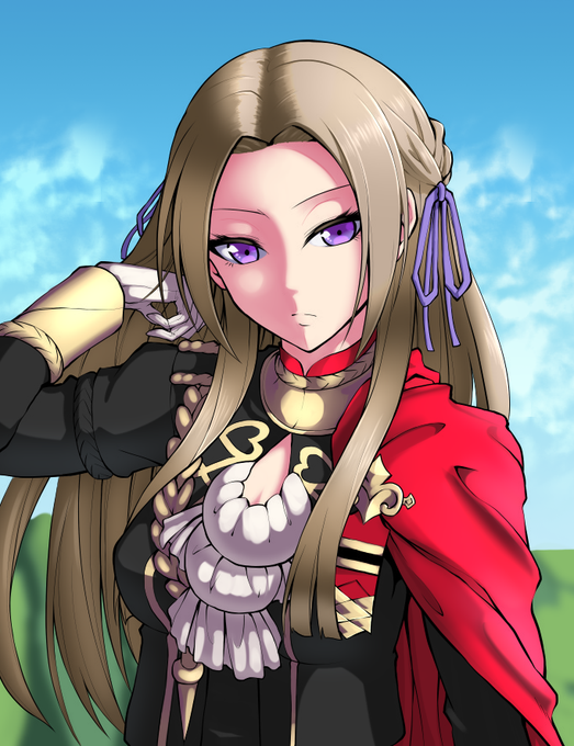
Colored an Edelgard, her hair still brunette from living a life of simplicity. Being the middle child allows her to attend her classes lazily, with her friend Dimitri. ( Original artist: @tenchan_man ) #FireEmblem #FireEmblemThreeHouses
Another #BookCoverLove post. This cover has a gritty, almost 70s feel to it (I had to check the release date! It's new!) But the simplicity and contrast pops against more standard, modern looking covers. It would stand out on a shelf. I also love the way the crow is painted.
Sketched this a couple weeks ago, thought i'd finish it for this but I went too hard with the simplicity :'/ ( and some other art for reference ) #ArtBoomsocks
Yo guys, I'm wondering for major feedback on a Twilight Forest 1.16 design. Since this was a key part of the original.
I'm looking into changing the rams head for fitting the game's current style, and keeping simplicity. Changes done were- 1/2
@__gauxgaux yup, heres another example of bad rendering vs decently good rendering in a overall scene from a work i did(and didnt finish)
pic1=gud
pic2=bad due to simplicity and no texture rendering
reason why pic1 is gud despite looking like a bunch of messy lines is that, 1 at least ...
She's shaken by learning that Kuririn is married to #18, and the dialogue and timing here save a trite central gag.
"That marble-like head... A canvas of simplicity without even a nose in the way..."
"A flawless specimen of man..."
Whis, dotingly: "They think you're handsome."


