GBCのTwitterイラスト検索結果。 847 件中 9ページ目


#これでフォロワーさん増えました
gb gbc gba ds switch
お仕事頂いて以降、描けてない。
描かねば・・・描いてるんだけど。


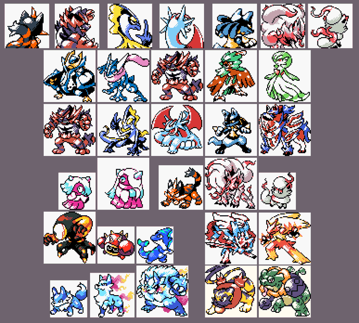
@omega_monsters here are all of my gbc/gbc like sprites...i think


A 18h on vampirise #twitch , avec du gameplay sur #nyghtmaretheninthking , le sympathique "Castlevania-like" #GBC de @ELVIEStm
Édité par @YastunaL pour la version boîte, mais on va en reparler de tout ça ce soir 😉
👉https://t.co/1RrhxMNYDK
#gameboy #homebrew #gbstudio


M1A1 edit. I'm not sure how to get the snow on the outside boss battle accurately, or if gbc palettes can even handle that


GBC style chibi sprite for Veronica Voltz!!!!! 🔮 https://t.co/QCQY43HpGy


ミディとテクノ/ロックマンXサイバーミッション(GBC)
Xシリーズに音楽系の名前のキャラが登場!と、わくわくしたのですがサックリいなくなってしまったキャラでした。もっといっぱい出て欲しかったなあ


Drew some of my besties in GBC style sprites weee
@JoleneTheBug @Zimmly @furuyoshii


【メタルクイーンビー】(ベイブレード)
本作のお色気要員その16。野生児ヒロインのティムティムが使うビット
カットインに異様に気合が入っており、パレットをええ感じに変えつつGBCながらフルカラーぽく仕上げている。なんと凄まじい執念か
だが敵専用で拝むチャンスは一回しかない。ゆるせねえ


Not a mere #duplicate I'm better!
-Mewtwo and Mew-Pokémon-For Today's
@Pixel_Dailies
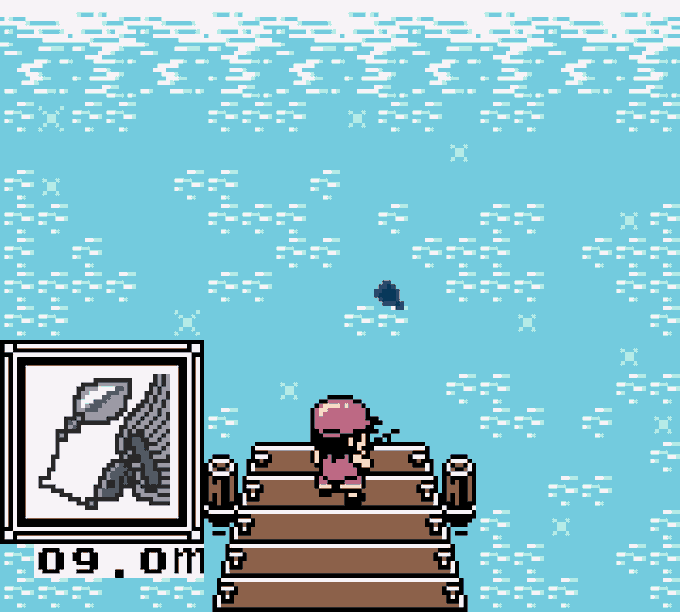
Tried to follow the early GBC sprite style.
#pixelart #pixel_dailies #aseprite #game #Pokemon #mew #mewtwo #psychic #legendary #copy #clone #rpg #GameBoy #Nintendo