comparison.のTwitterイラスト検索結果。 85ページ目


Gaint watercolour piece for school! Hand for size comparison. It's a big boy.


@lemmidraw Okay, quick mock up, I took the shoulder from my new armor and turned it into all gradients, with a side by side comparison.
Usually items are made with just filling in portions with different shades rather than gradients, gradients cause file size lag and looks odd in game.


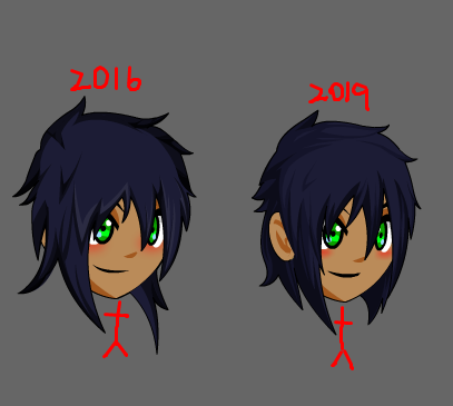
Then and now art comparison. 2017 vs 2019 of my Dazzlings art. Funny enough, both series were drawn up for the @UKPonyCon of those years.


Decided to redraw snoopy because what the hell not. I also put on the olds for comparison. #inktober


Here's my drawing for #inktober day two! The prompt today was #mindless. For this one I wanted to continue with an idea that I had for #inktober2018 for the prompt #chopped which I've included at the end of today's pictures for comparison. I hope you like it! 😁
#Inktober2019


I’m always tickled pink to see where my art ends up. Mostly it seems to be tattoos.
Found a few new images recently, the first two are my originals for comparison. The second two are tattoos I found in an image search.


Okay~ So the experiment was actually seeing how much my style has "changed" from my very first OC picture! /o/ the comparison. I also wanted to ask what do you prefer? ^^ It's okay to give an opinion.
@_@ I didn't focus too much on the colors but tried to keep it similar


I've always been terrible with background design and I wanted to try something. So I've been working on this between commissions as practice, and I really like working with this type of minimalist background.
Placed another Kawakami I made two years ago for comparison.





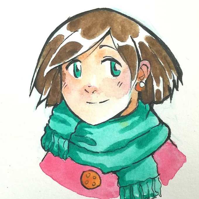

I'm using watercolors & Inktense for years now, but somehow I never made a comparison... I just randomly switched between them lol (¯ . ¯٥) Which one do you like more? Even colors of Inktense or splashy watercolor?
1 W&N, 2 D, 3 left W&N, right D
#inktense #derwent #winsornewton


The Mario Kart Tour render for Pauline is a bit low quality, since Mobile games are just Like That. So I used waifu2x, though it's not the best for 3D render images. Smoother on the left, original on the right, for comparison.
Still waiting on that Aces render though.



(partial) OC height comparison. A few I had to leave out because I didn't have good full body references of them.


So, not gonna lie, was inspired by TheMeatly's speedpaint of Miss Undertaker. 😁
I decided to challenge myself, to do something different that I've always wanted to try. I drew it normally just for comparison.
Background's still not my strong suit-
#ShowdownBandit

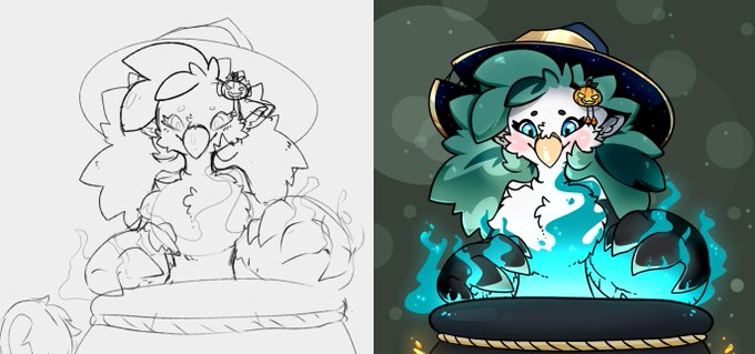
Oh yes, if anyone wants to know what my rough sketches look like! Here's a comparison.