font,のTwitterイラスト検索結果。 256 件中 2ページ目
GobTober Day 10: Dangerous Looking
"That font, those effects, his weird smile and the obvious shit of a knife... this looks like a dangerous scam"
(Shitposting again XD)
#gobtober2022 #GobTober #goblin #fantasyart #fantasy #monster #Advertisement #cringetober
So I've prepared some variants!
First one is Ames, the font I used for my webcomic. It's a great comic font; it just feels right and no one will think about it while reading, which is what we want.
I would have prefered a lowercase font, though. It might look too modern.
Di Lingua abbiamo conservato la palette colori e i font, e un'idea di cibo che è diventata sempre più ermetica nelle diverse bozze, con l'idea di andare alla sostanza. (mi veniva da scrivere "al sodo" ma poi mi è venuto da ridere).
New art by @maaudaan_tg
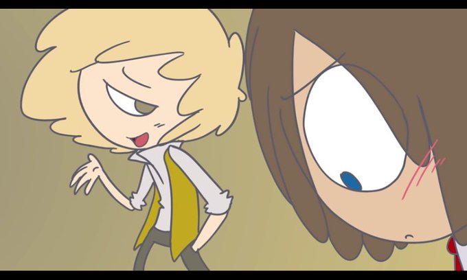
"Stop working on your dumb fucking scripts and Blender models Fred, the world is burning. At least make a font, something people want!"
"But... but it cool tho" https://t.co/RPZBBeVui2
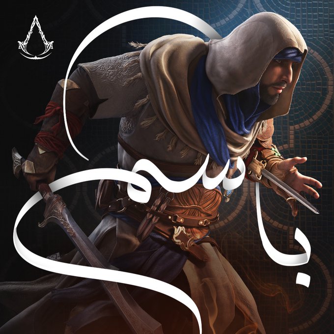
Just saw #AssassinsCreedMirage posters with some boring Arabic Naskh font, so I couldn’t resist doing Calligraphy around them! #FANART
@Ubisoft @assassinscreed #AssassinsCreed
New logo ! Just kinda designed it this morning while having a huge headache at class lol
Fyi this is designed with a freeware commercialized font, better remember to use legit freewares amirite creatives?
#VTuberEN #VtubersUprising #logodesign #logo
WATCH YOURSELF!
It’s ferociously talented artist @tangerine_haus / @Tangismyname and she’s out and about and looking for trouble!
(featuring my new font, battle layout, and very good party members 😎)
Thank you for making this lovely Mifont, his “f” is so cute I’m trying to including it >:3
Fun fact: You can’t type “Vox” by using mifont
#Akurylic https://t.co/3CvYsJJZCu
One of the backgrounds I made for my new font, Vanosky. I was going for a late-2000s edgy tween kinda vibe. #Y2K #design #aesthetic
Love the B.Positive font, with a Vectorheart-style 'digital billboard' effect & the 'Techno-Set' flyer with 'Dr-No' font.
Image #4 showcases the very popular-at-the-time barcode motif
@PBSKIDS Decided to do my own quick very amateur version of a new PBS Kids logo for fun. Keeps the Blue, Green and White color pallet, retains Dash, includes Dot, keeps the font, isn't a boring circle logo, can still fit in a corner on the screen. It's not great work, but it's an effort.
A new #undertaleoc I've been working on. His name is Kristen, named after the Kristen ITC font, cause why not? Something different
I'll release something on his story soon
#undertale #undertaleAU #undertaleFanart #characterdesign #characterart
OhaFont, Inkarnates~!
As mentioned, aside from the fanwork I did for Elaine, we also went to the other work for Haniel too~! This one is gonna be chapter based so I'm gonna update this constantly~
Story's available in the replies!
#phvtuber #HaniHaven
i just found a usb drive in my room that only has fightcade roms, the mother 3 soundfont, and this picture
This are the same ship in different font, I'm not going to elaborate
Anti-Air Cruiser Princess
E2, transportation operation, the first boss Anti-Air Cruiser Princess.
I didn't like the font, so I tried and tried many times.
#Kancolle #AntiAirCruiserPrincess #FleetCollection #illustration #boss
John Piper, 17. North Grimstone, Yorkshire (East Riding): the Depositition - Detail from the 12th Century Font, 1964 #johnpiper #tatemuseum https://t.co/BoaQc9eyzA
Baptismal Font, late 18th century #cooperhewittdesignmuseum #openaccess https://t.co/2ddDmHm4da
@alan_not_allen They also fixed the logo a bit which, though I kinda still hate the urban font, I REALLY like that the VI makes up both a 6 and the right side of an S. Iconic design.
#NFT in @NftMxMyA's own customised font, I'm a proud owner of this piece of art. Bought this one on @rarible
#Berlin #Palestine #NFTCommunity #nftcollector #NFTCommunity


