legibilityのTwitterイラスト検索結果。 35 件中 2ページ目


trying a color adjustment for legibility - always hard to tell what will read well at a tiny size


Atm I've been mainly drawing layouts that will be paint + animate as I did for this piece a while ago ( as a gift to lovely @Fleshsqueeze ) Here's the layout to animation process for legibility sake


im so scared by everything that i had to choose legibility over accuracy or i would be just a bundle of random stuff ahahah https://t.co/EhaSYRIoui


https://t.co/eYDuGTjAxz here is the survey, its just a few multiple choice questions about pricing and legibility!
I will be drawing one random winner for a free sticker like these on January 30th! Thanks for the help <3


I'm also available for colourful lettering work, with varying levels of legibility, depending on your needs! 👀
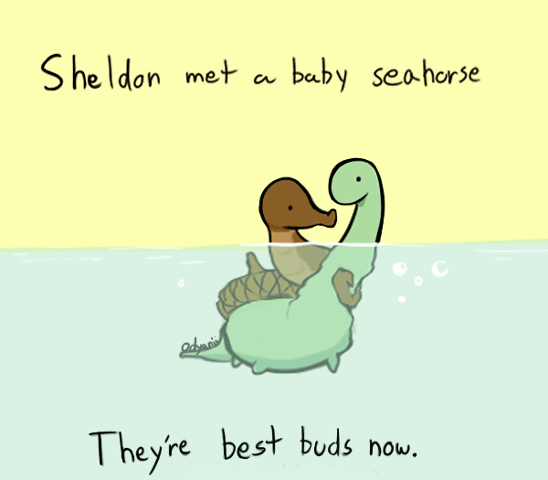
https://t.co/1WjnUF4x4G


Someday I am going to find an image size that patreon is happy with, but today is not that day. Let's see if Twitter doesn't scale it into illegibility...


I'm glad that I evolved to not care about the quality of the backgrounds anymore and just going for speed and legibility. Colored sketches forever.


Alright would any of you be interested in the final version of this sticker? 👀✨
She even has a tiny @sailorhg shell pin 😍 Most likely will need to make it bigger, though, for better legibility.


Procedurally-generated curves for #gdsFM's sequencer connecting 2 notes of various offsets and length. At first, I tried using a gradient to indicate a note slide, but for legibility I probably should taper the width at the points the portamento begins and ends.

For reference, this is what the earliest work looked like. I would probably still redo the text for legibility since it looks so messy now


Down the font legibility rabbit hole by @pvermaer https://t.co/30Ad45vpBQ


Updated Version for better Legibility
#PsDailyChallenge
https://t.co/AVzVCCZ2uX

#Repost @letterconstruction — check the full set of images they’ve designed. Very nice & smart. @aurelien_vret should like it!
・・・
Letter „e” from Prosaic by Aurélien Vret for @typofonderie #angularcounterforms #opencounters #openendings #legibility … https://t.co/8FHi2FP2VW


Working on this new animated typeface at work. Struggling with the legibility at the moment.


I continue. Battling darkness again legibility.
#gamedev #conceptart #illustration