typofonderie.comさんのイラストまとめ
@typofonderieFollow @typofonderieさんをフォローする
フォロー数:609 フォロワー数:10834

Austerlitz was born in July 2014 with first attempt to design a roman, trying different terminals, then optical variations and italics. But it is in 2018 that the project will develop over a period of 2 years. Read about it:
➽ https://t.co/nJWOPRUtrD

Did you know that the Austerlitz g is simplified in the Small version to guarantee better reading comfort?
➽ https://t.co/eryJITVYv5
Petit will be dedicated to very small sizes, Labeur to intermediate sizes.

Are you looking for visual impact? Nothing better than a contemporary Slab for powerful titling that bring much more style than usual sans serifs.
➽ https://t.co/abk2hkMJJL
Mislab by Xavier Dupré.

Mencken has sixty-three styles, divided into three widths, three optical sizes, romans, italics, borders and dingbats. Here Mencken Head who follow Didot genre in a contemporary outfit.
➽ https://t.co/0vUfZaJR9U

Oui! with 38 OpenType features, Altesse offer a lot of possibilities. The 1557 glyphs are divided as follows: two sets of capitals, two sets of numbers and lowercase glyphs, punctuation, ornaments and vignettes.
➽ https://t.co/K345Id9o8k
— — —
#typefaces #fonts #typography

5/6 Typofonderie's Year in Review 2022
November: Austerlitz
Austerlitz, is a humble typeface in small sizes & a charming Parisian Didot in large sizes. 56 fonts divided into 4 optical sizes of 7 roman & 7 italic.
https://t.co/eryJITVYv5
— — —
#typefaces #fonts #typography
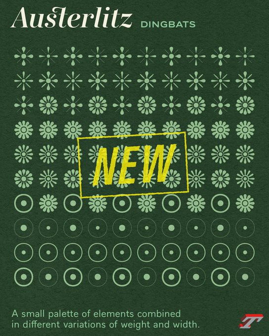


With Austerlitz, we set out to design a very reduced set of vignettes in weights and contrasts, adaptable and combinable.
➽ https://t.co/b85L14OhOv
💡It was with Ambroise (2001) that we started designing sets of vignettes and borders adapted to every weights and width.

🔤 Austerlitz alternates: Italics offer different endings for the g and y, in reference to the detail of the g present in Romans (Affiche, Gros, Labeur, not in Petit)
➽ https://t.co/BoOPfuLJzB
— — —
#typefaces #fonts #glyphs


🔥🔥🔥 Just to show you some French words set in different optical sizes of Austerlitz. Extract from this page:
➽ https://t.co/BV3XNc6GFG
— — —
#typefaces #fonts #glyphs

🔤 Austerlitz alternates: Asymmetrically, the typical shapes of Roman a and italic a are available. In fact you can use the roman a shape in its italic version, as it was the case a century ago for certain typefaces families.
➽ https://t.co/BoOPfuLJzB
— — —
#typefaces #fonts