opacityのTwitterイラスト検索結果。 1,338 件中 15ページ目


@rebecca_doodles True tho! I was practicing shading styles and found a pretty easy way to make a shaded color by grabbing the color black and turning the opacity to 25-40% (It varies) I do the same with white for highlights and after making way too many layers I can make stuff like this that I 💙


The example above is without any layer properties and just the gradient map itself on full opacity!
You can play with the layer properties and opacity if you'd like to change the feel or look of it, all based on preference!
This is of course for grayscale drawings/sketches.

So from what I've learned, gradient maps focus on transforming the values of the art, and not the saturation or hue themselves, into the colors of the set
If you notice, where the sketch's lines are lower or higher value/opacity, the gradient map chose a different color


also in case you're curious about the 'color variation' section of the color palette;
I use it in textures as a ✨rainbow vomit✨ layer at a low opacity (anywhere from 5-20%).
It adds visual interest with VERY little effort 💅 https://t.co/Ow4Abq9fLc


also no need for fancy brushes i did these with basic brush, just make sure you dont use a circle and use pressure/opacity to blend


I like to add a layer above everything with a color that matches the mood at a low opacity (Usually 10%) to help it fit the mood better (here I used blue)^^ aaaand done! If there's any part that you'd like me to go more in depth in or you have any questions about,-

Next, I transfer that stuff down and start doing details that look best at a lower opacity like more hair shine and others. You can change opacities and transfer down as many times as you want, until you like how it looks. Now it's pretty much finished :D


I take white, and start of with parts that look good with 100% opacity like some hair details/jewlry, and separating some parts^^


you're shading, and stroke highlights with the brush as well. While doing steps 1 and 3, I use the blend tool and soft airbrush erasure tool to make the edges blend in with the flat colors better^^For the highlight step, the opacity will depend on how dark the area is.


different dark colors depending on what I'm shading, For ex bbh's dark purple skin is good with a dark saturated purple at a med-low opacity, while gold rings I'd use a lighter red-pink at a low-ish opacity. * still using round mixing brush btw*


@paradinalo @artistsbase Jadi warnanya terkesan pigmented, karena ketika nimpa warna, pasti gak semua bagian itu terwarnai lagi. Hanya bagian tertentu yang keliatan lebih kereng, jadi lebih ada dimensinya. Contohnya ini aku gambar yg satu full opacity, satunya sistem layering. Rasanya berbeza kan? Wkwk


@webtooncanvas I'd have to say my most recent panel~ I have been working on his character design for a few years so to FINALLY reveal it felt so satisfying & it came out so much more epic & terrifying than the various practices! Finding the perfect opacity for the broken glass effect was PAIN!!


"Mountain Range". 169/557
Usual DB32 palette, 50% opacity posterized self overlay.
#fantasy | #collections | #pixelart | #ドット絵 | #8bit


@hellgrimer gradient maps are a gradient applied onto your art,affected by how light/dark the value of the drawing is- in csp i typically go to layer -> correction layer -> gradient map, lower opacity to 20-30%, set mode to color/overlay/normal and it adjusts the colors according to value :)


I suppose I'm somewhere at 1
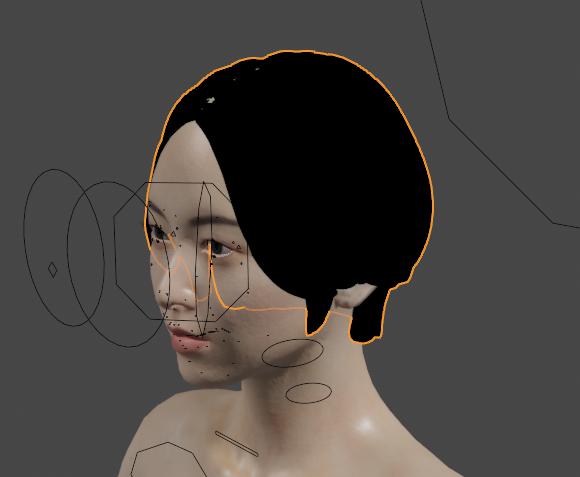
Since I took the very much unnecessary move to cut, paste and reduce the opacity of the lines beneath the hair
Examples would be https://t.co/IsLt0T0SXR


@moppy_stuff Better late than never, but here's my contribution!
(I dunno if it's okay to mess with opacity for color palettes like these but this is what the result ended up being, so...)

