FontのTwitterイラスト検索結果。 146ページ目

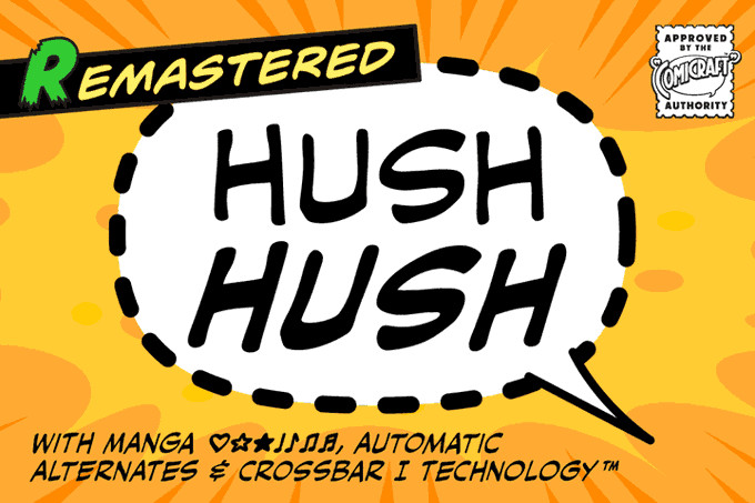


Comicraft’s classy balloon lettering font, Hush Hush now features four weights with support for Western & Central Europe, Vietnamese, Cyrillics, automatic alternate letters, improved spacing & kerning, Manga characters and Crossbar I Technology™. https://t.co/BJM3T0Kf8J


Pour les contreparties Ulule, vous voudriez quoi en print A5 ? Au cas où, j'avais déjà ma sélection mais je me dis que vous préfériez choisir ! Je choisirai parmis celle qui font le plus de bruit


Wait- so you’re telling me they AREN’T the same person but in a different font?!?


@SuperRADLemon 12 pAgEs?! nO wOnDeR tHe vIdEO iS tErRiBlE! ALL BOW MAINS KNOW THAT BOW SCRIPT SHOULD BE AT LEAST 87 pages with size 3 font. I cant believe you made a slight understandable mIsTaKe!

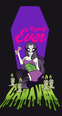
So I guess I'm making a vine/overgrowth font?
mxnnzx last #wip until completion I promise!


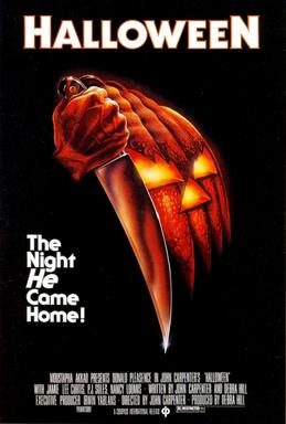

Historical: The font used in the Chrono Trigger logo is the same as John Carpenter's "Halloween."
Hysterical: The logo designer for Chrono Cross apparently didn't know this and had to reverse-engineer the letters to make the new title.

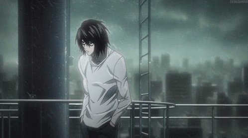
@nightslux same omg! Do they even know? And titles' font is supernatural...
(Ps: I love him)


there's a second echo this week, one that goes deeper! it dates back a year ago to our previous webtoon canvas series
on the left is a new bloody CHOMP using the same font and half-letter coloring style as the delicious cupcake chomp from the evil life: https://t.co/ZTPFkFCGor


Petit épisode spécial d'Au fil des mondes sur @webtoonfrance dans la série "Kiff à la maison". Le concept ? Des petites histoires ou les persos disent ce qu'ils font chez eux. N'hésitez pas à voir ça, c'est doux https://t.co/sKF3kz3S97


Je ne sais rien de lui, et pourtant je le vois
Son nom m'est familier, et je connais sa voix
Souvent dans mon sommeil, je croise son visage
Son regard et l'amour ne font plus qu'une image
.
.
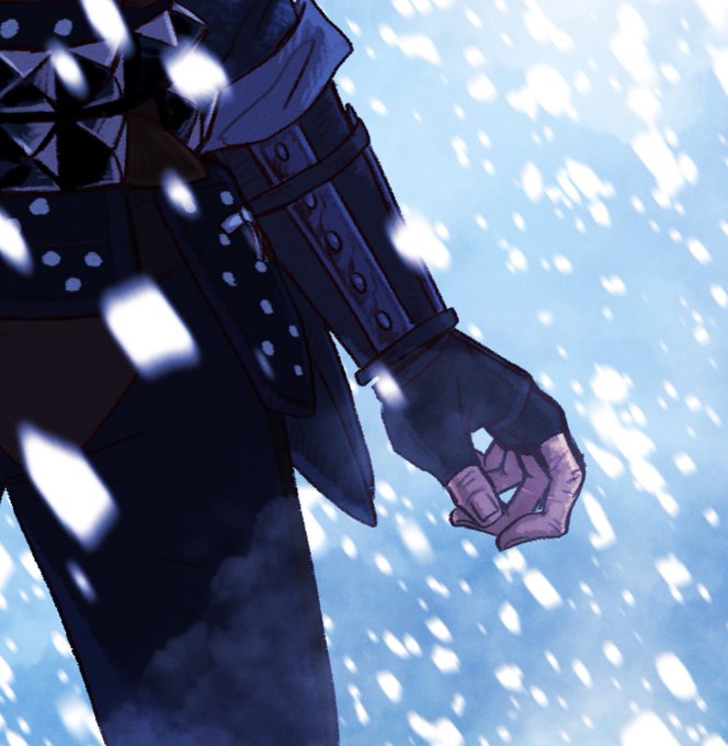
#aizawashouta #thewitcher3 au #BNHA


Hexcrawl Series No. 12 – The Nymph's Font
Repost of one of the coolest parts of the Brukesian Duchy #OSR hexcrawl. Includes random encounters and all. The best thing is you can consult it for free!
Read more https://t.co/4aczzPNoVa


Je voulais juste mater un anime avec des bg qui font du skate je m'attendais pas à autant de feels 😭
#SK8THEINFINITY