FontのTwitterイラスト検索結果。 152ページ目


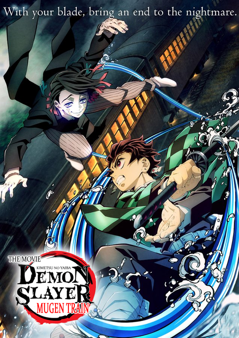

@CanipaShow the crooked impact font MUGEN TRAIN, meshing sans serif with serif, and the movie being all the way up there killed me so much I had to make this in like 5 min.


Voilà la série de "posters strange" que je préparais! @LaPetitePelle @Maliki_officiel @superalienninja @lewistrondheim font partie de ceux que je suis ici, une source de bonheur et d'inspiration régulièrement 😊




#PaulaRego "The Balzac Story" " Painting him out" (2011) Ici les peintres sont des femmes qui font leur autoportrait ou qui soumettent un homme à la puissance du geste créateur. Exposition @MuseeOrangerie https://t.co/W8VHZLzK2F ⤵️ https://t.co/JDVPIVJtC2


FREE FONT!! Perfect for posters, display copy and editorial, Bolden's strong presence will share your message in stunningly confident style. Bolden Display is an all caps, bold font with rounded and some rough edges. Test + buy - https://t.co/pTn2Rgq8H9 #typedepartment #typeface


Barroomba by Deedeetype
https://t.co/leWmRJo06j
#typography #freefont #font #comicfont,


j’ai essayé de représenter ce que les crises de paniques me font ressentir
huile sur bois (et gravure)


ngl Opherah is pretty much my trollsona from my Homestuck phase, just in another font


🪶 Nouvel épisode de SEAGULL par @tsubogallery
« La vie et la mort ne font qu’une, tout comme la rivière et la mer. »
Ne manquez pas ce quatrième épisode de SEAGULL, disponible sur notre plateforme :
👉 https://t.co/nR4hfdJQta
#webtoonfr #webcomicfr #yaoi #boyslove


@lavabun was doing a #dtiyschallenge of their #BreathoftheWild roleswap AU so I thought I’d try. I had to kinda make do with the font of the text but I’m proud of the rest.

Armelo Dianovista by Ochobot
https://t.co/hcIMxWalCi
#typography #freefont #font #calligraphy #handwrittenfont,


An irreverent, contemporary neo-Grotesk font, Grotta has strong geometric accents and sharp contrasts in its form - characterised by tight apertures and dynamic feel.
Test + buy - https://t.co/L9Rt9KxxMG #typedepartment #type01 #fonts #typedesign #typeface #font


✨✨✨
It's a cybertron font. If anything, the layout is Russian. You can try to decipher . Ahahaha