proportionのTwitterイラスト検索結果。 170ページ目


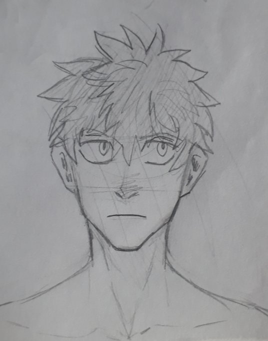
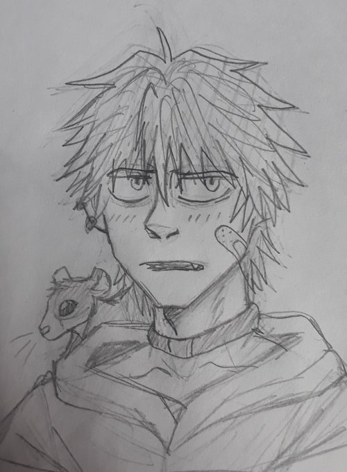
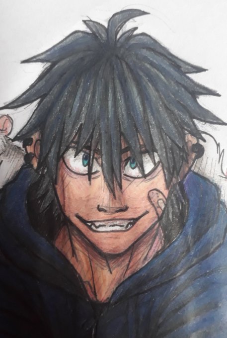

Maybe... I'm not that confident drawing them though. The proportions are shit https://t.co/mbhRC0wuUD


@AndeAlmighty yer right these proportions are fun. they givin' me.... ideas


From his hair. Gloves and shoes were also less defined shapes. In Partners in Time, body proportions and shapes were adjusted (look at Mario’s head and Luigi’s slightly slimmer body shape for example). You’ll also notice Luigi’s silhouette has high waters. (3/6)


The silhouettes have had numerous changes. In fact, they’re slightly different in almost every installment. In Superstar Saga, certain body proportions, such as the head, arms, and body, were a lot larger. As well, Mario’s arm had a white outline separating it… (2/6)


Glad that in many of her shots that are actually in the show, she looks a lot better proportioned (still kinda lanky though lmao). I actually think they purposefully toned it down a bit in season 10 because her head and waist is noticeably smaller and she generally looks better

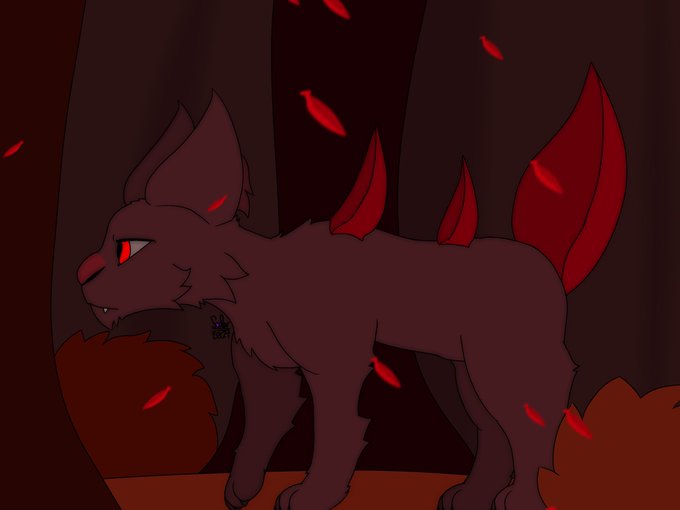
This is for a school project I haven’t turned in for a few weeks now <w>
I generally don’t draw feral stuff, so my proportions may be incorrect, but it’s a species I had to make


I'm really happy for all the people that will get to play BBCF and BBTAG with good netcode. Unfortunately for me however, I play on Nintendo Switch so my netcode's staying the same. *insert questionably proportioned drawing*

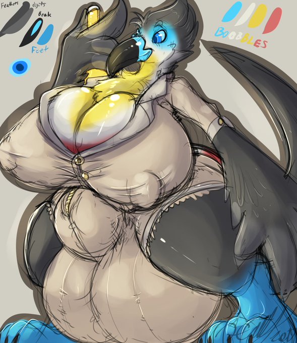


@AndeAlmighty Rook's massive paws and hands were heavily inspired by your designs. The problem has always been trying to get other artists to roll with the proportions.

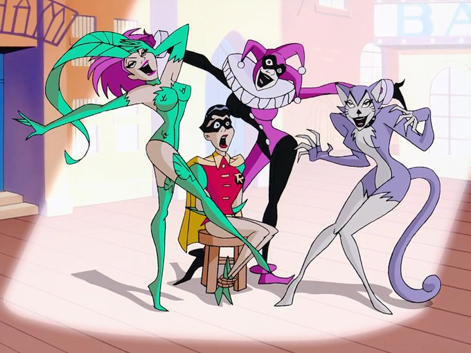

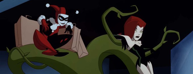
@FrancisCermak Oh, god! Now you have me looking at some of these villains more closely. And how Harley Quinn's "proportions" are a little off from the real one. 😳😂


Day 1 of sculpting practice, I made an attempt to sculpt the human face, somewhere I got lost and messed up the proportions.
#sculpting #3dsculpting #blender #Blender3D #b3d


Last gesture batch! I think I'll start doing longer time intervals, such as 2 mins. It seems that if I don't start doing them that I'll never move on. Constantly worry about losing that flow and thinking about contours and proportions. Hope I'm improving! @StanProkopenko (3/3)

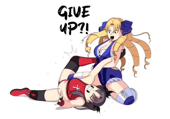
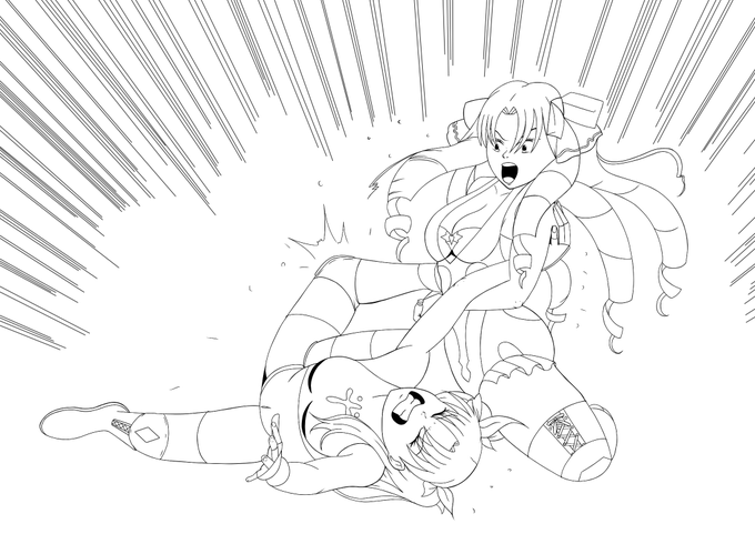


This is my first time drawing a pro wrestling illustration and I'm really happy with the results. It was definitely a challenge to draw though. Matching up the anatomy and getting the proportions right was really difficult. Still lots to improve on. Finished but not perfect. 😁

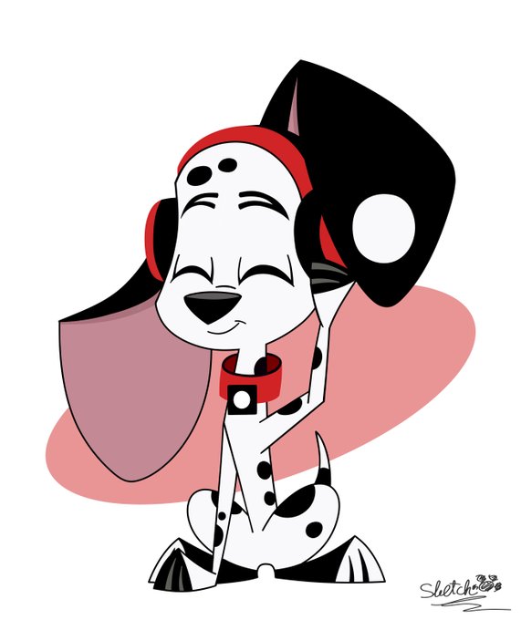
This time fail and disproportionate DJ.
#Save101DalmatianStreet
#101DalmatianStreet
#101ds
#DisneyPlus
#Disney


@WereWhusky @DairyotaTsutomu The drawing was not traced as you can see from the very rough sketch process I did at the first image. The drawing was inspirited and referenced out of Nommz's work you showed, that is right. But not traced, my friend. Proportions of the body and positions are not the same.


Sasha Waybright has been in my mind, quick drawing to satisfy the brainrot ignore the bad proportions #Amphibia #SashaWaybright

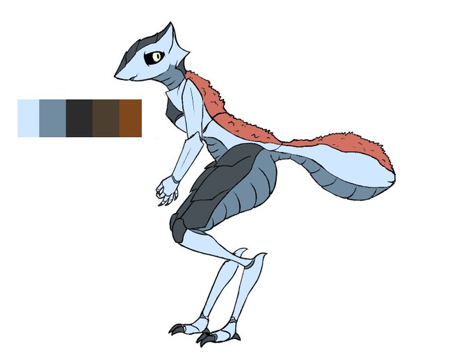

@oofRowdy Hocus pocus bigitus, raffle me up daddy-O.
Here is the one and only Dowd, a bug lady whose proportions can be strongly altered to fit your every artistical whims.
She likes to tend to her garden and go hike in uncharted places, she's kind of an agoraphobe though, shy bugger


that's the front of her done.
Put Racchel next to Fioxa to sorta show proportion.
now I need to do the other 5 views
🙃 the troubles of being an artist lol


@Junkmech Oh no that's not the worst imo, that's at least a decent suit shot
nono
Behold Electro's disproportionate head and body