valuesのTwitterイラスト検索結果。 5,654 件中 178ページ目


Day 1538: Detailed Values! I really am excited about this piece again. I think it's going to turn out well if I can keep up with it. I'm inspired by a piece by my mentor and I hope to handle it properly to end up with a good result! I'm going to start exploring colors next!

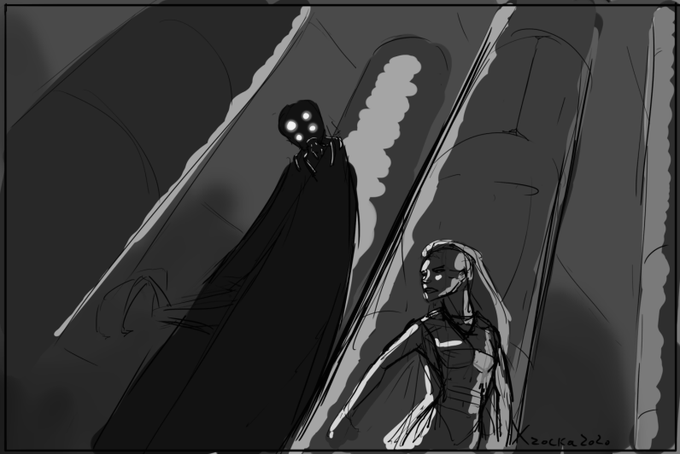
This is a really quick test I did just to visualize something to myself, but looking at it I really dont like it. The values arent nearly as cohesive as I would want them to be for a scene like this but I just do not have the time to fix them right now. Perhaps some other time.


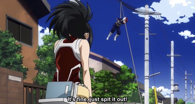
For someone like Todoroki, who for the most part is usually stoic/dull, he seems to let that part of him go when he’s speaking to/about Momo. It’s obvious he values her a lot, so much in fact he makes sure she sees it like in the final exams, jt arc & during kamino ward #todomomo


The world’s most influential values, in one graphic https://t.co/d779qHci8V #values #behaviour


I liked it more at this point but felt like my values weren't varied enough. Now I'm not sure.

I think I'm done with this at this point. The contrast study was fun, but the bright values really threw me off. Really fun experiment though.


I'm working on an old portrait I've been wanting to redo for some time. Values are done, now moving to color! #sketch


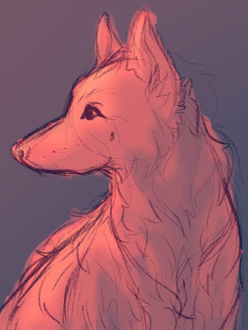

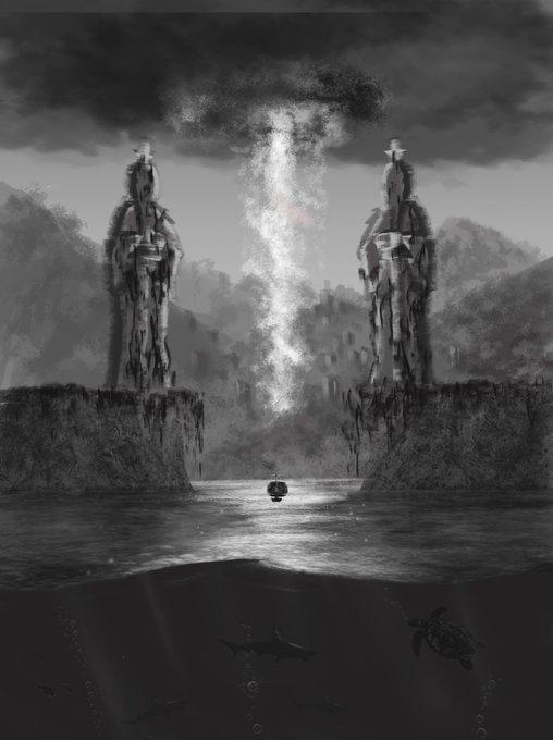




Trying to work on my values, colour and light, composition... everything really. Here's another small piece. #yermanfran #art #conceptart #visualdevelopment #visdev #forrest


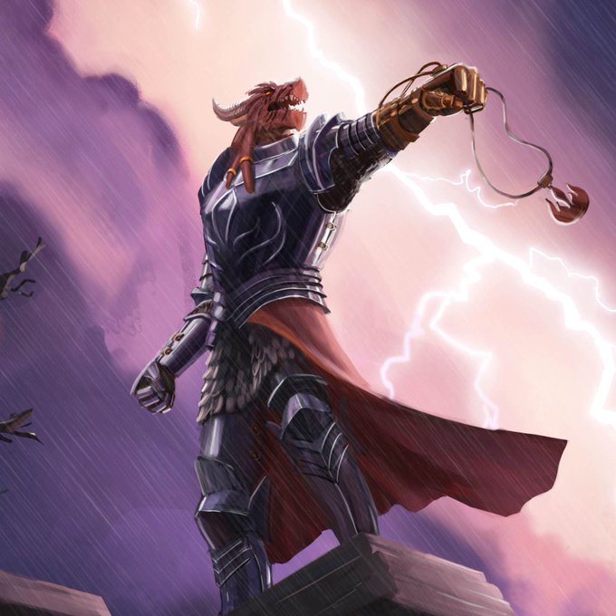
Painted this illustration recently, tryna push my colours & values to be as dramatic as I could get em ⚡️ ⚡️ I think I managed 😁 #illustration #digitalart #paladin


Comic tip: I've heard comic book publishers prefer higher K values for better printing. What about dark-haired people? Turns out, if you have strong black shapes instead of low K values, it adds an illusion of darker colored hair.


Observant; Sentinel. Some #CriticalRoleArt for values and lighting practice. #CriticalRole #beauregardlionett


Work in progress!
Did a value check on my latest painting, and I'm really pleased with the results... This was an easier problem to fix than I was anticipating! I just had to pay extra attention to values in my thumbnailing and color palette stages.

