strokesのTwitterイラスト検索結果。 3,972 件中 184ページ目
My newest fanart of Park Jimin.
You know who has our heart, hm~?
#bts #btsfanart #chibi #kawaii #drawingapp #pencilstrokes #inkstrokes #chibi
#iloveyou
@haaaaaaaaaadi Trackpad ada tak puas for me haha. I used to draw background for animation and I need different kind of strokes untuk bezakan from foreground to background. These are default brushes in photoshop yg I selalu guna
Aozaki Touko.
I'm trying to get a little bolder with my colors and strokes.
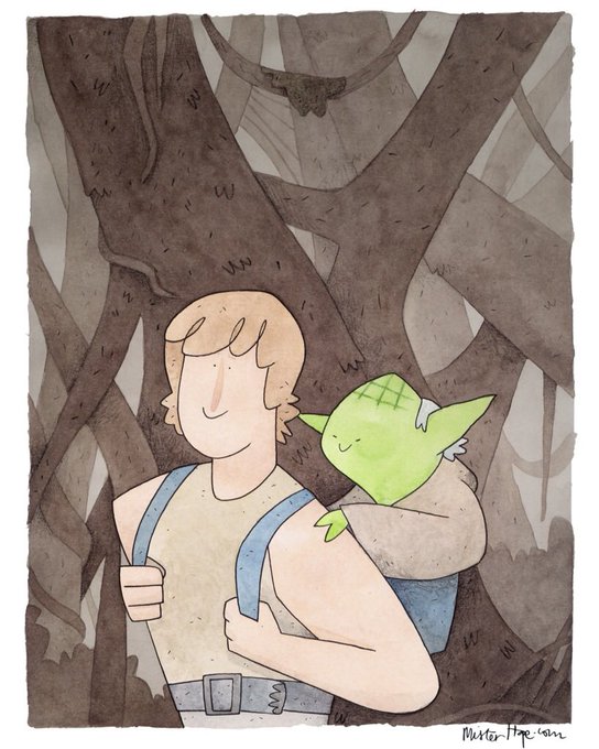
My #CuteCouples piece for the new @SquaredCo show at @DoughandArrow. If you’re in the area, or even if you’re not, check it out. #yodaandluke #empirestrokesback
Messing Around with brushes and being more deliberate with my brush strokes
Broad strokes! Primary forms! Trying to apply the technique I would use for #sculpting to my #gamedev #map creation. The idea is for the map itself to BE a #puzzle.
If you can get the rivers to flow towards the middle maybe something special will happen?
#madewithunity #indiedev
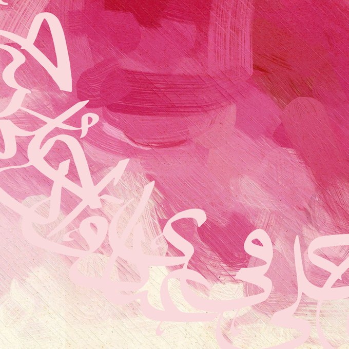
This is a sample work I am currently working on. The fluid brushstrokes and the bold text was used to contrast with each other. The opacity of the text was lowered to provide balance.
Torabi's new additions to his Blurred Vision Collection are stunning! "The contrasting loose abstract brush strokes with the meticulous detail of Torabi's landscapes display the true power and versatility of Torabi's artistic talent."
So I didn’t do anything with the 2 previous paintings (yet), but I did start a new 24x36 inch canvas today. I’m enjoying experimenting with diagonal brushstrokes. #melaniebiehle_wip #melaniebiehle_creativeprocess #mb_cityandsea https://t.co/17B7BGc9rI
Commission of Akaashi for karasunovolleygays, for their fic Different Strokes: https://t.co/PHuLLZpBTE
Do you desire for good strokes? Really good strokes? #wahawednesday #popteamepic #ポプテピピック
In Monaco I make up colors and try to paint with as few strokes as possible. #painting
Brilliantly colored eagles take flight with just a few strokes in @Illustrator. Follow along with @MossTTafaa and learn how to create your own: https://t.co/6qjZvuaP1R
"Hell is a beautiful woman" Quick painting ( took me 2 hours lol) to experiment with rough brush strokes and vibrant colors c: btw, funfact: red spiderlilies are a symbolism of hell/death hence why i used them. Beautiful, but deadly.
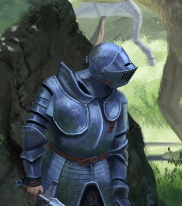
Stolen horse. Personal work.
https://t.co/Rs6pFmP3Rv
#art #conceptart #design #illustration #conceptdesign #forest #artist #knight #digitalpainting #lighting #horse #illustration #brushstrokes
Raffle Portrait Painting Prize number 4 of 6, this one for @Nea_Puppers of their Neapolitan doggo. The prior painting was in my darker faux-Rembrandt style, so for this one I tried my softer, lighter style with Leyendecker-esque light strokes around the perimeter.
Stolen horse. Personal work.
https://t.co/Rs6pFmP3Rv
#art #conceptart #design #illustration #conceptdesign #forest #artist #knight #digitalpainting #lighting #horse #illustration #brushstrokes
Thank you for all recent follows and likes. Always appreciated #abstractart #acrylicpainting #oilpastel #mixedmediaart #abstractexpressionism #brushstrokes #paletteknife#contemporaryart #artwork #bockingford


