valuesのTwitterイラスト検索結果。 5,656 件中 188ページ目


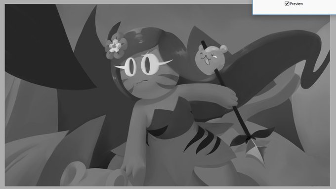
Once again I'm doing the "focus on the values" thing, as it's starting to become my comfort zone, plus I want to get better and fixing what's wrong with the way I do them.
#DigitalArt #WiP #Pokemon #Smeargle #Sketch


First post! Here’s something I did mainly as a study on values, it is the costume bow you can get from @Com2uS game The World of Magic.


@Namba_Harumi I love your work - every piece of it feels like it's jumping off of the screen, between your incredible skill with values and dynamic posing. Beautiful!!
I'm an artist too, working on building out my character portfolio. For now here are my recent favorites 💕


Study I did the other week on my Behance stream when we were talking about values.


I've started an instagram side account to post daily dark doodles and in just 5 days it's getting almost the half of likes as my Colton Crux posts 😂 instagram values quantity over quality. twitter side account didn't worked out though so I will start posting these doodles here.

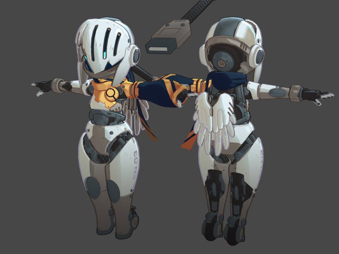
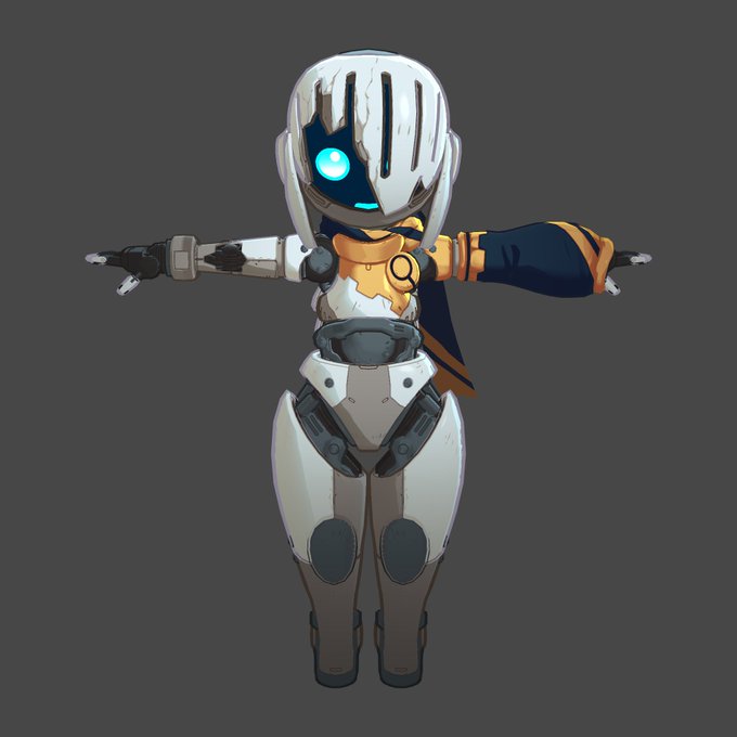
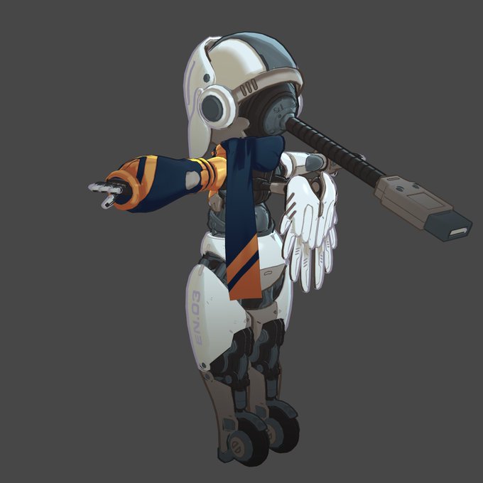
Also, the values for the metal are fighting each other. The white and silver are too close in value and thus they don't seperate well, yet the secondary body tone is too dark and gives way to the silver. So I'm trying to push the body plates up and the joints down.


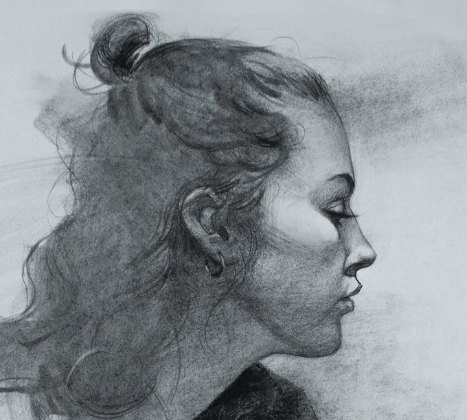
Portrait master Chris Petrocchi uncovers crucial topics on drawing fundamentals, measuring techniques, proportion, values and more in his Drawing Demonstration in Charcoal.
Find out more: https://t.co/fZdcegSUzG


Taking a break from picking out colors for characters and switching to pushing a mood using only monochrome and values

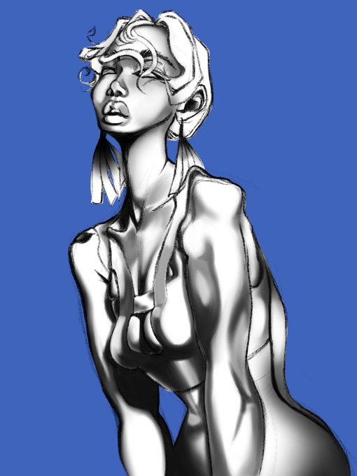

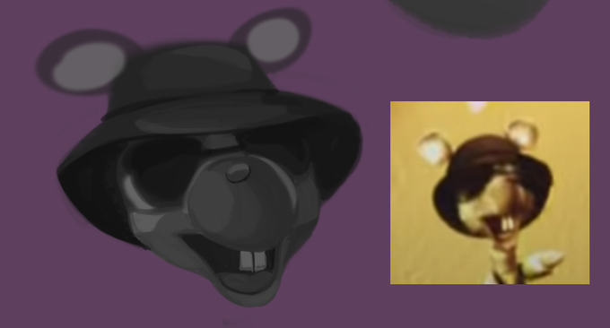

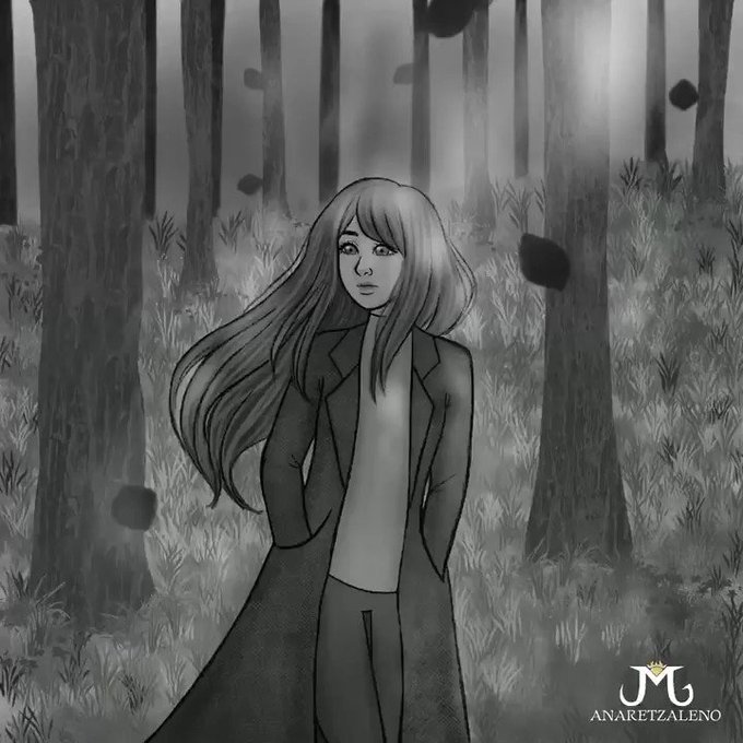


A 2014 VS 2020 redraw of my #OCs Solace (they/them) and Grace (she/her)! I’ve definitely improved at least on colour values and anatomy lmao
✨ kofi link if you’re feeling generous ✨ >> https://t.co/mKhKLAUbCB


@Sooneaaa Don't really need color for webtoons, just values work well enough. A monocolor drawing can be just as appealing as a full color one if you place values right so everything is clear.😉


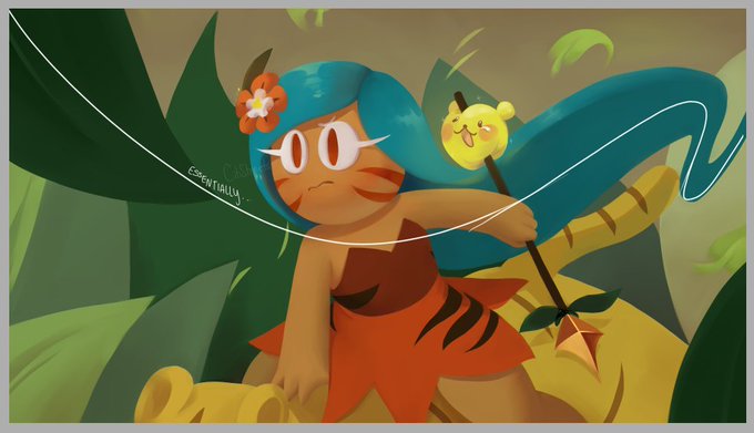
I'm really happy with how this illustration turned out. This is a nice hybrid workflow between fully rendering and doing flats or cel.
I usually use a grey "color mode" layer to check values, but this is why I prefer working directly with color. Read tweets below for detail...


Sticker work done over the week.
I still have some indecisiveness as far as coloring approach: detail vs simplicity, rendering vs readability and all that. Will probs end up adjusting values later I feel... But I like how they look so far!!! Even if I have to simplify later.
#ALT




by thought i mostly mean some sort of composition as well as values and the like hahaaaa