opacityのTwitterイラスト検索結果。 1,338 件中 30ページ目


And you're done! You can change the opacity of your sequin layer as you like - left is at about 60%, right is at 100. I kept mine bold to further emphasize them but the world is your oyster :)


posting in case anyone else wants this i remade this screenshot of teru at full opacity because its awesome and. i love it


My shading’s a light pink/magenta multiply layer still done w the fuckin,,,pencil brush (second slide is what the layer looks like when not in lower opacity + multiply)


ああー解決した!
カラーモードをindexedにしてたのが原因だった
RGBにしたらopacityもレイヤーのoverlayとかも反映して出力できるようになった

レイヤーのopacityいじってたらpngでうまく出力できなくなってバタついた...
asepriteってレイヤーのopacity変えてても、出力すると不透明maxになる?
背景だけ色味変えたくて半透明のレイヤはさんで出力したらはずが左のpngがでてきた


Tips yang aku rasa berguna in digital painting
Turunkan opacity of the brush below 70% (aku guna default je).
And aku tak suka buat kerja dua kali so usually aku akan kemaskan sketch aku instead of buat layer baru untuk outline. https://t.co/RedMD2yL3L

I used a slightly different brush here (Though that doesn't matter much), set the layer mode to glow dodge, and used a blueish-white color
Of course, I blurred/blended it down so it was a little smoother, then brought the layer opacity down (That part's up to preference)
3/3


ลงสีรูปแล้วอยากลองทำฮาวทูคุมสีแบบง่ายๆดูค่ะ
เอาเลเยอร์เส้นไว้บน โทนภาพไว้ล่างสุด แล้วก็เลเยอร์สีเบสอยู่ตรงกลาง ลดopacityสีเบสลงให้จาง โทนภาพกับสีเบสก็จะผสมรวมกันได้เป็นโทนรวมๆของภาพแล้ว ! ที่เหลือก็ลงเงาเอาตามความถนัด ออกจะมักง่ายไปหน่อย(?)แต่เราก็ใช้บ่อยสุดเลย มันเวิร์คนะ


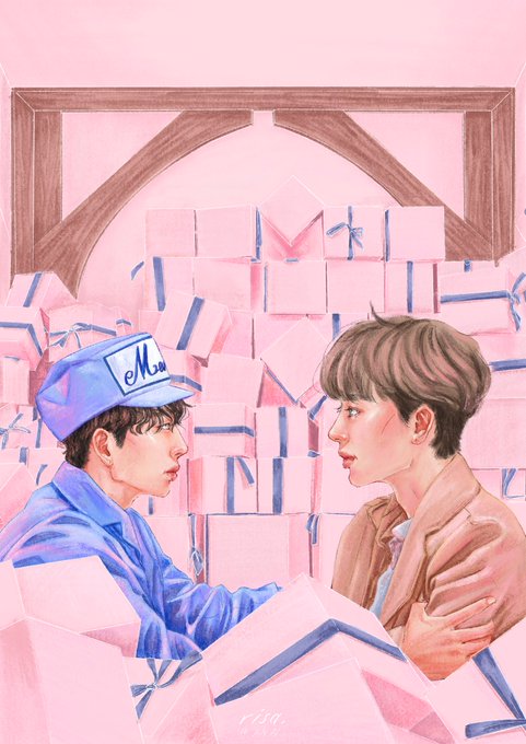
ลืมลงอันนี้ คอมมิชพี่เคนมะ จ้างโดยคุณดาเกะ
@thekbearz กับคอนเซป อนุญาตให้หลงใหล แต่ไม่ให้หลงรัก ✨ #opacity25_comm


8th. with the same color, we create a new layer, we set it to "Add (Glow)" we lower the opacity to 80% (or the level you like the most) and then we are going to do the same process of the 4th part, but this time adding color instead of erasing it


@redvalient then i take slightly lighter color than the base for highlights, sometimes i add some gradient overlays and the cutesy blocky highlight is optional but i use an add layer on mid opacity for those


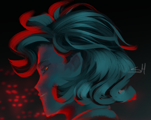
dont rt but look at the full opacity ver of that nana i posted a couple days ago this shit is BRIGHT


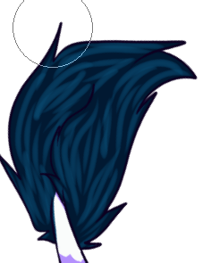
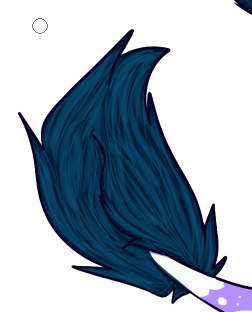

Hair✨
1) Cover with a darker color
2) Do long strikes with eraser following the shape. Don't push too hard
3) Do short, thin strikes in the same layer, following the same shape. Push hard
4) Repeat with a lighter color
5) Adjust mode, opacity and color
Voila✨


@Yuranamchoom Idk I just imagine it as pieces that click on onto of each other so I tend to saturate or darken the parts where the light doesnt reach. I guess you can get away with more saturation, some highlights depending on how strong the source is. And a textured brush on a lower opacity


