throwbackthursday!のTwitterイラスト検索結果。 229 件中 4ページ目


🐸✨ #ThrowbackThursday! Patricia D. Ludlow’s cover art appeared on the March 2003 issue of CRICKET.
Explore CRICKET: https://t.co/877OtLmskg #kidlitart #kidlit


✨ #ThrowbackThursday!
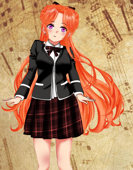
A snippet of a brand new CG, in which Kakeru is actually happy for a change! 💜
Here's the initial sketch VS the end result, which also gives you a closer, front-on look at the boys' school uniform.
#visualnovel #vndev #indiedev #indiegame #gamedev #game

✨ #ThrowbackThursday!
Here's an early sprite for Haruka, back when we were still figuring out what her default pose and expression should be. A bit too wooden, right? It improved a lot for the final version!
#visualnovel #vndev #indiedev #indiegame #gamedev #game


It's #ThrowbackThursday!
Ten years ago I got into #ATCard s. My very first ones were from #Pokemon and highly inspired by the first and second Pokémon movie.


I haven't posted to twitter in a while so lets get back into the swing of things with a #ThrowbackThursday! Heres one of the biggest projects I ever worked on which took over 200 hours. my version of Middle Earth! :D
#lotr #middleearth #fantasy
https://t.co/QAX3yHHWYv


#ThrowbackThursday! Haruka's casual dress was originally very dark, but I thought something lighter and more fun would suit her better, so it changed to baby blue. Also this old sprite is a rare one with full body and shoes! #visualnovel #vndev #indiedev #indiegame #gamedev #game


#ThrowbackThursday! The initial sketch of Kakeru's mom (with a photo for a clothing style reference!). Her cardigan is a lighter green in the final version, which you can see alongside her husband's sprite on the right. #visualnovel #vndev #indiedev #indiegame #gamedev #game

#ThrowbackThursday! This cover art by Linda Wingerter is perfect for a chilly day. It appeared on the December 2007 issue of CRICKET.
Explore CRICKET: https://t.co/877OtLmskg #kidlitart #lindawingerter

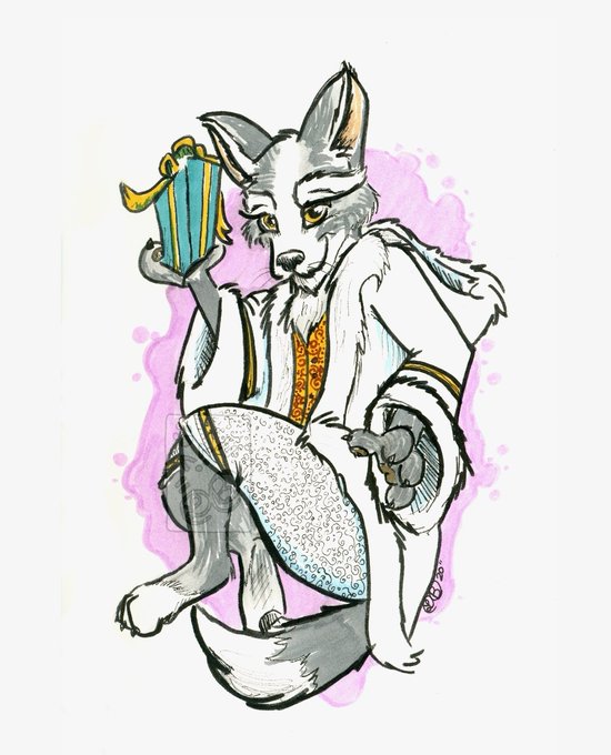
Day 17: Christmas wolf
#ThrowbackThursday!! This is actually a character I came up with last year.
#gbjewelz #ralphbutt #art #original #originalcharacterart #ArtistOnTwitter #christmaswolf #wolf #canine #christmas #holiday #whimsical #furry #fursuits #throwbackthursday


#ThrowbackThursday! 👋🏽
What's a throwback thursday without a throwback to a concept that was rejected. But glad to share nonetheless. 🙂
Hilltop is a construction company specializing in building industrial buildings, and does renovations.
https://t.co/v9bgYP8VDO


This one’s for #ThrowbackThursday!
(Dear Cartoon Network/DC Comics:
Please let me write/draw a Hong Kong Phooey comic, in the style of 2D fighting games. I promise to be your BFF & if we have Capcom make a tie-in game, we’ll make a kajillion dollars.
Sincerest Regards,
J.Ho)

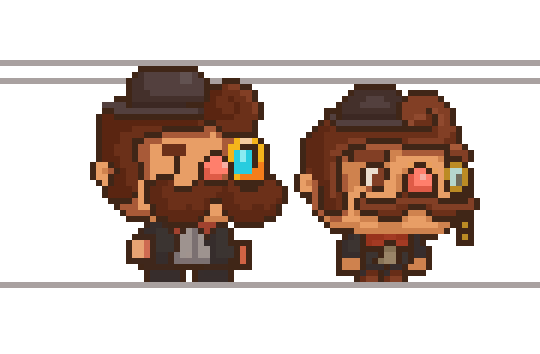
It’s #throwbackthursday! Show us some of your #indiedev and #indiegame art! How far as it come?
Here’s a comparison of some in-game art for @moustachevania!


Fired enamels are glass-based pigments that melt and fuse to metal when heated to high temperatures. In the early 1970’s, #DeGrazia became fascinated with the medium & created hundreds of enameled copper and silver objects. Happy #ThrowbackThursday! #TBT

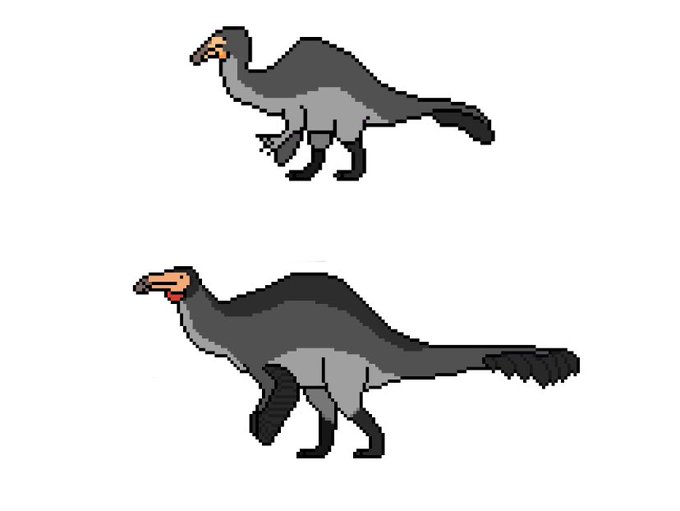
A good ol’ #throwbackthursday! When POTP first started, the animals were MUCH different, and the Deinocheirus was the first ever pixel (that I recall, I think). POTP: Deluxe was the major overhaul that changed everything!

#ThrowbackThursday! This spooky cover art from the October 1980 issue of CRICKET was created by the legendary Trina Schart Hyman! If you like #HalloweenArt, join us daily for our Halloween bracket on our Facebook page: https://t.co/x0LDAz6xZA #kidlitart

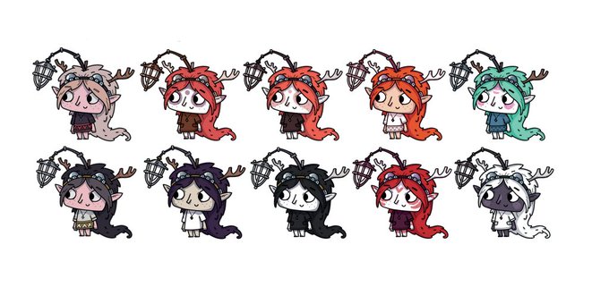
Here's a #TOHU colour study for #ThrowbackThursday! Earlier on, we envisaged The Girl as being more elven or another fantasy race 🧝♀️ We wanted to use a strong and definitive colour palette to expand her personality and express the mood 🎨
#gamedev #conceptart #illustration


Happy #ThrowbackThursday! We’d like to share one of our 3d designers! As you can see, his plane models have become a lot more lifelike! It’s amazing to see the progress one can make in such a short time period! Drop a ✈️ in the replies if you enjoyed seeing this incredible work!


#ThrowbackThursday!
Its an old piece of Petra that I did from Fire Emblem 3 Houses.
And its a secret santa piece that I made for someone ^^
#FE3H #FireEmblemThreeHouses #Fanarts #secretsanta #artwork #illustration #drawing #digitalartwork #petra


#ThrowbackThursday! Curious how Yan's World started? We dug up an ancient build from 2015 to see just how far we've came! If you're interested in seeing our progress finally completed, feel free to check out our KS and Demo - https://t.co/lPfmw3GuTD #gamedev #pixelart #indiegame