ContrastのTwitterイラスト検索結果。 10,507 件中 313ページ目

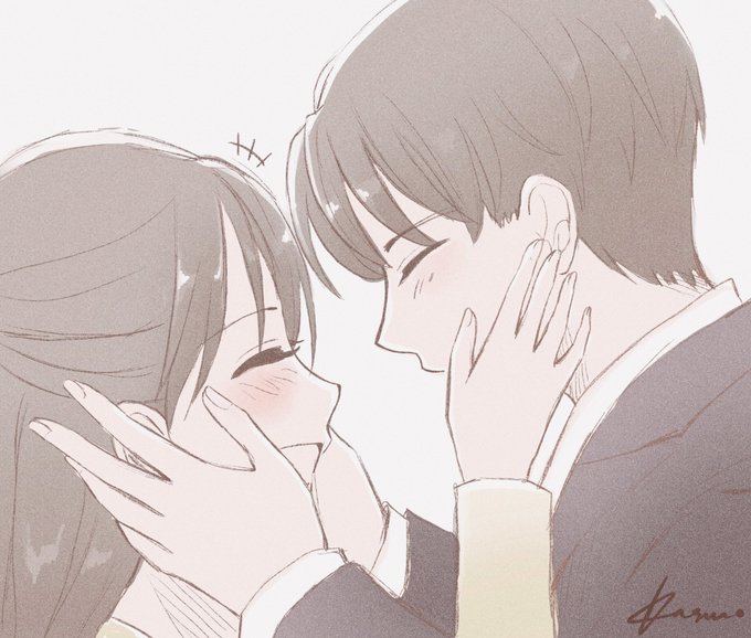
I’ve been drawing for years and tbh my fav still remain M&F cp. The contrast nature between a male anatomy and a female anatomy just really satisfied. The height, hands, eyes, hair, etc. the lineworks of a male and a female are on an opposite spectrum


Our new series is an experiment.We are inspired by G.Richter his monochrome works. In contrast to conventional painting, which is only flat on a two-dimensional surface, painting in 3 dimensional space still develops depths, shadows and light. #ArtistOnTwitter #bülow #artwork


Pain is moving a picture across devices to just look at the contrast being different


#betaamity #betatoh
ベータアミティには八重歯があっほしいと言う願望🐾
二枚目は影あり✨
I desire betaamity has a vampire tooth🐾
The second picture is contrast✨


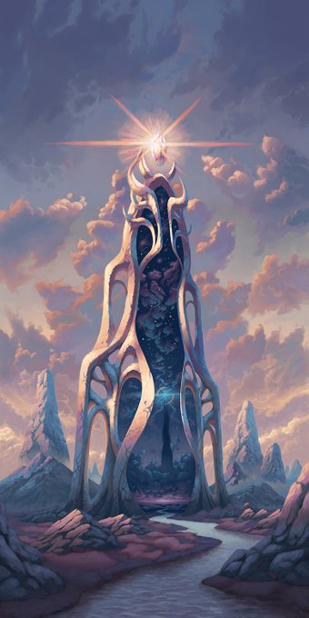

The Twilight Gate and The Waning Passage were imagined as companion pieces from the start. I wanted to contrast them both visually and conceptually: light against dark, solid against ephemeral, cosmic against terrestrial, among other dualities. What story do you imagine for them?


@thenewt_uwu I drew this trying to accomplish an anime style. I was asking people what color I should color her and this is what I got! Oh I also finished this commission. It is an interesting contrast lol the finished product looks very different from the final result!


Contrast isn't the only way to separate elements in your image, it's just probably the most basic. There are other elements, like color saturation, to make certain things pop out and certain things recede. Like @MadyGComics said in a recent comment, it's about color relationships


To illustrate the 'no rules, just tools' mantra, sometimes you use the concepts but dial in how much value separation for desired effect. U can pull back on contrasts (in the case of this torchlit witch burning) or dial the contrast to 11 (in this dramatically lit closeup dialog)


There are many ways to lead the eye, but the strongest is often value contrast. Looney Tunes are great examples. Whites and Blacks are often saved for the main characters or framing the characters. Establishing good value hierarchy is one way to lead the eye


*hands you the hardest jungler in the game*
Tried different medias in class today. it wasnt exactly the best, but some photo/color editing really made the colors contrast and pop out. I just thought that Lambs anatomy is perfect for trying out posing practice! #LeagueOfLegends


This Steppenwolf design is so gorgeous.
Very difficult to handle but it looks incredible.
Hope you like this, it’s an old piece I did but with some slight alterations to the light and contrast 🔥
#ZackSnydersJusticeLeague #SnyderCut


Poetic and contrasting yoga | Yoga illustration, Illustration character design, Illustration design


Pictures taken around Lakeland.
I especially like how the Crystal Tower lights up in the dark to contrast with its surrounding.
#FF14 #FFXIV #FF14風景 #ffxivsnaps #GPOSERS


@Loopifyyy @101cryptoart I'm interested!!!
Here's some of my existing work, I make heroic fantasy art with vibrant colors and contrasts
You can see more on my portfolio https://t.co/effWAVnvae


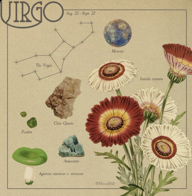

@1pouniette J'oublie qu'on a le même ascendant krkrkrkrkr
J'ai des sacrés contrastes pour ma par aussi olala


I like the fact that they imply multuple time that Prototype's Gilgamesh is actually pretty civil compared to the usual guy from Fate. Its nice contrast.


Doodle of my bird wearing some stockings and shorts. I think the background is a nice contrast