readableのTwitterイラスト検索結果。 912 件中 37ページ目


I follow a little too many Sonia+Leon fan-art accounts (It's my favorite ship), all of which are from Japan and Korea, so now my timeline is 50% unreadable to me. #pokemon #PokemonSwordShield


🌙🌙🌙Please read ( I tried to make the text readable ) 🌙🌙🌙
We will still be out of it for some more weeks, but please bear with us. Thanks for your understanding 🧙♀️


I edited the pictures where I turned @How21011 and @Akaji_lion into paint to the point that the text bubbles are now readable.


Can finally post this. This was part of an art chain.
So much fun. :D
#artchain #scorpion #scorpiongirl #swamp #drawing #art #spreadable


HOL DOES COMMISSIONS
updated take on last year's board (complete with examples and actual readable text)
➳ https://t.co/0YXQJ5Woyx
➳ freaquin.art@gmail.com
more info in the thread

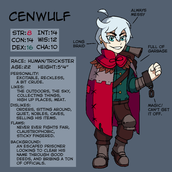
My slightly edgy, mostly goofy dungeons and dragons guy. Thx for the help with the font baconpal, my handwriting was almost unreadable.


I love this tall gentle boy
I used a less saturated palette, made the tail less massive and long, gave him some cute new pants. ALSo i reinstated the chest eyes bc they just looked cool
Man i hope the text is readable, i dont have the greatest writing style


for the back of...my artist...bussiness card? yay or nay
also unsure about the text; I originally had right version because it's quite clean and readable but I realized I was mixing three types of fonts and so I checked if it fits making the middle and bottom ones the same

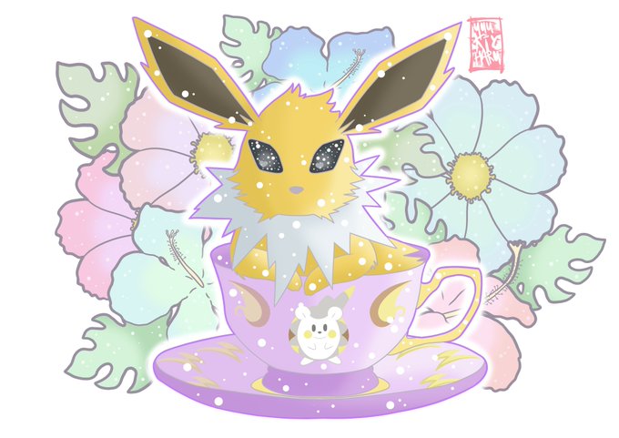
⚡Jolteon is here⚡
She was a difficult one, because shes so spiky but I also had to make her look like a readable shape! I think I smashed it @^3^@


Saw this going around and couldn't help myself. I tried to keep it fairly readable so I only added the ships I kind of care about. There are also some characters missing that I would ship. #OnePiece #ShippingMeme


Aeducan x Gorim 2.0
I went in & tweaked the colours, added a shadow, made the text slightly more readable. I think there's other things to fix on this but I'm calling it done for now.
#dragonage #dao #art #aeducan #dwarf #gorimsaelac #romancenovel #dwarves

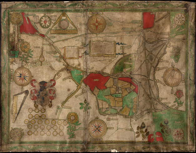
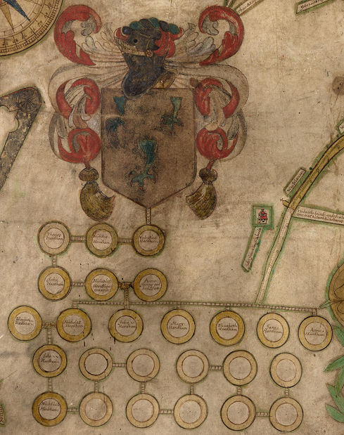

#MapMonday equals another gem for you: Add Mss 28784 - a 1631 map of Cuckfield, Lindfield and Wivelsfield - is beautifully detailed, including an acorn & rose border, open books with readable text, & the pedigree of the Hardham family going back 5 generations. #ExploreYourArchive


"a delightfully readable and informative wrendition." - @KirkusReviews
https://t.co/9tjr5oa1M1


had a secret santa for our dnd group so i drew up a convo one of out pcs had with a character from their past bc i thought itd be fun hee hoo... rest is readable here bc its long and im lazy > https://t.co/FyQrfukbsQ


Completely Unreadable Band Logo of the Week: Win a Grab Bag of Metal Goodies! https://t.co/CHMYyqXOqM


my quest for readable speech bubbles continues
Untempered Chain ch. 2 p. 17: https://t.co/Ue3TAm8Hx7
( chapter start here: https://t.co/XjUS0IkkWb )


These are the originals. They have a recipy for the potion on it. :D This isn't readable on the print though.