CONTRASTのTwitterイラスト検索結果。 396ページ目


in contrast to Raoul and Gigi, Jangles was easy to figure out. i wanted his palette to be the most subdued of Angel's skeleton crew, because he's not meant to stand out




@therealneyzilla Hey there! I'm Chinua, a pixel artist and 2D Generalist. I draw monsters and favor an angular, high-contrast style. I stream at https://t.co/CsXIXRRYiY | https://t.co/GpTTNesq0p and have a brief portfolio of works at https://t.co/8A68jbil1a.


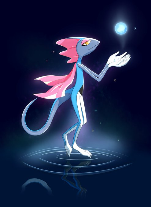
Inteleon, but something surreal
I used a finer pen tool for the lineart in contrast to the size I normally use. The result is intriguing


Experimenting with uh. Contrasts. #sokka #southernwatertribe #warrior #photoshop #avatarthelastairbender #digitalart


@LiamSorta @_Teejay5 Hi there! I'm Chinua, a pixel artist and 2D Generalist. I draw monsters and favor an angular, high-contrast style. I stream at https://t.co/CsXIXRRYiY | https://t.co/GpTTNesq0p and have a brief portfolio of works at https://t.co/8A68jbil1a.


@ContinueShow Hi there! I'm Chinua, a pixel artist and 2D Generalist working in Lansdowne, near Philly. I draw monsters and favor an angular, high-contrast style. I stream at https://t.co/CsXIXRRYiY | https://t.co/GpTTNesq0p and have a brief portfolio of works at https://t.co/8A68jbil1a!


ベレス比較 Contrast
#スマブラSP #SmashBrosUltimate
#FE風花雪月 #FireEmblem #ThreeHouses #FE3H #FE
#FireEmblemAwakening #FEH #FEHeroes


Watercolor #painting of the dramatic #storm sky, titled "Sky No. 6'" (30 x 40,8 cm, 2017). I just love those contrasting colors!
You can find the original watercolor and signed art prints of it here:
https://t.co/BO4WBzUoE0
https://t.co/cSVqObweKm


Spiros Halaris highlights the contrast between the classic cut and eccentric attitude of the Emporio Armani Stars capsule collection for men.
#EmporioArmani #EArtists
Credits: @spiroshalaris


Final Day of #MaySketchaDay
The exhaustion of painting all day nearly every day for a month has made the last few days especially difficult to process - and the dissonance of enjoying art more than I have in ages contrasted with the horror of current events hasn't helped. (1/3)


@luulubuu Hi there! I'm Chinua, a pixel artist and 2D Generalist. I draw monsters and favor an angular, high-contrast style. I stream at https://t.co/CsXIXRRYiY | https://t.co/GpTTNesq0p and have a brief portfolio of works at https://t.co/8A68jbil1a.


poor kitty
I am supposed to make a contrast video not keep taking screenshots


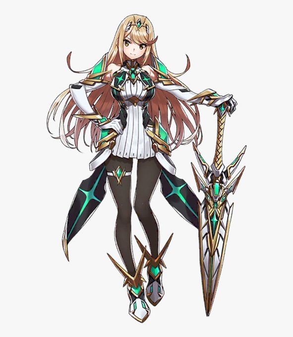

I will come to be the odd ball here saying this but I prefer the left Mythra compared to the original right mythra in design. As the leggings give out this interesting contrast the outfit already did with the white and just needed a bit more darker colors to do it the og didn't


Musician By Thushari Gamage .
A bold and illustrative piece with contrasting colours, shows two women playing ancient guitars in a field of palm leaves. With the use of Aqua, pale yellow, orange and burgundy oil paints.
#art #illustrativeart #oilpainting #srilanka


Yes, I think I will adhere to the usual colors ...😅
Less contrast🤔
#btsfanart #btsart #fanart #art #BTS #bantansonyeondan #Jimin #ParkJimin #Jiminfanart #prettyboy #cutesexylovely #jacket #oversized #bareshoulders #experimented #experimentwithcolor #lesscontrast #digitalart


@victoriaying I've been self teaching for a long time and I'm reaching a point where I need some direction, even if its just going back to basics. I think Schoolism will help me with color, contrast, texture, and stronger/more energetic composition