CONTRASTのTwitterイラスト検索結果。 420ページ目


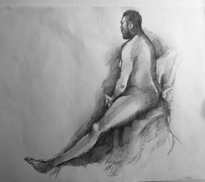
Tonights life drawing. Again love the contrast of 3 minutes to 30 minutes @OurQueerArt @LGBTArts @fmspear @hugo_greenhalgh @PinkNews @GayArtists #lifedrawing #lgbt


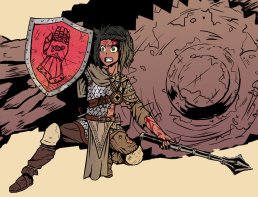
Dungeons & Dragons Commission Progress #WIP ~
Geez this is not her day! I tried to be subtle with the red of the blood so I wouldn't take contrast off
As well as drawing the monster, though it's mostly traced over to keep in budget
#fantasy #dungeonsanddragons #conceptart


Dungeons & Dragons Commission Progress #WIP ~
Geez this is not her day! I tried to be subtle with the red of the blood so I wouldn't take contrast off
As well as drawing the monster, though it's mostly traced over to keep in budget
#fantasy #dungeonsanddragons #conceptart

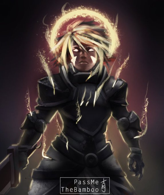


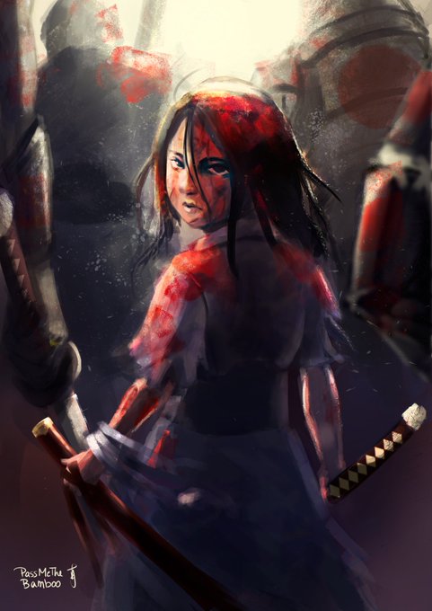
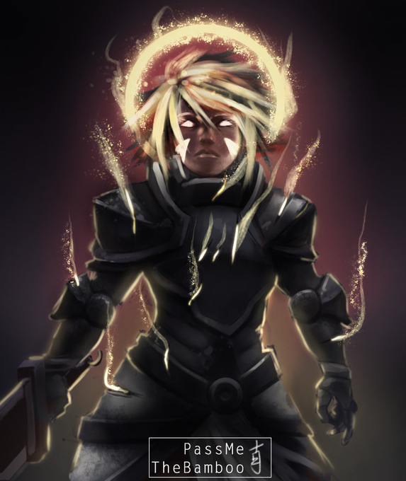
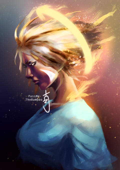
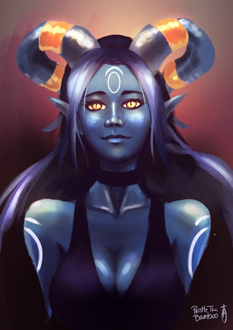
@RosenniaArts Hi friends, I'm Noah. I'm a hobby digital illustrator who likes using a lot of contrast when drawing. ❤️🙏
Here are some people that deserve to be noticed: @TheUrbanestBear @JazzyRe62476978 @RosenniaArts @RoselynShade @shaekormos @HardKandyStudio @Inky_Brainz @Saftabi13


Happy YOUTH ART MONTH!! 💥🌈🎨 I’m celebrating with @ArtEducatorsNJ #31DaysofYAM this #youthartmonth #60YearsofYAM! @youthartmonth @NAEA @HVArtsEd #hvartsed day 5 - #contrast 3 by students, 1 by me


@Cyb3rDo11 ...I like the contrast between your picks hehe😊👌✨
(Thing is about top 4 favorite fictional characters)
It is very hard to pick just 4 but this are at least in my top 10 fav, they always make me smile💜
Sorry guys but i pick u💖: @Inawon2 @Jeib_art @JoelKaradsheh @PylonsArt


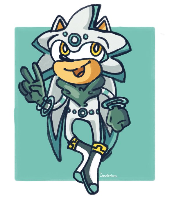
A lil Silver the Hedgehog redesign! There’s not a lot of method here beyond liking the idea of him looking more regal and wanting more contrast than white against off-white. This was really fun!


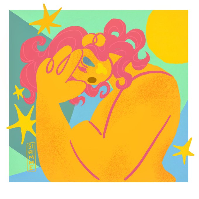


Hello #VisibleWomen ! I’m Iris Cintron, a Puertorican illustrator and designer.
My work consists of bold contrasting colors and depicting women in all their wonder.
I would love to work in Editorial!
✨:sirimme.art@gmail.com
🌷: https://t.co/HchyHfWwkN
🌱:@sirimme


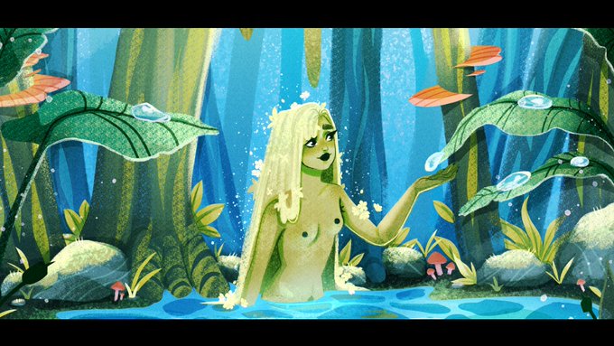

Hey #VisibleWomen! ✨
I'm Jess, a UK based freelance illustrator! I love using bright colours, illustrating nature and using lots of contrast!
✨ port: https://t.co/mCck0zgCvy
✨ insta: https://t.co/L8rvs1dZEb
✨ email: jessicabernadette@hotmail.co.uk


Hey #VisibleWomen, I’m Tori, and I love digital painting, high contrast aesthetics, fantasy, and exploring bakeries.
💼: https://t.co/sAX0sP7PnT
✨: https://t.co/oP28Oi2BpX
🎨: https://t.co/53CbT0W4sv
📧: victoriacjeon@gmail.com
INPRNT Shop: https://t.co/vaRQAgf7dW

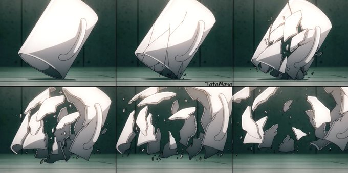


i like the contrast of their lines being what harugumi has done for sakuya and what tsugumi wants to be for afterglow! they're both working so hard tho and im proud of them ♡ https://t.co/TS9mZEtNpI

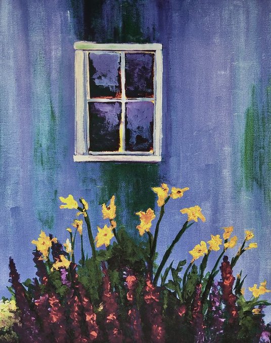


"My work has a colorful and abstract quality in addition to my impressionistic style," says 2020 IWAF artist Tracey Moscaritolo, whose detail, sharp contrasts & wonderful ability to blend hues combine to create colorful #landscape & #seascape paintings. https://t.co/zv3a9H32zi


ive had issues w/ the contrast in design between TWINS vex and vax in the official animation trailer, but stereotypical features aside, why is their hair literally two different tones? its a small thing but also im frustrated that they look dif soley bc theyre different genders
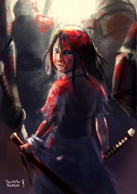
@RosenniaArts Thanks for doing this, Lex!
I like how I always try to bring out a lot of contrast and through that, try to tell a story. I still have a lot to learn, but I hope to one day be among one of the greats. <3

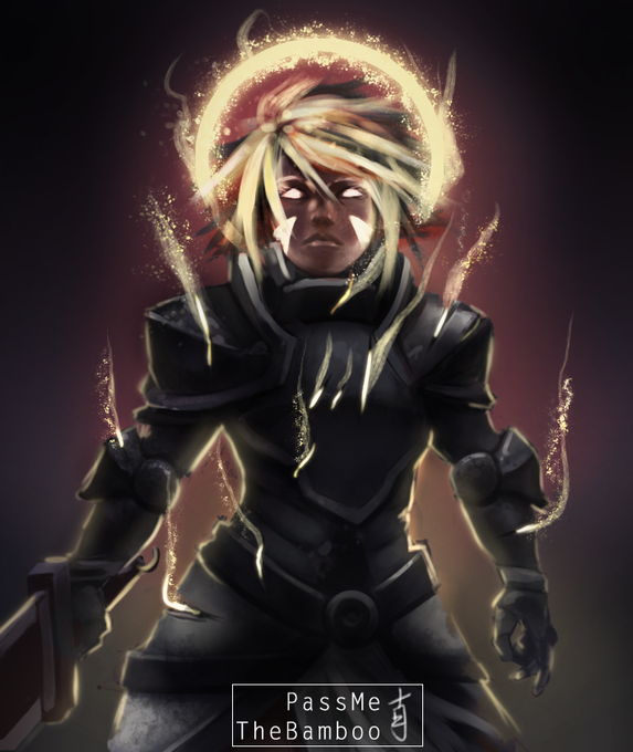
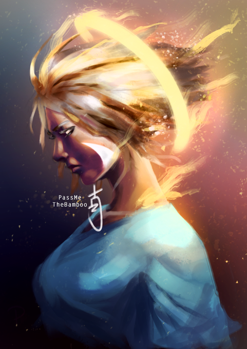

@RutherArts Thank you very much for the thread!
I'm Noah, I draw many things!
I love working with a lot of contrast while trying to tell a story.
Some artists that inspire me are:
@RosenniaArts @TheUrbanestBear @HozureArt
@JazzyRe62476978
@ShivyShivon
@Inky_Brainz
@shaekormos
@juliedillon