CONTRASTのTwitterイラスト検索結果。 434ページ目


#screenshotsaturday Calling this done. New "Rocket Launcher" for Bears In Space @Broadside_Games
I always try and design them up to be toy like, it gives a good contrast to the grungy enemy robots and surroundings.
Always keen on feedback
#gamedev #SubstancePainter


@NintendoES "¿Dónde encontraste esa baya meloc?"
#FanartPokemonEspadaEscudo @NintendoES @Escolajoso


“At the Tip of Two Galaxies” 15in x 30in gallery canvas.
I love the colors and the texture contrast in this piece. I may add a reflection in the helmet 🤔
Available for purchase 🖤
.
#artistsontwitter #painting #space #bluewhale #astronaut


Just removed a “halo” layer I had placed just behind the foreground, and I like it much better now... also the original (on the right) had a “Lux filter applied to it in Instagram, making Lionel less noticeable next to that newly high-contrast environment.

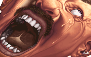
Sackpain by Contrast / Acme
🔗 https://t.co/dyw43OeDJ9
🗓 Released in 1995 at Somewhere In Holland 🇳🇱
#demoscene #creative #2d #graphics #pixels #pixelart #drawing #painting #pictures #digitalart #art 😍


🐗2019🐗 → 🐭2020🐭
今年もどうぞよろしくお願いいたします♪ #happynewyear2020 #あけおめ #contrast_design


Sun god effirie, from Conjured setting - I'm so proud of how I built their design off of Kay's design for Neph, and I'm so pleased with the colors and contrast and general everything??? and the fish. The fish turned out so good.


eu ia fazer art summary mas eu to com preguiça
ok vai 4 desenhos q eu tirei da mesma pasta msm
janeiro // junho // julho // setembro
foi mais questão de aprender contraste e mexer no design da Silica


Mis ilustraciones favoritas del año.
He mejorado mucho en tan poco para ser honesto, a inicios del año me daba miedo el color y ahora no imagino mi vida sin él.
Cad día quiero colorear de nuevas formas y contrastes. También quiero mejorar en lo ecchi (para el patreon jejeje)



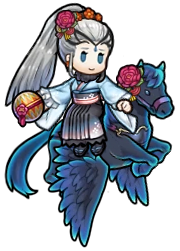
And NY Eir, which is, bizarrely, the unit I'm most hype for. I love how-in stark contrast to her normal sprite-she seems actually happy here. Good content. Wholesome.


Now that I hand Paint my environments, I'm getting use to depth, and contrast.
#VideoGames #IndieGameDev #IndieGames #GameDev #IndieDev #MetroidVania #Retro #PixelArt #IndieWatch #IndieGameTrends #IndieGameLife


Deviating from my usual ink/sketchy style to attempt a bit of digital painting of the wonderful Claire and Jamie Fraser from #Outlander.
I think I’ve caught their personality in their faces, now it’s just about building up the colour, contrast and depth to get the final piece.